Hello walkers —
I really should have spent another night in Matsumoto last week. Thanks for all the tips and recommendations folks sent in — it seems Matsumoto is more popular than I realized. Looking forward to exploring in the future!
I’m Modo-san, and this is Ridgeline, your weekly, infinitely running, walking newsletter that, because of COVID-19, has become strictly about Japan these last eighteen months. Perhaps sometime in the future, once again, we will explore big walks beyond these (fine) borders.
Because of the hellish doom-heat of summer in the Kanto-area, I earmark July and August (and most of September) as butt-in-chair work months. Last year, we were in full Kissa by Kissa production, punctuated by a few random walks for fish and chips.
This year, I’m working on completing the third edition / printing of Kissa by Kissa. Each printing I make a few tiny changes to production; hence a bit of fuzziness to calling them “editions” vs printings. This latest edition, I hope, will be the “best” yet. We’re switching to “Swiss-style” binding. Swiss biding is a bit weird, because the front cover isn’t attached to the body block, so I’ll have to photograph and explain to buyers that this isn’t a flaw. The benefit is: Allowing for the spine to open up a bit more, and more of the pages to lay flat without resorting to other tricks. The results of our tests have been fantastic. The “dummies” (test books) feel amazing and there’s almost no durability hit as far as I can tell (since only the rear of the body-block is glued to the cover).
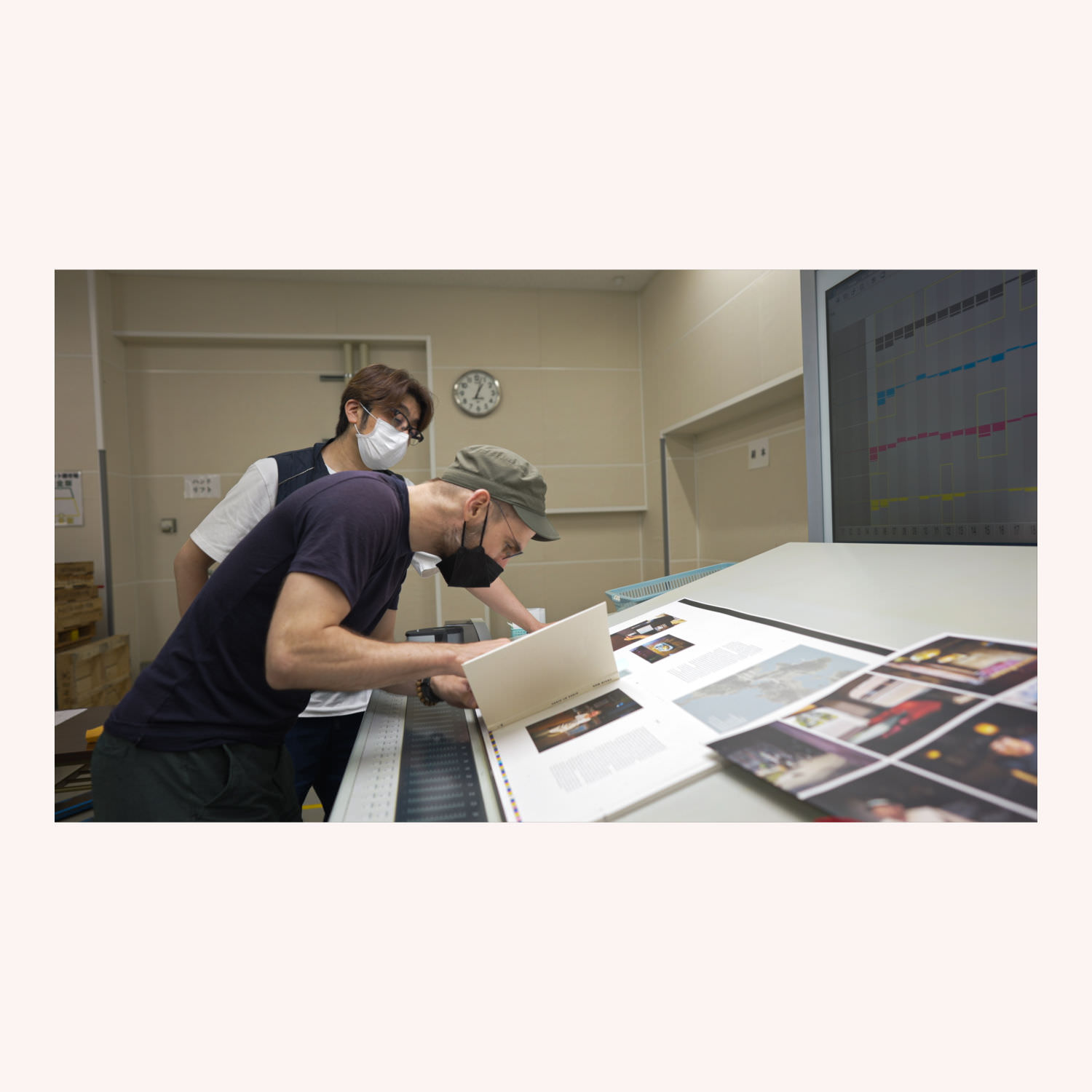
We’ve also switched printing companies and upgraded our printing machines. This edition is being printed on some hulking Heidelberg Speedmasters, and (as far as I can tell; I’m far from an expert on this stuff), we’re using an FM or stochastic screening halftone process, at a higher lines-per-inch, resulting in images with significantly more detail. It’s kind of shocking, placing the new pages side-by-side with the old. The difference is especially visible on images with thin lines or textures. Same paper, more detail. This kind of printing is only possible with the tight tolerances of higher-quality machinery. And we’re achieving all this without switching to, say, a glossier paper, which is normally what you reach for when wanting to increase “punch” or perception of resolution. I’ve never been a fan of glossy paper, and I don’t think it aligns with the “tone” of my photographs. So this feels like a best-of-all-worlds solution.
I did a members-only behind-the-scenes peek at the printers. And I’ll do another one when I head to the bindery in the coming weeks. (Assuming COVID-19 numbers don’t get too crazy in Tokyo.)
If you want an explicit notification when the 3rd edition is available for purchase, you can sign up on this one-off newsletter.
Otherwise, I’m presently working on a big essay for a newspaper, and consolidating my Where are all the Nightingale? posts and more into the shape of the next book. The plan is to have that done and going to press by the end of September. A tight schedule, but I have the sweaty dog days of summer in Japan to keep me focused, and at my desk.
C
Not subscribed to Ridgeline?
(A weekly letter on walking in Japan)
This essay is from the Ridgeline newsletter, mailed out July, 2021. Thoughts? Email me@craigmod.com.
Craig Mod is a writer and photographer based in Japan. He's the author of the books Things Become Other Things and Kissa by Kissa and is a MacDowell, Ragdale, and VCCA writing fellow. His essays and articles have appeared in The New York Times, Eater, The Atlantic, California Sunday Magazine, Wired, Aeon, New Scientist, Virginia Quarterly Review, The New Yorker, The Morning News, Codex: Journal of Typography, and elsewhere.
He writes newsletters, oh yes, newsletters: Roden & Ridgeline.
The work on this site is supported 100% by paid memberships and book & print sales.
Whatever you do, don't follow @craigmod on Bluesky or Instagram.