Hello, Again
Feet on the ground, satellites, and the indie web
Hello, again. Some six weeks ago I began to contemplate a few changes to my small nook on the web. As tends to happen, minuscule changes to font sizes trickled into deeper typographic investigations, barreled into layout grid updates, resulted in a total gutting of the site, which conspired to an overall simplification and reevaluation of the purpose of craigmod.com.
In this mode of digital existential reflection, I was — of course — obliged to collate a large chunk of my writing from the past few years from a medley of sources, online and off. Finally, what else was one to do but revisit and lightly edit all of the essays once again?
You see, this is why you snip the dangling thread, never pull it.
And so six weeks later, after far more hours than intended at the outset, I present to you an updated craigmod.com. Though it doesn’t look that much different, believe me when I say, the margins have been considerably reconsidered.
#Satelliting
My writing is now collected under the Sputnik Journals. These essays and articles and snippets felt like a collection of satellites of varying trajectories floating around the web, now finally logged under a single ledger.
As for the name, Sputnik was not only the first artificial Earth satellite but it’s also a damn fine word — SPUT-nik!, say it loud. And the Laika story is a quirky one (she also went orbital on November 3rd, the day after my birthday). And Murakami managed to write a pretty good novel called Sputnik Sweetheart. So Sputnik it is.1
#To be, indie
It had been years since I put time or effort into this site. That got me thinking about what it means to be or publish online in an “indie” way, or what the “indie web” is. Those thoughts have been collected in an essay for The Message: All you need is publish.
To do indie. To be indie. To publish indie. The indie web. What is indie? By “indie” we mean independent. Under our control or some pretense of our control. Accessible by all robots and humans alike, no accounts necessary, no paywalls — porous or opaque — in sight. Sorry Google, leave your real name in your passport. This library here’s open and open for good and we don’t care who you are.
When we talk “indie” we implicit two genres of indie. Craft Indie and Mass Indie. Both important. One not better than the other.
… the article goes on to talk about so-called “Mass” (a Tumblr page) vs “Craft” (a site like this). I also discuss the motivations and advantages in publishing off of a “home” like this. If you want to dig deeper, I suggest reading — at the very least — Jeremy Keith’s In Dependence post from the end of last year.
#Additional details for the geekily curious
Since I geeked out a bit on this project, let’s geek out a together.
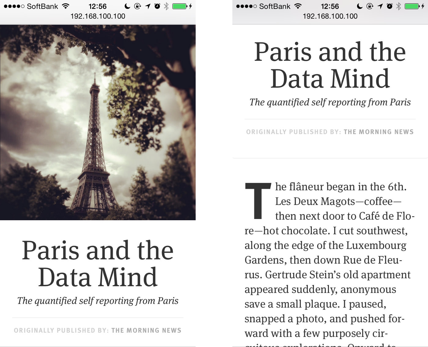
The type is all FF Meta. I suppose there’s something a bit retro about that choice. Truth be told, I was hoping to use a pairing of KLIM fonts, only because I had been using bits and pieces of FF Meta here for nearly … six? years, and thought it would be nice to mix it up. Although Kris — the perfectionist that he is — still hasn’t released any web fonts to the public. Mainly, I was looking for a family simple and effortless where I could focus on rhythm and consistency above all else. FF Meta Serif and Sans work damn well, and I love how it all came together. They also have a proper small caps (another requisite — severely limiting choice — for the type update).
I’m using the Sans for drop caps and am tickled by the funny little quirks that appear when made bold and blown up far beyond the font’s intended use case. The slants in the T, Q, and F, the funny taper of the J. They become curious ink-blots at the head of each piece:
T Q F J
Overall the site (to me) feels eminently more readable and lighter and tighter than ever before — most of the lingering typographic fat that had accumulated over the years has been shed.
There’s also a full-text RSS feed. Call me Grandpa Mod but I believe all RSS feeds should be full-text. Partial text feeds feel like such a … tease. No? I’m not sure who uses RSS these days, but it’s there if you want it.
Related: Because RSS feels so geeky and on the periphery of normal users, I’ve rejiggered the entire site to funnel to my mailing list as a way of capturing intent and following up with readers. Mailing lists are way more fun than RSS.
It goes without saying that comments have been removed.2
The articles are for the most part, written / stored in Markdown. I’m not a total over-the-moon Markdown fan — it works, but is sometimes too syntactically cumbersome for its own good. And because I tend to add little flourishes to each article, there is the inevitable raw HTML that sneaks in. (Like right there — wrapping the HTML in a small caps span.) So while good in theory, pure Markdown is difficult to pull off in practice.3
I’ve implemented all Twitter card and Facebook meta tags, so everything (in theory) should render nicely in tweets and on Facebook.
I even went through and implemented some microformats. Do I know what microformats are or what benefit they bequeath upon those who use them? Not really. But, Jeremy Keith whispered to me: Use them, Craig. And one has no choice but to listen to his whispers. So everything is tagged up, ready for robots who eat microformats2 to come along and use my content to excrete a better, more semantic universe.
#Welcome
Golly, see how geeky managing your own website is? And I didn’t even get into talking about my .htaccess files, which I had to muck with to get the /essays/ url scheme going. (Long story.) This kind of indie web work will never be mainstream. And, really, at this point, to work on a project like this — at this level of detail, for yourself — is a form of meditation (lest it become torture). And, I admit it — I like trying to get the margins and fonts right.4
I reckon, though, that this may be the last time for a long time where I will futz with this corner of the web. It feels good for another five years. For now, back to the words.
#Noted:
-
AND it pairs nicely with the “Roden Explorers” moniker. ↩︎
-
Mainly. They’re still on a couple of old entries since the threads are pretty good and supplementary. ↩︎
-
I’d really love a nice WYSIWYG, uber simple Markdown editor. Right now I’m using Ulysses III for almost all of my writing. I really like it. But I wish the Markdown was more obscured, just sat in the background. ↩︎
-
That said, I haven’t extensively tested on iPads — my philosophy (and analytics data show) that most people land here on their phones. After that, it’s desktop. And in a somewhat distant third, it’s tablets. I wanted to make sure the text felt great on the phone and desktop. The exponential complexity of yet another device size was a little outside of the scope of this project. That said, if you see some obviously broken bits, feel free to chime in. And I’ll probably have to add some more rules for the larger iPhones. ↩︎
This essay, published September 2014. Thoughts? Email me@craigmod.com.

Craig Mod is a writer and photographer based in Japan. He's the author of the books Things Become Other Things and Kissa by Kissa and is a MacDowell, Ragdale, and VCCA writing fellow. His essays and articles have appeared in The New York Times, Eater, The Atlantic, California Sunday Magazine, Wired, Aeon, New Scientist, Virginia Quarterly Review, The New Yorker, The Morning News, Codex: Journal of Typography, and elsewhere.
He writes newsletters, oh yes, newsletters: Roden & Ridgeline.
The work on this site is supported 100% by paid memberships and book & print sales.
Whatever you do, don't follow @craigmod on Bluesky or Instagram.