Let’s Talk About Margins
We're making a book. The margins are important. Do you know how important?
Originally published by: The MessageI saw a film recently on an airplane that made me cry. The film was a love story but the love part of the story didn’t make me cry. No, the scene that made me cry was about paper.
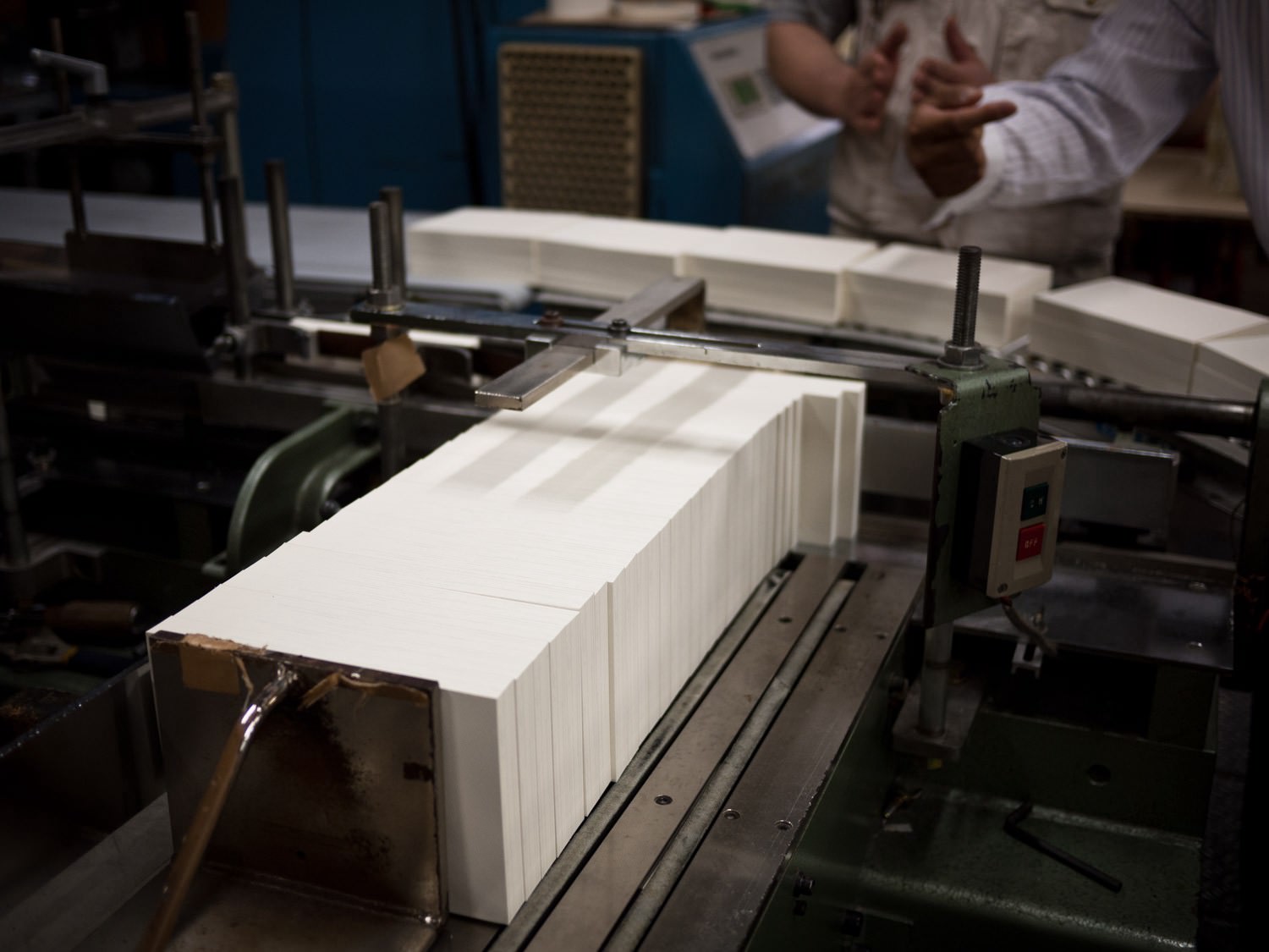
The movie focuses on a Japanese publishing company’s small dictionary unit. There are only four or five people in it. They are working on a dictionary that will take fifteen years to complete. Fifteen years. The scene that got me was towards the end. The head of the dictionary project meets with the paper maker. They are testing paper.
Hmmm, it doesn’t stick to the fingers enough, says the Dictionary Man as he thumbs the dummy book the Paper Man brought with him.
Oh, is that so? asks the Paper Man.
Yes, look here — perfect dictionary paper sticks to the fingers but doesn’t stick to the other pages. This paper doesn’t adhere properly to my fingers.
The Dictionary Man reaches behind him, grabs another dictionary, and shows the Paper Man a specimen of perfect dictionary usability. It’s exactly the sort of thing you’d never notice unless you lived and breathed dictionaries. Here, you try turning these pages, says the Dictionary Man. The Paper Man does so and responds with an, Oooooooooooooohhh, as if part of the matrix has been unzipped before him. He then apologizes and yells, WE WILL TRY HARDER while bowing deeply.
That’s when I realized my eyes were heating up.
Maybe this was the love part of the story: Two people collaborating on a solution to a problem occupying space often unnoticed but always felt.
Thoughtful decisions concerned with details marginal or marginalized conspire to affect greatness. (Hairline spacing after em dashes in online editing software — for example.) The creative process around these decisions being equal parts humility and diligence. The humility to try again and again, and the diligence to suffer your folly enough times to find the right solution.

A physical book is difficult. If you haven’t made one, it’s tough to imagine just how difficult it is. Every detail requires deliberation. There are many details. I will spare you an enumeration. But believe me when I say, if you think about them all before you start, you will never start. The rabbit hole is deep. The truth of any craft.
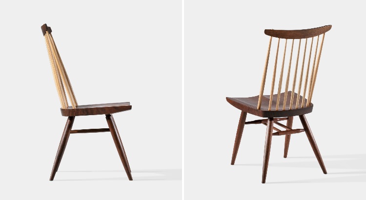
If George Nakashima were standing here (which would be amazing because he is dead), I’m sure he’d be more than happy to discuss ad nauseam the nuanced complexities in shaping a piece of wood just so. We’d say, OK OK Mr. Nakashima, got it. And he’d say, Listen, kids, in order to produce a fine piece of furniture, the spirit of the tree must live on. You give it a second life … You can make an object that lives forever, if used properly.
Forever.
Physical work remains. Physical stuff has edges, can be “completed,” becomes vessels of wood or pulp or iron into which ideas are made immutable. It’s easy to forget this solidity as we live and make things online. Online has no boundaries and online can be fiddled with indefinitely. We trade solidity for instantaneous and boundless distribution. It’s a pretty good trade.

A physical book is a multiplier. Every second spent pondering, testing, retesting, test printing, print testing, smelling, swiping, or weighing a physical book will manifest a hundred thousand times over in delight for the readers now and the readers to come. And if a reader doesn’t notice, they will feel the difference. This you must believe.
Consider buildings. Although you may not be an architect, you can be touched by a graceful space. The kind of space where you close your eyes and feel the gentle hand of the architect reveal itself in the way sound and air moves around you. Try it sometime. Go to your favorite space. Close your eyes and breathe slowly and intuit the goodness. Conversely, you can sense neglect or disregard the same way. There’s a building in Tokyo that feels like it hates the world. Standing in its shadow, the wind becomes portentous, howling, angry. It will swallow you if you close your eyes. It does not want you there. Its rotating doors even killed a child the first week it opened. It is not a nice building. You are not an architect but you know this: The building is bad. There are no George Nakashima chairs inside.

A book with proper margins says a number of things. It says, we care about the page. It says, we care about the words. We care so much that we’re going to ensure the words and the page fall into harmony. We’re not going to squish the text to save money. Oh, no, we will not rush and tuck words too far into the gutter.
A book with proper margins says, We respect you, Dear Reader, and also you, Dear Author, and you, too, Dear Book.

Years ago I arrived at the MoMA on the last day of the Richard Serra retrospective. I didn’t realize the museum closed so early. It was open for only ten more minutes. I paid and went in anyway. It was empty. The staff left me to wander alone for 45 minutes. This was the first time sculpture moved me to tears. As I slid, misty eyed, into the space between the hulking, towering, bent iron slabs, I could feel in the vibrations, the balance, the soft curves of the objects a deep love and consideration. I was surprised by the tears. I was also quite jet lagged.
Text printed on the best paper with no margins or unbalanced margins is vile. Or, if we’re being empathetic, sad. (For no book begins life aspiring to bad margins.) I know that sounds harsh. But a book with poorly set margins is as useful as a hammer with a one inch handle. Sure, you can pound nails, but it ain’t fun. A book with crass margins will never make a reader comfortable. Such a book feels cramped, claustrophobic. It doesn’t draw you in, certainly doesn’t make you want to spend time with the text.
Hmmm, it doesn’t stick to the fingers enough.
On the other hand, cheap, rough paper with a beautifully set textblock hanging just so on the page makes those in the know, smile (and those who don’t, feel welcome). It says: We may not have had the money to print on better paper, but man, we give a shit. Giving a shit does not require capital, simply attention and humility and diligence. Giving a shit is the best feeling you can imbue craft with. Giving a shit in book design manifests in many ways, but it manifests perhaps most in the margins.
A book is a flexible mirror of the mind and body.
So Robert Bringhurst begins his chapter, Shaping the Page, in his seminal Elements of Typographic Style. Bringhurst is an excellent typographer and collector of typographic rules. Above all, he is a poet concerned with the page. He has yet to make me cry, but he is still worth mentioning.
Here is how he describes the textblock’s relationship to paper, or, in other words, margins:
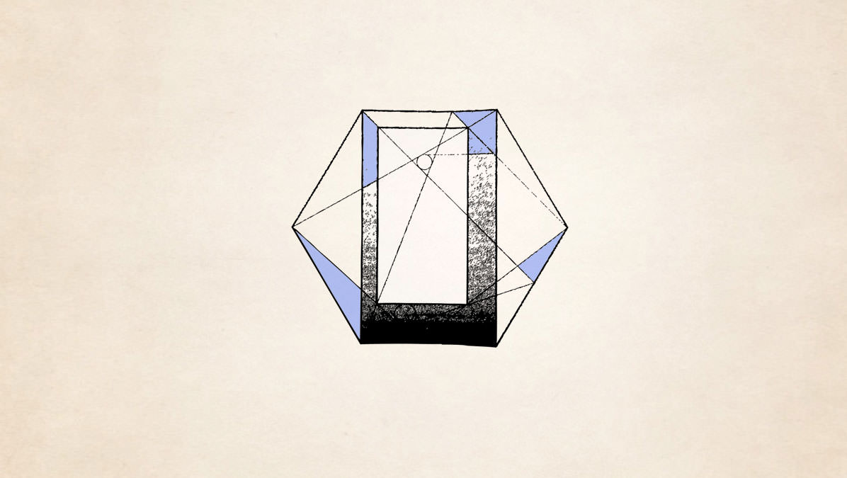
The page is a piece of paper. It is also a visible and tangible proportion, silently sounding the thoroughbass of the book. On it lies the textblock, which must answer to the page. The two together — page and textblock — produce an antiphonal geometry. That geometry alone can bond the reader to the book.
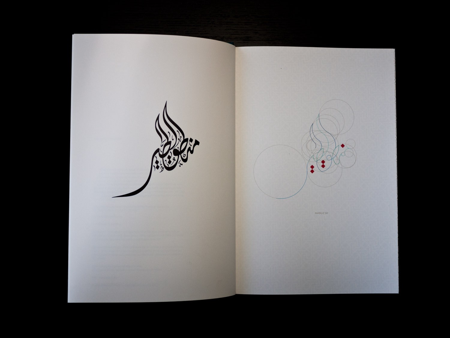
Reach for a book. The dedication and earnestness of those who made it is revealed immediately in the margins. If the margins feel questionable, be suspicious. Other corners were likely cut. All authors should have a Margin Clause in their contracts. Objection, your honor. Never be fooled by a fancy cover. Always remember: Covers are just there to protect pages with beautiful margins.
The layout of this essay will change in time. If we return to medium.com in a few weeks or months or years, the margins will be different, the block quote styling a darker grey, the headers a new font. We will read it on new devices, bigger and smaller phablets, goggles, contact lenses, windshields. Nothing is fixed.
Do not dismiss the fixed page. Margins on the screen are necessary, but margins on paper have the power to affect.
Fifty per cent of the character and integrity of a printed page lies in its letterforms. Much of the other fifty per cent resides in its margins, says Bringhurst.
Yes, look here — perfect dictionary paper sticks to the fingers but doesn’t stick to the other pages, says the Dictionary Man.
Make an object that lives forever, says our ghost of George Nakashima.
WE WILL TRY HARDER, says the Paper Man.
Today we set the margins, tomorrow we finish the book.
