To Make a Book, Walk on a Book
Designing Koya Bound and other books by placing them on the floor
When making a book, I find it’s useful to walk on the book. To peek over it and look for patterns, shuffle pages, grouping and ungrouping the loose sheets. Walls work too — a book can be made on a wall. But floors are easier. And there’s something joyful about the tip-toe dance you do across a room when it is filled by a book.
I spend most of my time writing and brainstorming books with others. Photographer Dan Rubin and I had long discussed making a book together. In March of 2016, we walked for eight days on the Kumano Kodo, a thousand year old pilgrimage path in the mountains of Japan.
When we finished the walk, we made our book.
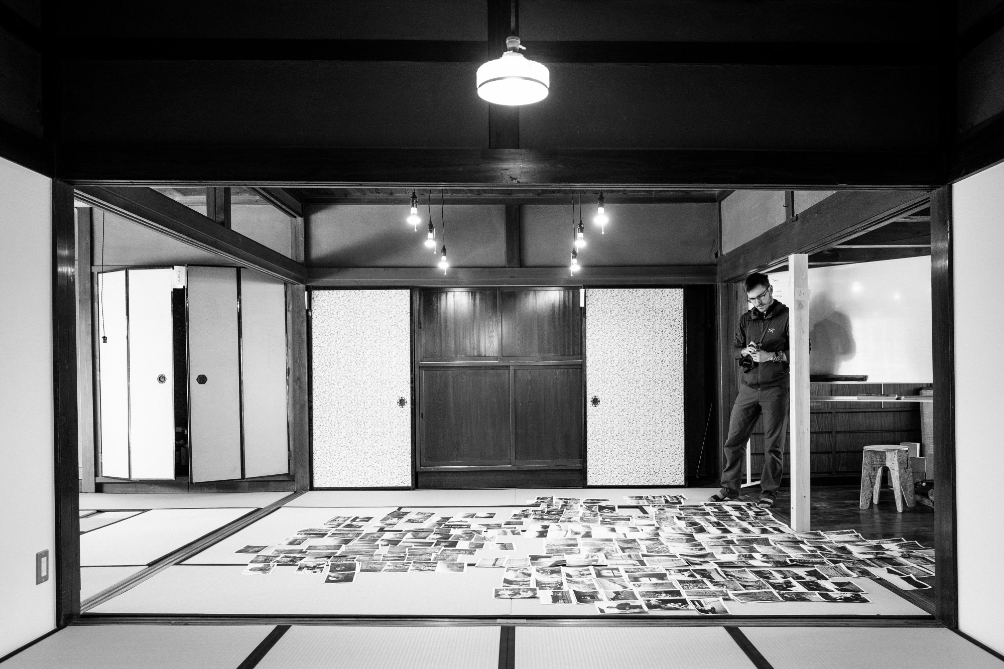
We hid for a week in an old house in the middle of nowhere Japan. We Amazon Primed1 in a cheap Brother laser printer and some knock-off Chinese toner. We then sifted through the 3,000 or so photos we had taken on the walk, whittling them down to about five hundred. Those were printed, placed on the floor, and walked upon.
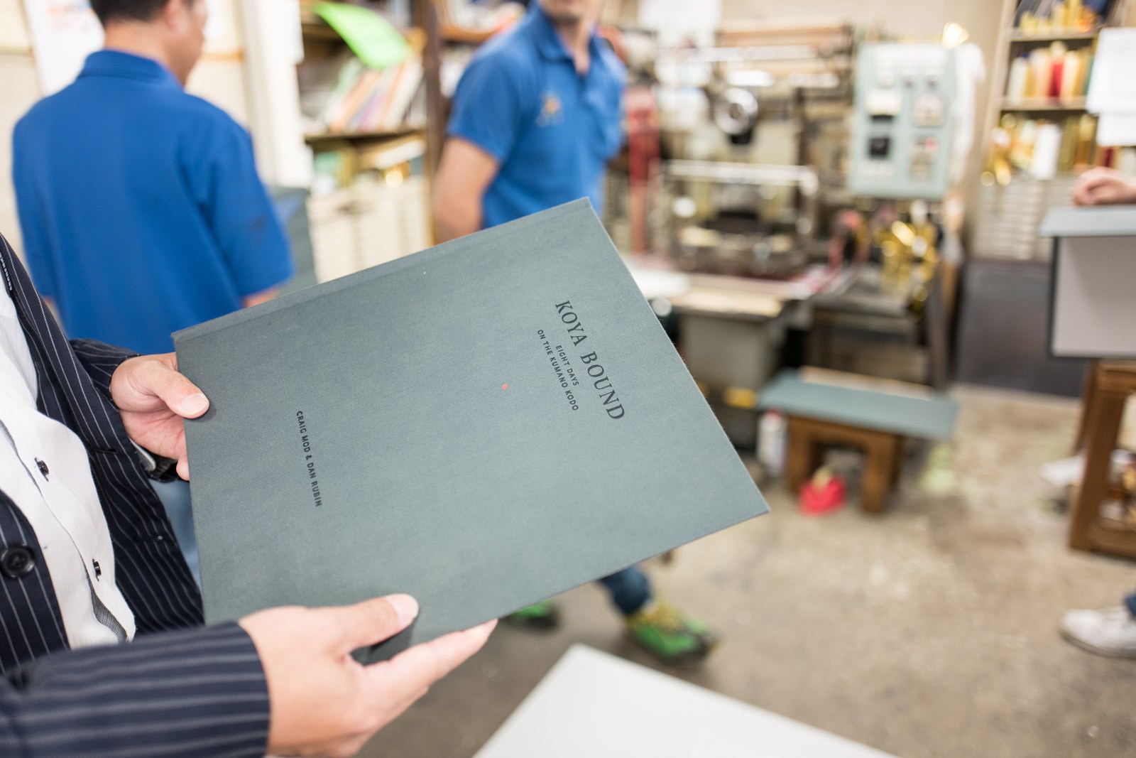
By the end of the week, the skeleton for the book was complete and we’d go on to finish it over the coming months. The book is called Koya Bound and it recently won a AIGA 50 Books | 50 Covers book design award.
I’ve been formally working with books since 2001— making, publishing, writing, printing, hemming, hawing. And so I understand how much work even the simplest book requires, and even in knowing that, I also know that I’ll still underestimate how much time it takes to write, art direct, or design a book.
Over the years I’ve also learned that there are three ways you can make money in publishing:
- Make a best seller
- Make several hundred decent sellers
- or — make a few premium priced, niche sellers
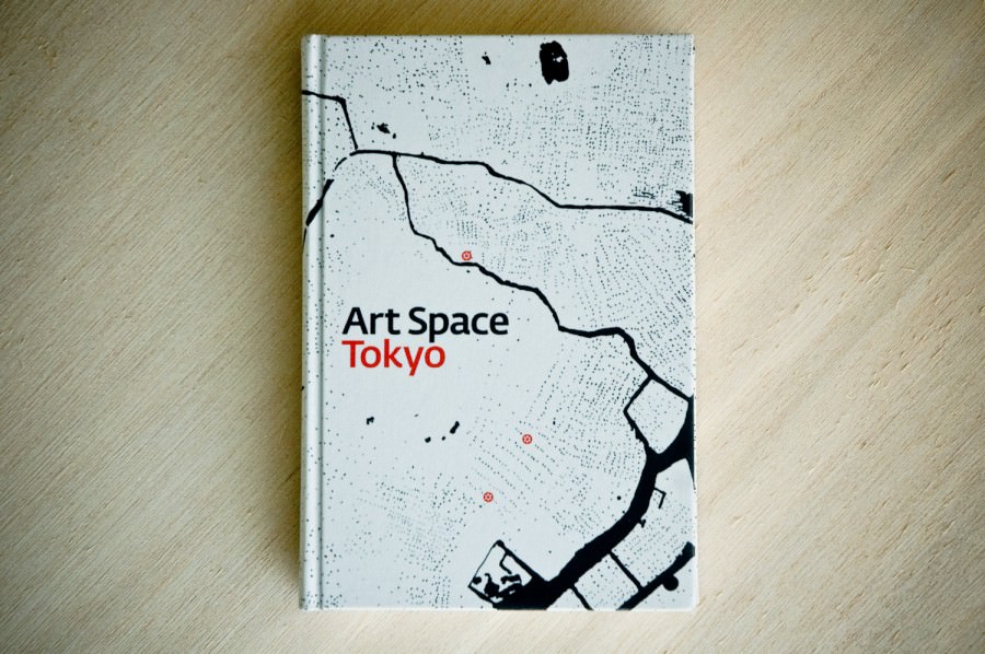
Crowdfunding allows more authors and designers to focus on #3 than ever before. My first experience with this was in 2010. Ashley Rawlings (now director of Blum & Poe’s Tokyo gallery) and I had co-authored the book Art Space Tokyo. We used Kickstarter to raise enough money to print and profit from the project.
I wrote up that experience — effusive with the joy in finding a new mode of publishing — in the essay: “Kickstartup.”
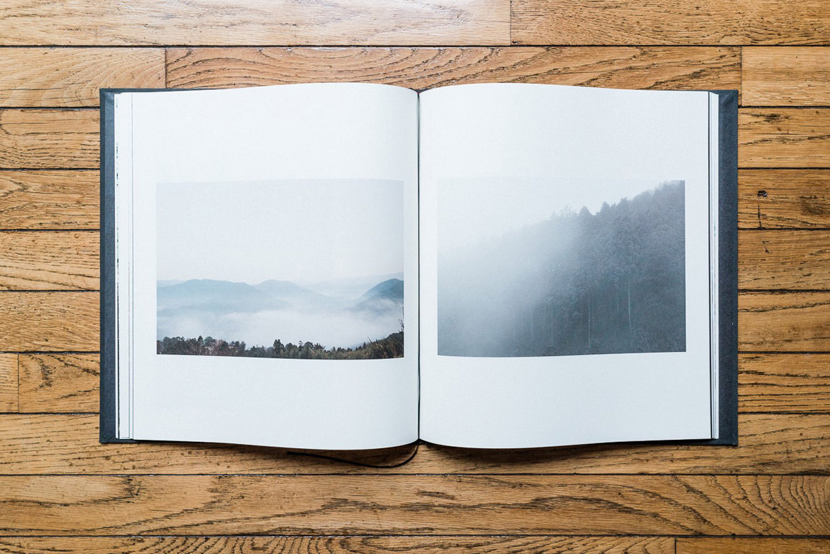
Koya Bound is certainly niche. Eighty-four pages, shots from a walk on an old path in the mountains of Japan. Not a guide book, no historical insights. Essentially: A set of visual poems.
Dan and I decided to limit the number of copies of Koya Bound to 1,000, and price them in a way that maybe — just maybe — we’d cover our costs, and — triple maybe — pocket some lucre. We ran the Kickstarter campaign last September, and — much to our surprise — by the end, a big chunk of the books were sold.
It’s easy to forget that the ability to crowdfund an independent (art) book is still a new phenomenon. (In 2010, with Art Space Tokyo, the act was downright embryonic.)
In total, we’ve sold over $80,000 worth of Koya Bounds through crowd funding and direct sales. It’s an astounding number in the world of publishing for a book like this. And was only possible thanks to the normalization of these funding platforms.
Designer Frank Chimero — who has also crowdfunded books to great success — and I recently discussed this normalization on my podcast, On Margins.
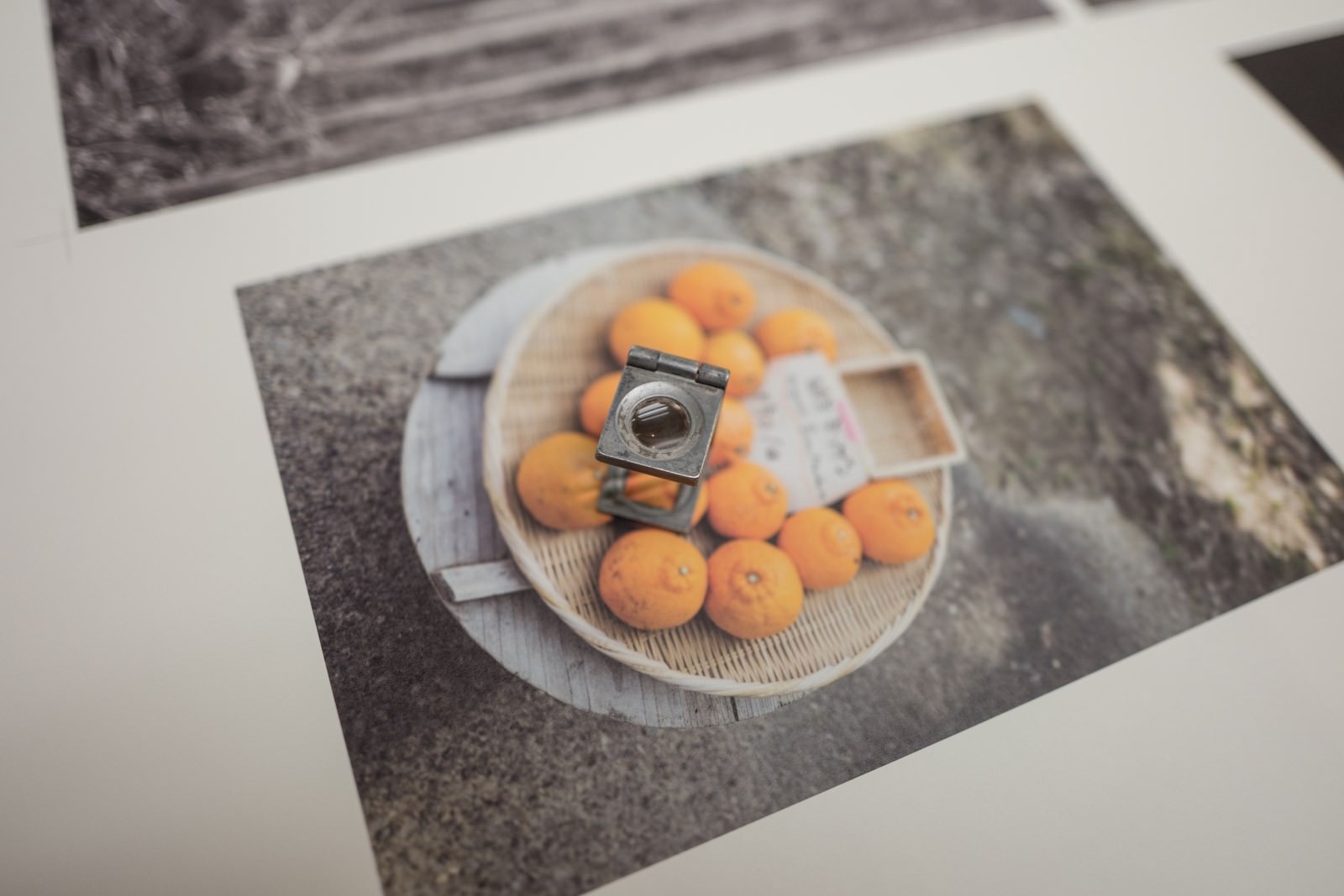
Deciding to make any book is an act of creative faith (and ego and hubris, but these aren’t all exclusionary). But before Dan and I sold any copies of Koya Bound, we walked atop the pages that would become the book, not really knowing if there existed an audience for the book.
Koya Bound isn’t the first book I’ve worked on that involved the floor. And I’m definitely not the first person to walk on books or lay them out like this.
The writer and philosopher André Malraux is a classic walker-atop-books. Here he is, photographed among his imaginary museum:
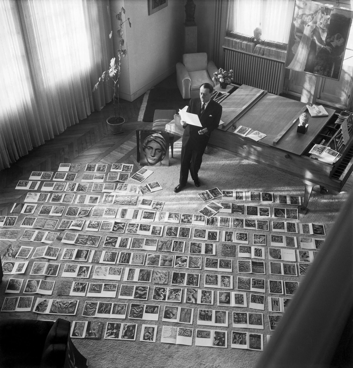
Malraux used photography to bring together disparate pieces of the art world — to make adjacent things that were normally far away. He was essentially building a tiny, bounded, internet. Whereas today everything online is essentially adjacent, in 1954 this was a mildly radical notion.
The ability of the physical world — a floor, a wall — to act as a screen of near infinite resolution becomes more powerful the more time we spend heads-down in our handheld computers, screens the size of palms. In fact, it’s almost impossible to see the visual patterns — the inherent adjacencies — of a physical book unless you deconstruct it and splay it out on the floor.
When designing The Books of Our Generation in 2014 with Eiko Nagase (「僕らの時代の本」) — a collection of my essays in Japanese — we continually printed the whole thing out, giving each chapter a row on the floor:
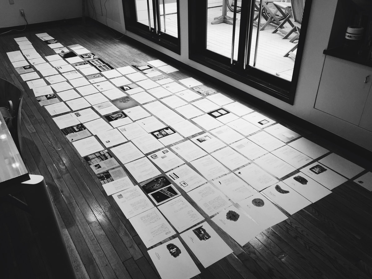
This was the only way Eiko and I could hope to understand the macro rhythms and interplay between image and text. Off to the side we kept a stack of additional images that we wanted to use, but didn’t quite know how. And so we’d print the book, place it on the floor, and shuffle in and out the new images, cutting them up, injecting them into the layout, stepping back, squinting, getting a sense for how the changes disrupted or enhanced the overall effect.
We knew fair and well that the reader would likely never understand these decisions explicitly, but had to believe that they would feel these decisions. That as they moved through the book from spread to spread they would feel a kind of orchestral rise and release of visual tension.
This shimmer of visual tension is an example of what I call a “margin” — a piece of design felt but not noticed. You can read more about margins in Let’s Talk About Margins.
In the end, we were pretty happy with how The Books of Our Generation turned out:
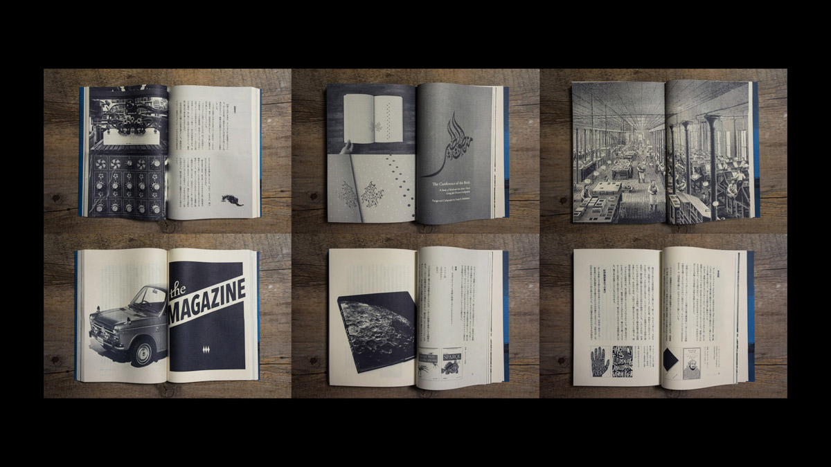
Most strange about the making of The Books of Our Generation was that it began on a screen. That is: All of the chapters started as elaborately designed online essays.
The design challenge online is not a series of linear, horizontal spreads, but rather an endless vertical scroll. The rhythm should be smooth and continuous, breaks can and do happen anywhere, and you have little control over larger juxtapositions. All you can hope is that over a distance of a few hundred pixels, the cadence between type, image, and language inspire the reader to keep scrolling down.
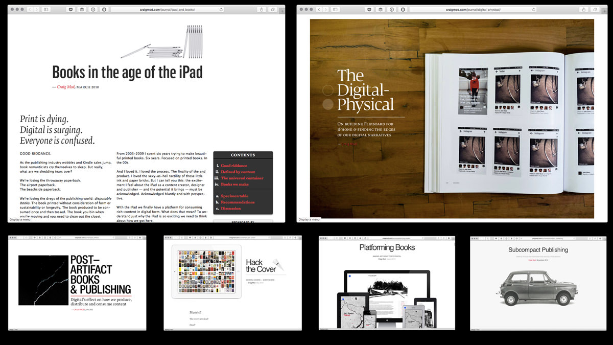
To best redesign the online essays for a physical book we broke them apart, started from scratch, pulled out their constituent fragments and slowly reassembled. It was a much an effort of design as it was one of editorial incisiveness. As the pages began to come together, we went back, reshaped the text, added and pruned as needed to achieve what felt like the correct balance between lines and images.
The design process of Koya Bound, drew inspiration directly from the design process of The Books of Our Generation. I knew we needed a floor, and a big one at that.
Atop tatami mats in our old house, Dan and I spent a week printing pages, squinting, arranging, discussing, cutting, rearranging, and printing out pages once again. We took breaks to eat and sleep in a loft directly above the pages, but not much else.
Eventually, the shape of the book began to reveal itself:
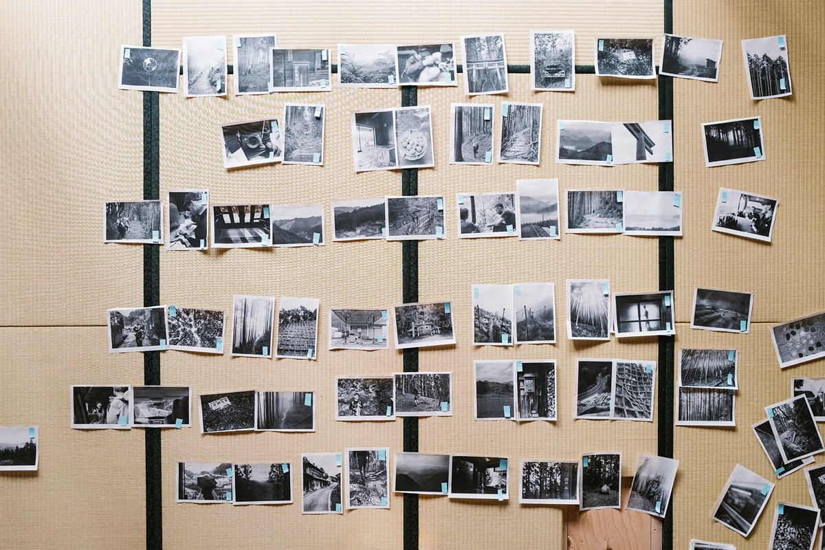
The biggest Koya Bound design challenge we faced was in transposing a time-bounded, linear series of photographs into a sequence unbounded from time but still connected to the emotional pulse of the eight days. A walk carries with it an inherent linear bias — you want the images to unfurl the way the days unfurl in your mind. But precise linearity was less important to us than that emotional pulse.
Pulling images from Lightroom, printing them out, and throwing them willy-nilly on the floor is a great way to break from metadata timestamps.
If The Books of Our Generation was about moving from the screen to the page, Koya Bound was about moving from the forest to the page.
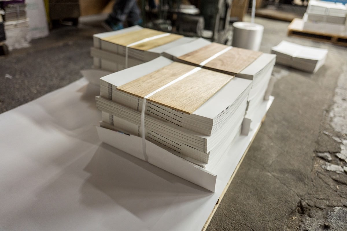
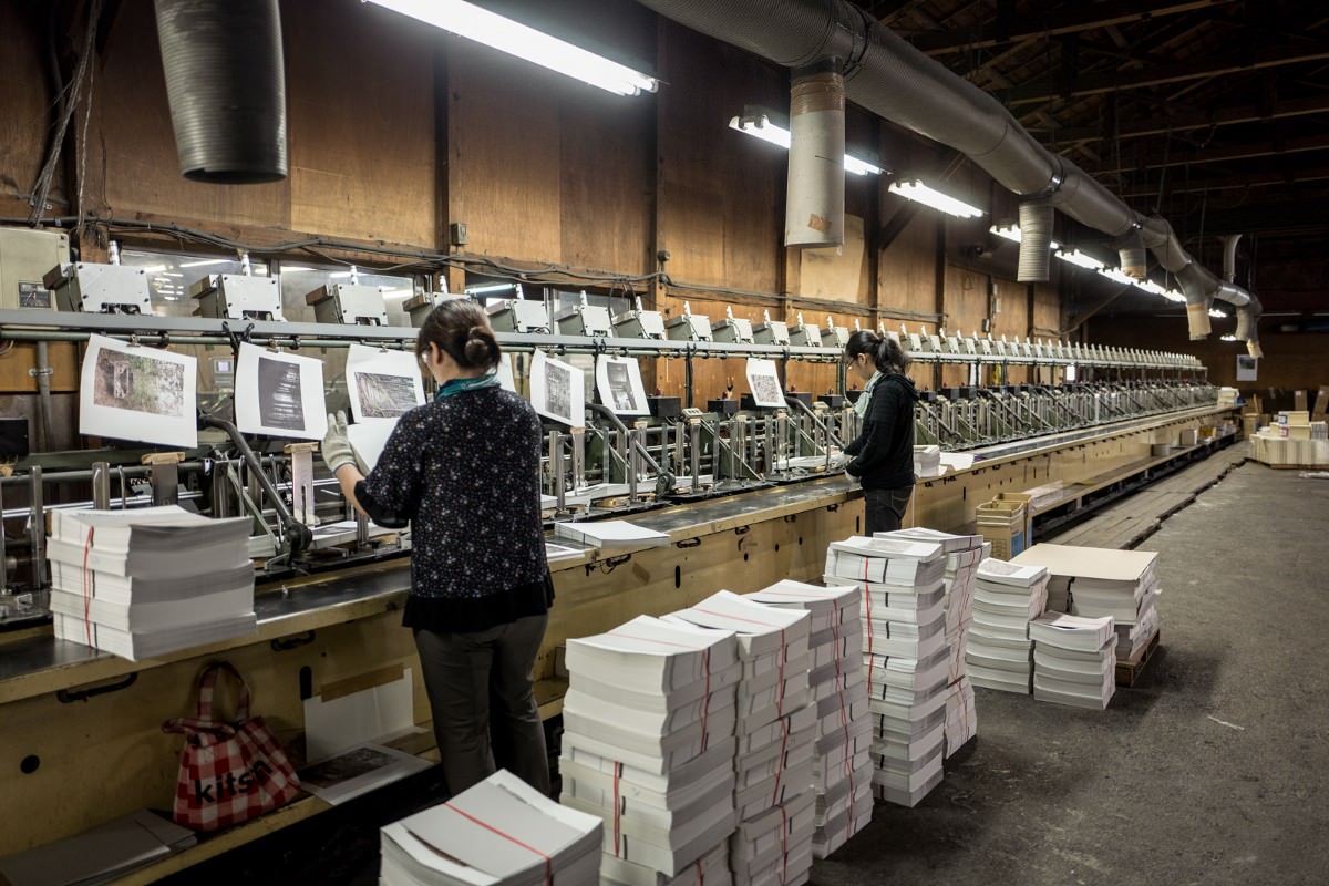
Since our physical artifact of the walk would have almost no explicit pragmatic value, we created a website as counterpoint to the book. The website contains a precise log, is wholly pragmatic: https://walkkumano.com/koyabound/.
Somehow this split felt correct: The physical would be a minimalist love letter to the world of trees and bugs and bears and rain soaked packs, the digital would be a practical, interactive guide.2
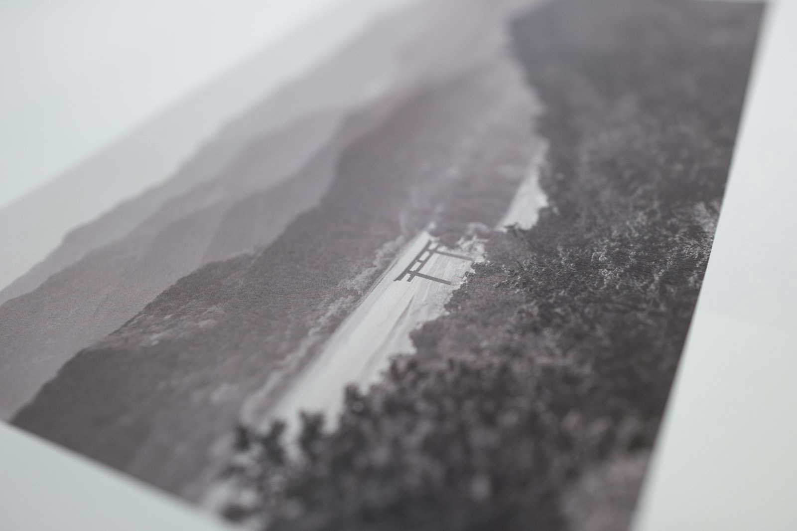
Since 2013 I’ve spent roughly two months each year in the mountains of Japan walking its old foot highways or ancient pilgrimage paths. Japan has a long history of walking, and the Japanese have been travelling — as bona-fide travellers and pilgrims, proto-hipster backpackers — for centuries within their own country. As such, the infrastructure — lodging and food, well worn paths, rocks inscribed with classical Japanese haikus — for a long walk is exceptional.
The walks can last hours or days (or months), but many require about a week. Because the walks are grounded in a history and culture of walking, the paths are frequently lined with inns or temples or homes to sleep in. Some are hundreds of years old, others new, others crumbling, others filled with centipedes and spiders and strange electric beds. But they all provide the same thing: The space and permission to think and talk about the world while walking, enjoying the progress, eliminating worry about where next to camp or when to make food.
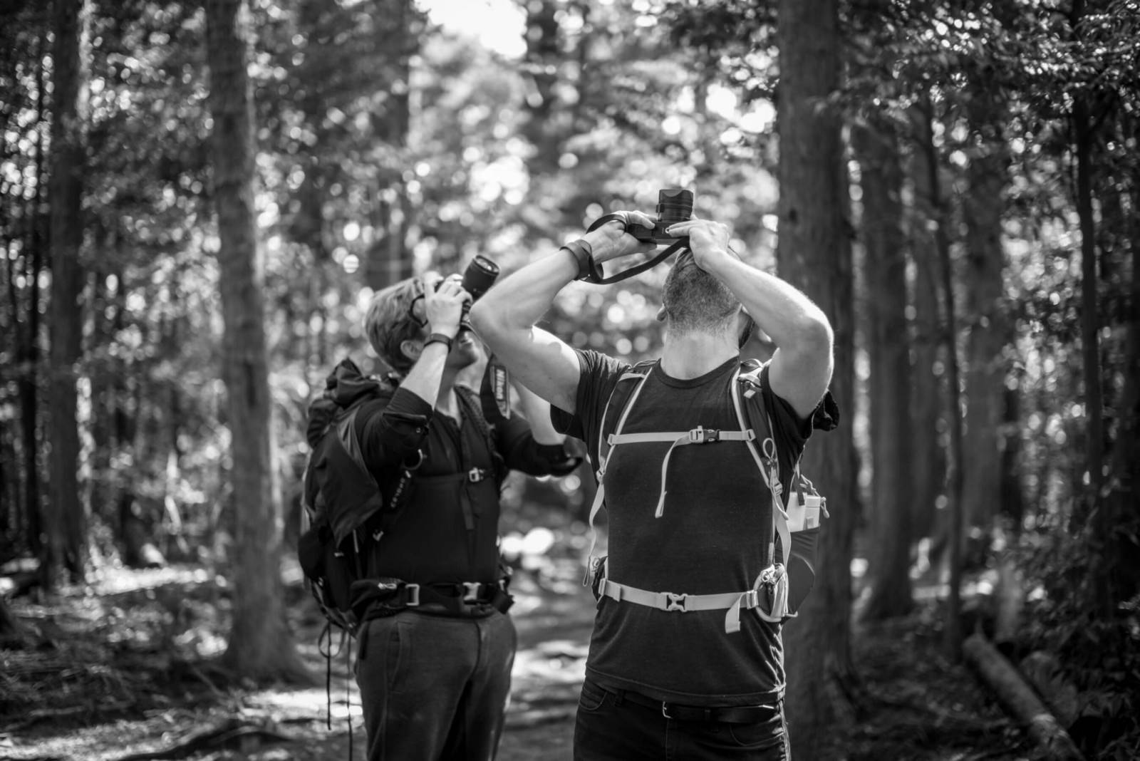
The days of walking began early. Dan and I (and Matt Mullenweg, who was also part of our crew) woke, ate a meal of grilled fish and rice prepared by the inn, slung out bags on our backs, grabbed a lunch sack (some onigiri perhaps) and headed out. We’d walk and talk, or walk and sing, or walk and shut our mouths for eight or so hours. Step after step, tens of thousands. Arriving at the next inn, we’d shed our soaked clothes, quickly slip into scalding waters, eat a sometimes lavish, sometimes spartan dinner, and sleep the sleep that well worn bodies sleep. Waking to do it all again the next day.
I’ve done variations on these walks a dozen times now, with a dozen different duos or trios (or sometimes quartets). I’ve always wondered: How do we capture this? The conversations, the pacing, the stories and insights? Koya Bound is my first grasping attempt to seize a walk. If the walk takes eight days, can the artifact, too, be produced in eight days?
In the end Dan and I each invested about one full month of time (160 hours each) into the book, as spread out over six months. Not quite eight days but what a timeline! Just six months from walk to launch event at the Leica Salon in Ginza.
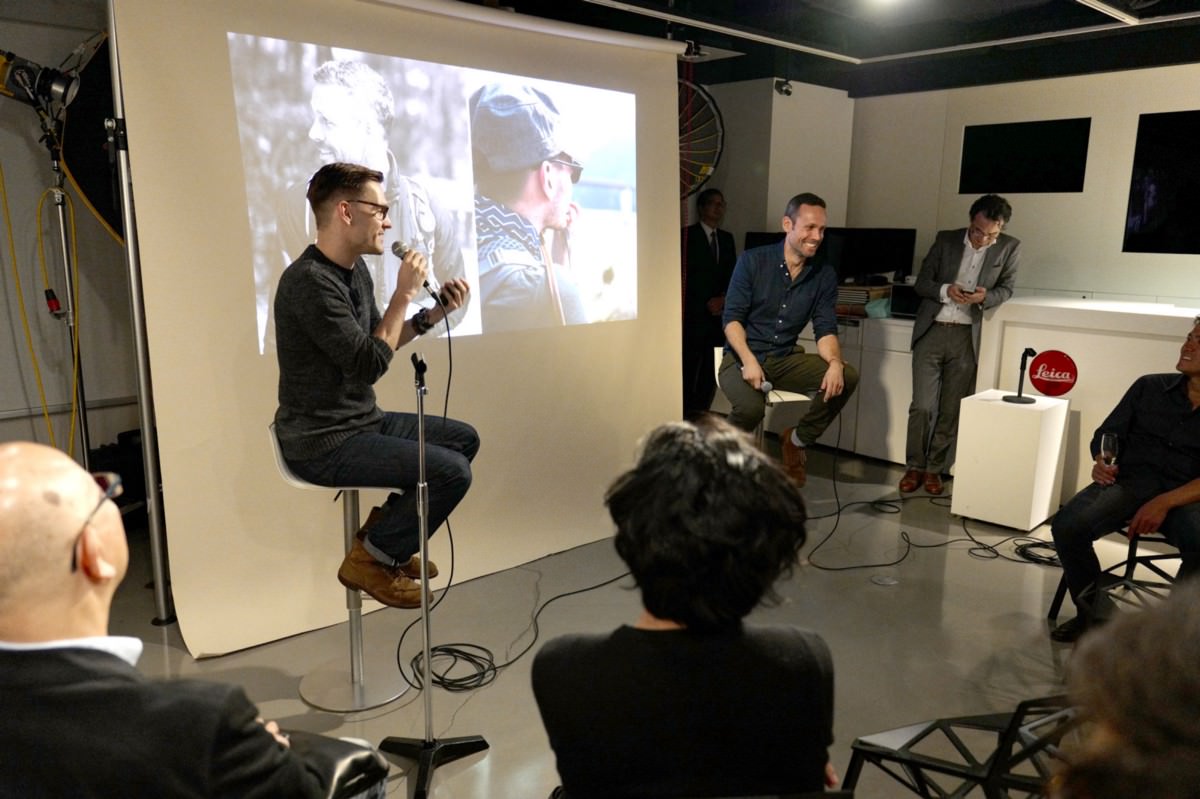
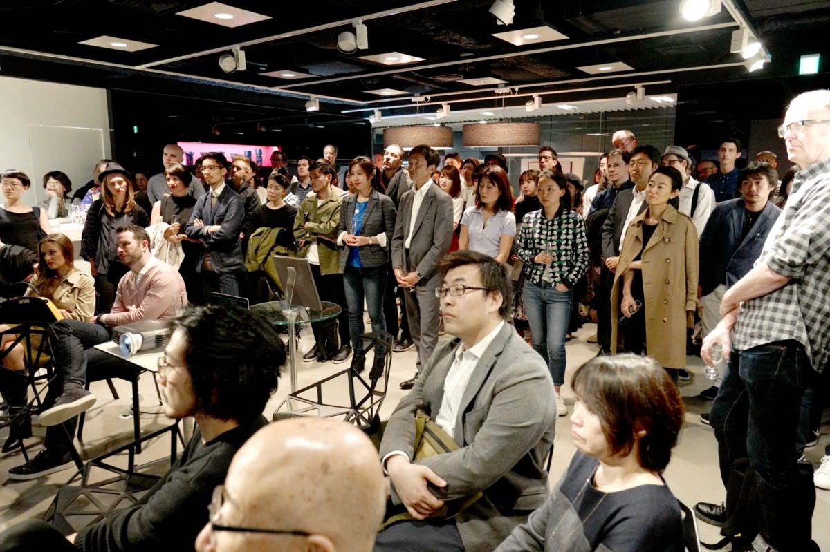
The original plan for Koya Bound was to produce the “most beautiful” print on demand book possible. The design challenge was to work within the constraints of POD, wrangling something from the system that, on the push of a button, would astound.
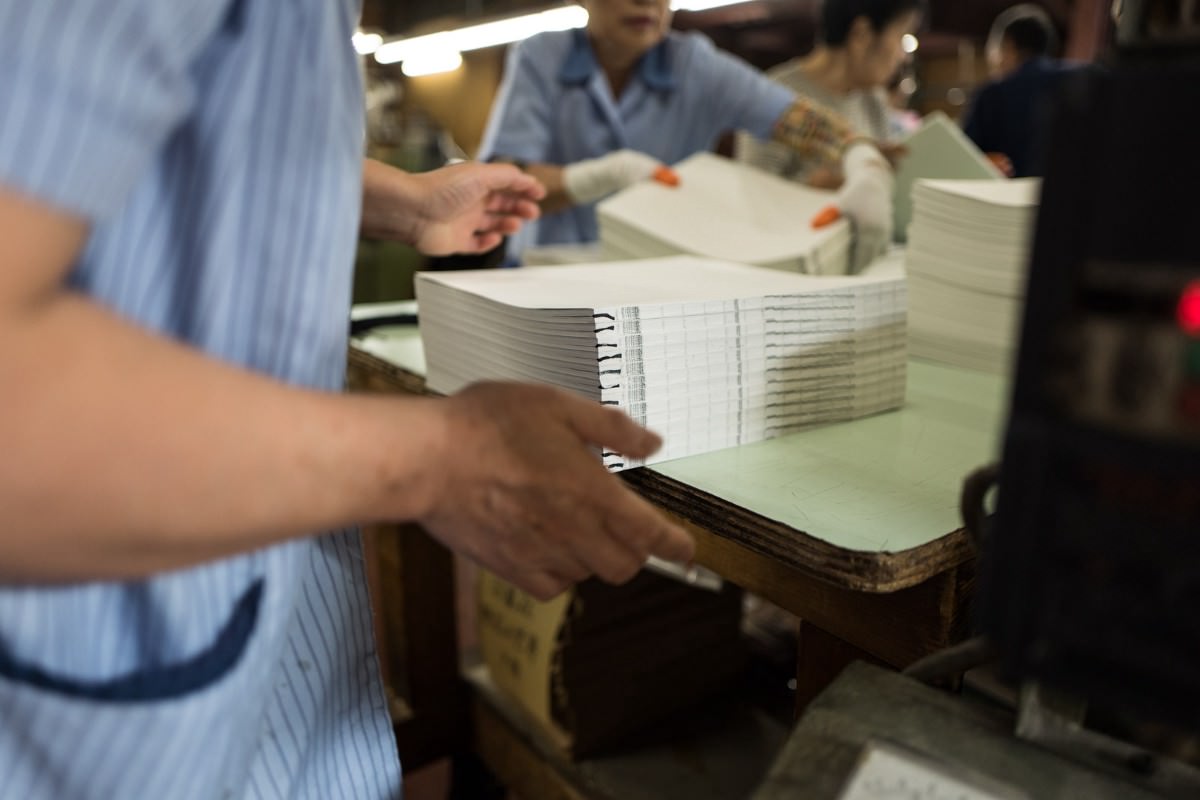
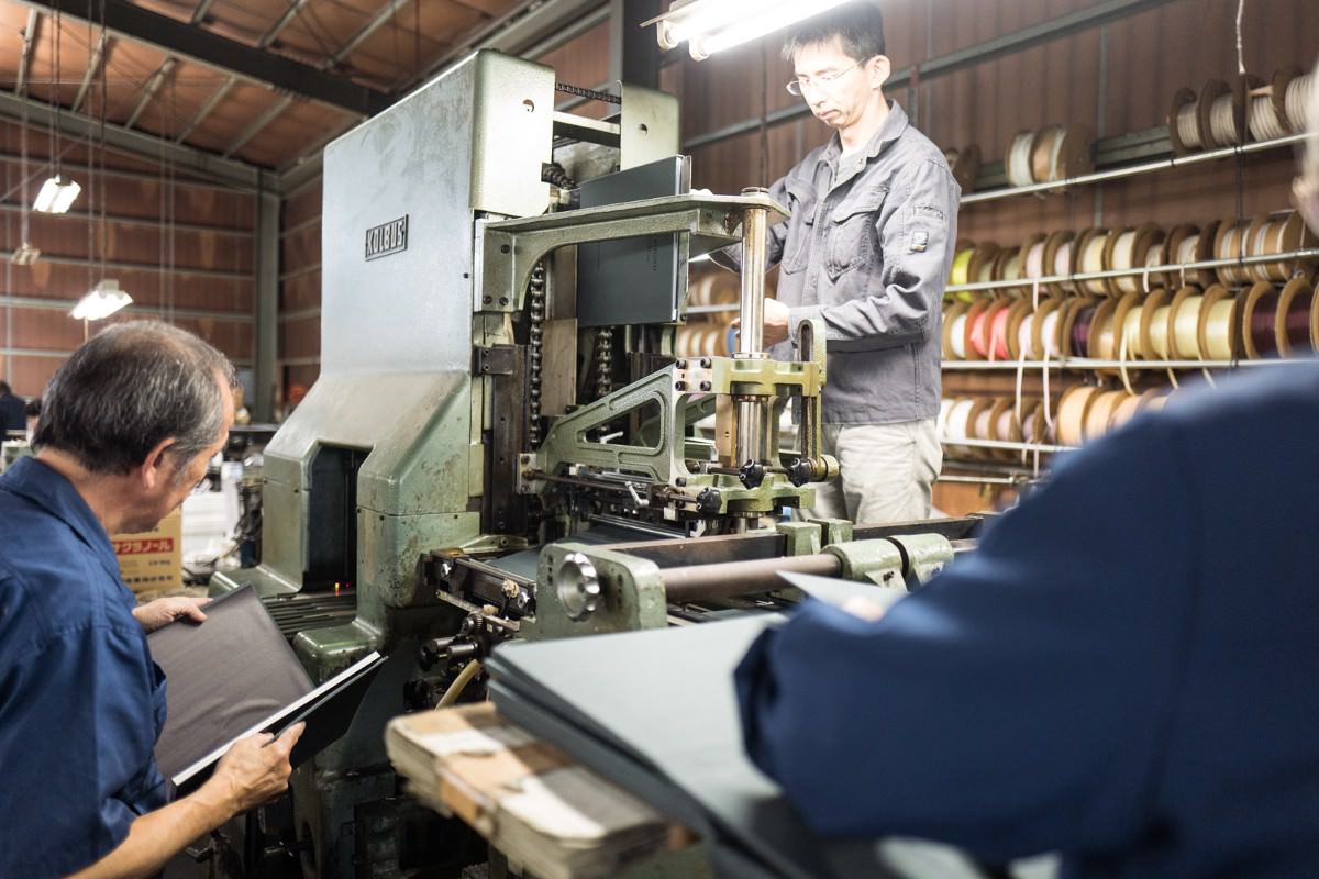
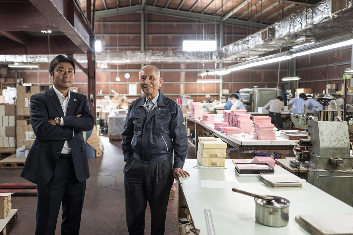
Sadly we bumped up against too many walls. POD can produce beautiful books, but once you start to dig deeper into materials, you realize that the returns for anything over 20 copies quickly diminishes. That if you’re going to sell 50 or more books, the cost saving of offset printing are too great. And the multiplicity of paper and printing options when printing offset is simply too seductive. Halfway through the POD experiment, we switched course and I called my printer in Japan.
In making a book (or anything, really), it’s good to steal ideas from other books. In May of 2016 I spent a month as visiting lecturer at Banff’s arts center. Everything at Banff is staggering with its mountain backdrop, but perhaps nothing more so than their outstanding art library.
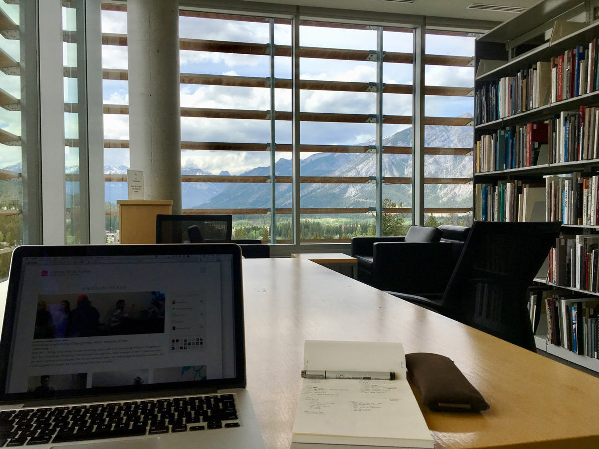
Walking through the stacks of that library I found The Architecture of Time, a limited edition book of the work of Japanese photographer, Hiroshi Sugimoto. Immediately I knew this was it — the polestar to guide Dan and I in dialing in the last 5% of Koya Bound.
We had the general size of Koya Bound set from the get-go: Something that would sit well on a table, but not scream for attention. That meant going large in format but subtle in materials and cover design.
The Architecture of Time helped us realize two critical, final design elements — paper quality and maximum restraint.
Insight into paper quality is important because it’s difficult to judge how a certain type of paper will feel when bookified without making a dummy book. Just looking at a paper sample leaves much to the imagination. (Never leave anything to the imagination when making a book.) And so to see a book made of a paper you love is a great gift.
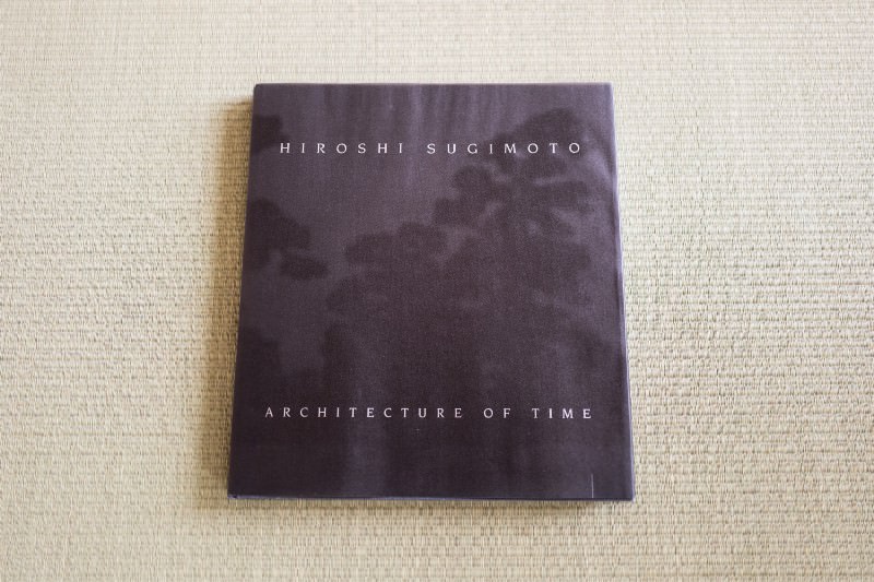
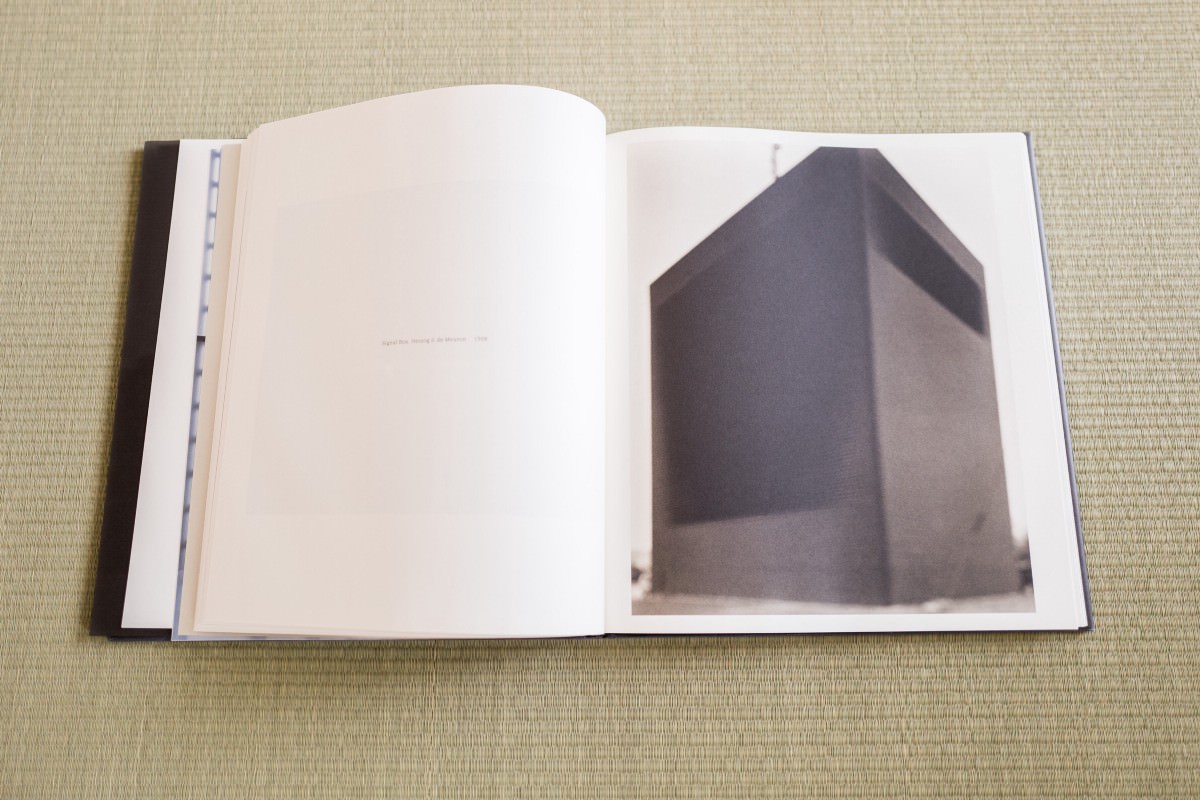
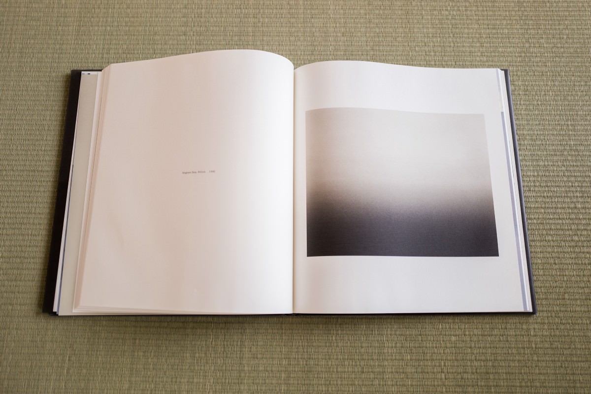
Seeing Sugimoto’s exposures printed as they were in his book turned them into delicate things, beautifully made, almost like physical objects. There was tremendous restraint in the printing and typography. And it was from that restraints that we dialed in (or dial back) our own expectations, inspiring us to be even more subtle with endpaper and typography.
I tracked down a used copy of The Architecture of Time at The Strand in New York. Showed it to my printer in Japan. Said: We’re trying to hit this mark.
How many disparate elements come into play when making a book? Too many. A thousand coincidences, stumbling on the right book at the right time, the right signage, the right patina on a wooden shingle on the side of a seaside building, small inspirations, details fleshed out organically by happenstance.
Think too deeply about how arbitrary it can be and you risk crushing your spirit.
Details like: Just a week before going to press I showed the cover to buddy Rob Giampietro on a train ride back from a temple visit at Koyasan. He suggested we add a line break to our subtitle, and now each time I look at the book I’m grateful for that little break.
This is why you must always give a book enough time to be made. A book must be allowed to sit still, set up shop in the back of your mind, hone your eyes so they’re receptive to the right inspirations at the right times.
Though we produced Koya Bound in a scant six months, Dan and I were aggressive in limiting the number of elements to design, the complexity of each page. Even in its simplified form, the number of insights (in materials, framing, sequence, typography, edits, map making) required to finish feels in hindsight like a star map to some tiny, but dense, slice of the sky.
Malraux called art books “museums without walls.” The goal of Koya Bound was just the opposite — to give physicality to a space without walls, being both bound for a place, and bounded by publishing. Is it possible to hold a walk in your hands?
A walk in the woods, a walk in the stacks of a library, a walk on some cheaply printed photographs.
The last time I walked on Koya Bound was after we had ripped up a dummy copy for our Kickstarter video. Dan and I tore out the pages, threw them on the floor. We didn’t look for patterns or shuffle the images, they fell where they fell. We left them for the afternoon, scattered about the kitchen, doing little tip-toe dances whenever we passed by. And with each little dance I thought: When making a book, I find it’s useful to walk on the book.
#Footnoted
-
To Amazon Prime something is to replicate it on a 24 hour print cycle. A technology verb the inverse of “to Google” — instead of folding inwards towards the collective mind, you explode physicality outward around the world. ↩︎
-
I consider a website like walkkumano.com to be as much of a digital book as any .mobi or .epub file. Digital books don’t, and most likely shouldn’t, be defined explicitly by the presence of a “page” or horizontal movement or having a curly animation. Being overly strict about the expected form of a digital book inhibits innovation, and certainly gets in the way of finding the best shape for a block of content as a digital artifact. ↩︎
