Brilliant Hardware in the Valley of the Software Slump
Our software feels less refined as our hardware achieves platonic ideals
Something strange is happening in the world of software: It’s slowly getting worse. Not all software, but a lot of it. It’s becoming more sluggish, less responsive, and subtly less reliable than it was a few years ago.
In some ways this is hyperbole. Objectively, we’ve never been able to do so much, so easily with our smartphones and laptops and tablets. We’ve never pushed more data between more places more readily. But while the insidious “worseness” I mention falls only in part on the engineering side of things, it falls harder on the more subjective, craft side of things, making it all the more worrisome.
Why should we care about this? Because the majority of our waking hours take place within the confines of applications. A truth recently amplified by the COVID pandemic.
And I believe software used by millions (if not billions) has a moral duty to elevate the emotional and intellectual qualities of its users. That elevation begins with craft.
In the same way that physical architecture can affect a mind, so too can software. Slower, less reliable software is like Penn Station: Sure, you can catch a transfer from one train to another but the dreary lowness of the place, the lack of sunlight or sensible wayfinding will make you feel like a rat, truculent and worthless, and worse: You’ll acclimate to that feeling and accept it as a norm.1
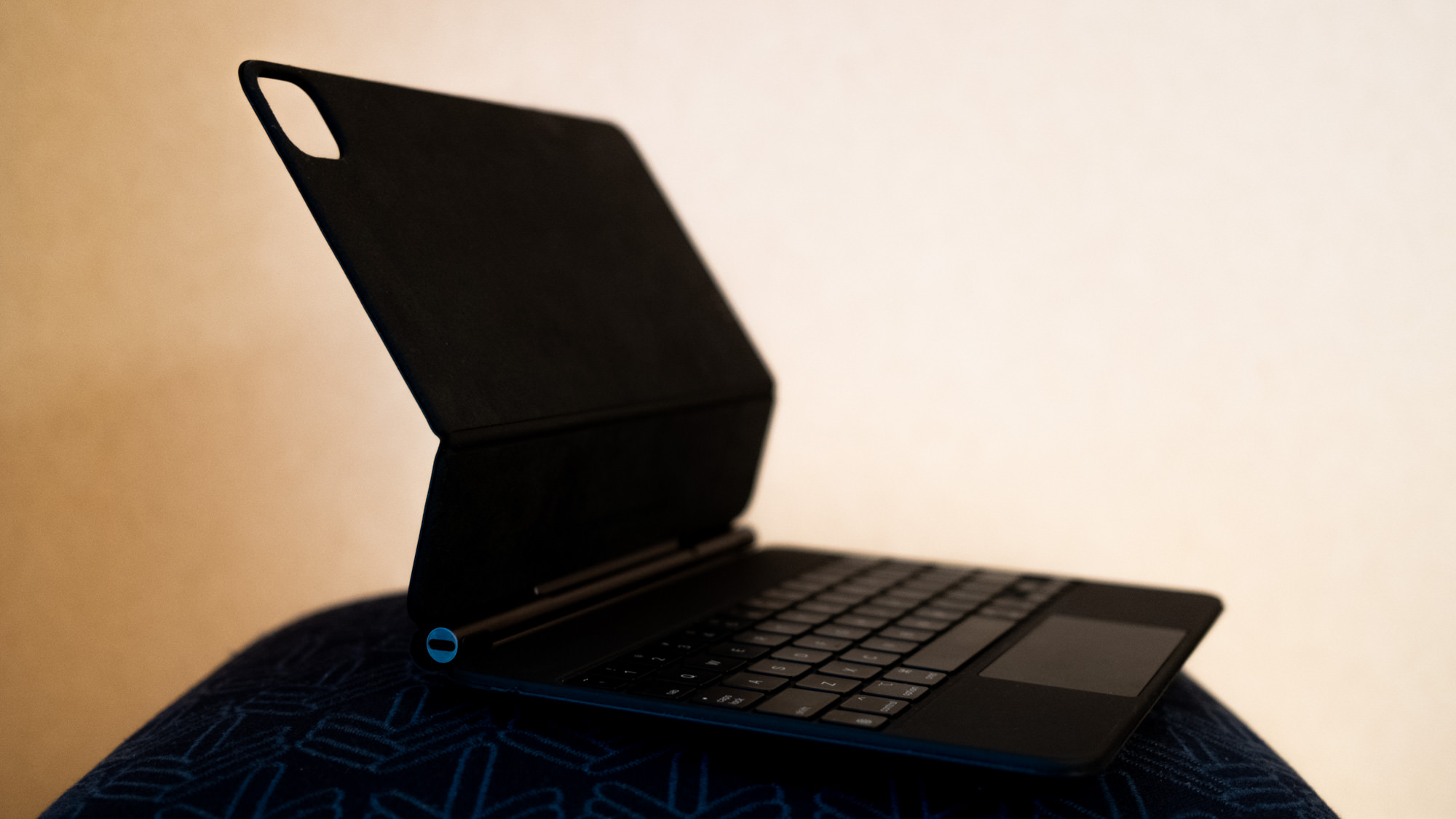
This sense of a decline in software craft has been building for years, but it wasn’t until Apple released the iPad Magic Keyboard that I felt the pain of this hardware-software gap so acutely.
So let’s start with that pairing: A superb keyboard coupled to budding but still-faulty software and work our way out to broader lands.
#A Typing Ballet
Make no bones about it, an iPad Pro is an enchanting object. It’s a slab too thin and light to be so powerful with so much battery life. And the iPad Magic Keyboard highlights this brilliantly. By floating the device on a bed of magnets and plush felt, and inviting you to pull the iPad off its stand as needed, the Magic Keyboard somehow enables and rewards both stand-alone and paired use of the device. Overall: An engineering marvel.
The clickty-clack keyboard element of the Magic Keyboard is also great. I’m using it with an 11" 2018 iPad Pro and though it can feel a bit cramped, the mechanics are satisfying, the sound quietly pleasing, and the key travel excellent all considering. The latest MacBook Pro keyboards (2020) are a degree nicer, (in fact: possibly the nicest keyboard to ever grace a laptop) but not by much. The Magic Keyboard is a bit heavy, and a bit weird to open, but aside from those niggles the quite wonderish accessory has but one glaring problem (and it’s the same problem we’ve been hemming and hawing over for years now, the same problem brought up every few months as if it were news): The software.
#Fluency
Sometimes, if I’m in Reader Mode in Safari and three-finger-touchpad-swipe to switch apps for a second and come back, the viewport has jumped to the top of the document. If I’m typing a tweet in Twitter’s app and hop back and forth between apps the cursor is gone, poof, lost until I tap again in the tweetbox. Not every time, but often. Which is worse than every time.
It’s exasperating and speaks to low-level, foundational issues of iPadOS, an OS built for direct touch — a finger or Pencil on glass. Bear in mind — iPadOS is a branch of iOS, an operating system designed to be used with one hand while standing in an elevator. I don’t know how to fix these core iPadOS issues, but the fact that these problems persist indicates that they’re non-trivial and may never get fixed without some serious gut-level OS rewrites.
Heck, back in November 2018, I wrote about these same problems in Getting the iPad to Pro: 2
Switching contexts is also cumbersome. If you’re researching in a browser and frequently jumping back and forth between, say, (the actually quite wonderful) Notes.app and Safari, you’ll sometimes find your cursor position lost. The Notes.app document you were just editing occasionally resetting to the top of itself. For a long document, this is infuriating and makes every
Cmd-Tabfeel dangerous. It doesn’t always happen, the behavior is unpredictable, making things worse. This interface “brittleness” makes you feel like you’re using an OS in the wrong way.
More examples: Use the Share > Mail option in Safari, start typing in an email address. Switch windows to check the address, Cmd-Tab back, now the address you’ve been typing has been auto-converted into a broken address. Tab down into the body of the email. Try to Shift-Tab back to edit the subject — you can’t. A bug? Shift-Tab inserts a Tab character — the cursor dumbly flops forward. The expected user experience here is if the cursor is at the start of a text-field, Shift-Tab will pull it back to the previous field, as it does in Mail on macOS.
It’s not just Apple’s software: Google’s apps are egregious in their disdain for a keyboard. YouTube doesn’t even accept the universal standard of hitting the Space bar to start and stop a video.
These aren’t the complaints of a laptoper-wannabe, but the concerns of literally anyone who desires “device fluency.” Hiccups in UX disrupt this fluency, make it impossible to obtain. Viewport and input reliability are table-stakes when it comes to gracefully navigating an operating system, using a device, being creative, making cool shit.
Because the Magic Keyboard is well-made, and because you believe in its ability to register keystrokes accurately, the dissonance of not having commands fire off as quickly as you think them hurts all the more. I often smack Cmd-c five or six times to make sure a copy has “taken.” Copying is so hit-or-miss that visual feedback would be useful — a cursor blink, anything. And then: Cmd-v itself can take two or three tries to properly fire off.
Often this is because I know where I want to paste, and pasting happens as contexts are switching. I’m Cmd-ving as the transitions are happening. I do not believe I am unique in this behavior. Essentially: The keyboard buffer on iPadOS feels non-existent.
No, I can’t scaffold my terminal-dependent static-site generating publishing software on an iPad, but I’ve long since given up using this device (on which I am drafting this) for those things. The bumps I’m running into are basic operating system bumps (keyboard buffers!), polish bumps. Bumps we haven’t butted against in decades on desktop operating systems.
Software should first and foremost elevate the intellectual and creative fluency of the user. As it presently stands, iPadOS makes this fluency more difficult to achieve than necessary.
#That Hardware
What baffles about these software moans is that Apple’s hardware is ever-more refined. While far from flawless, the entire lineup is now (finally) largely free from these “foundational” issues you see in software.3
Hardware has literal and metaphorical edges — it must be fully complete and largely bug free to ship. Software? It’s far more amorphous, like mist. Patches can be endlessly pushed. It never ends. Faulty hardware can destroy a company. Faulty software can be patched. The butterfly keyboard debacle may never be lived down. Even as I type on this improved Magic Keyboard, I can’t help but wonder: Did they really test this thing? I had three butterfly keyboards die on me, twice in the field. Not fun. Hardware failures live long in the mind.
Take the iPhone’s camera as counterpoint to the butterfly keyboard. The cameras are things to admire. Stalwart, reliable. As hardware they are fabulous in their boringness. When did you last think about your iPhone camera or worry if it would work or not? A sign of great hardware and software is in forgetting about it, smoothly allowing it to integrate with your life — drawing fluency from it. The best camera is the one you have in your pocket … that reliably takes great photos.
And yet: I think constantly about interacting with my photos on my iPhone because Photos (both the app and the service used by other apps to access your photos) has gotten slower over the years as the service has become more dependent on iCloud. When you swipe up in Instagram to choose a photo from your Photo Stream it routinely takes four or five seconds to show your photos. Same in Facebook Messenger. This used to be instantaneous. And the interface in, for example, Messages to select photos is uniquely baffling. (Since when do photo streams scroll sideways? And so many years on, just what the heck is the difference between “Photos” and “Recents”?)
#Et tu, macOS
Looking beyond iOS/ipadOS: Catalina is arguably the least stable, most disruptive-of-fluency macOS releases in recent memory. There are egregious issues of data loss in Apple Mail. Mail also simply won’t scroll — scroll! — certain HTML emails anymore. And Mail spontaneously pops forward as the frontmost application again and again for no obvious reason.
The Finder — one of the oldest pieces of Mac tech, doesn’t reliably report disk usage. This worries more than most other bugs because it means some of that core code — the closest-to-the-metal bits — is being changed in ways that negatively affect stability in general-user and professional environments alike.
The three primary pieces of software on macOS are probably Finder, Safari, and Mail. To have two of these show signs of instability is like ordering a salad and having half the lettuce appear as ceramic roofing tiles. It’s just weird. It shouldn’t happen, especially when these are new, critical bugs in decades-old programs. It makes you wonder what else might be broken, and what’s broken with the development cycle to allow for these bugs to ship.
I asked folks on Twitter what problems they’ve had with Catalina and the list is depressingly impressive.
Many of these issues dismantle user fluency.
Because Catalina no longer runs 32-bit software, older, perfectly fine and functional apps have been “updated” to work with the new OS. Sometimes the developers switch to the Electron framework for development. Electron makes it easier to develop cross-platform applications, but comes at the expense of an application feeling or functioning in a way you’d expect a native application to function. Almost always, these Electron applications are slower and more cumbersome than a native version.
Consistency + reliability = fluency.4
In Fast Software the Best Software I wrote about how speed and the intuition of stability are intertwined:
Speed and reliability are often intuited hand-in-hand. Speed can be a good proxy for general engineering quality. If an application slows down on simple tasks, then it can mean the engineers aren’t obsessive detail sticklers. Not always, but it can mean disastrous other issues lurk. I want all my craftspeople to stickle. I don’t think Ulysses is badly made, but I am less confident in it than if it handled input and interface speed with more grace. Speed would make me trust it more.
Electron — by very definition of its purpose — abdicates low-level detail obsession away from the developer and onto the framework. It feels like it fosters an anomie of craftsmanship. It’s no surprise that Electron applications (Slack, Arq 6, Dropbox, and more) feel more brittle than most native applications. That said, applications like VSCode show that Electron apps can be performant given effort and resources.
Still, in the end, there’s something parabolic about Slack having been written and re-written four times now in Electron.
Beyond frameworks, we’re seeing once-reliable applications suffer from feature creep and bloat. Perhaps this is endemic to the very nature of public companies and their conflation of features with user growth? For example: Dropbox has gone from a svelte, hyper-reliable file syncing service to a bloated curiosity that pegs the CPU at 200% for unclear reasons. I now keep it unloaded until I need to sync and then turn it on for just a few minutes. Which upends the core purpose of the original Dropbox: To be a seamless and OS-integrated local-and-cloud-synced file storage system.
#Catalyst
For arguments against Mac Catalyst, Apple’s cross-platform iOS / macOS framework, see the Twitter application. A small sample of issues (which may seem like nits but these details are important!):
- choppy scrolling / scrolling at a rate different than the rest of the system
- window resizing blanks out all content
- elements like the “home” button stay highlighted (as if tabbed to) for no apparent reason
Most worrying: Catalyst may normalize a lack of craft and refinement. It’s important to remember that we had a solidly native-feeling Twitter client for macOS ten years ago. So this software problem was once solved, unsolved, and now re-solved in a worse way.
#And Beyond
Issues of badly-crafted, fluency-disrupting software extend beyond iOS or macOS onto the web itself.
Gmail and Google Drive both take far longer to load than one should reasonably expect. I just ran an informal test: To go from opening a tab to composing an email in gmail took eight seconds.
Twitter’s web site now loads (regardless of browser or operating system) in so many various layers and stages I never know if my internet connection is functioning properly or not. Twitter.com’s strange complexities also bring with it the ignoble award of being the only site to regularly crash Safari on my iPhone.
Newspaper sites deliver hundred megabyte or greater payloads filled with ad tech. Open nytimes.com in a Chrome tab and you’ll soon deplete a fresh MacBook battery.
#And Yet! There is Wonder
Editing a photo on an iPad Pro with 120hz screen and latest Apple Pencil is one of the most genuinely “magical” ways to develop a photo today. Friends of mine who are professional illustrators swear by their iPads. An iPad with the folio keyboard is one of the lightest, most capable little writing devices around — you could take it up into the mountains and use it offline for hours a day for a week without needing to charge the battery, don’t have to baby it or worry about it getting lightly rained or splashed on.
The latest 2020 MacBook Pros are solid refinements of the butterfly-era fiasco of machines. And when Catalina doesn’t go wonky on you, macOS strikes a superb balance between power and usability, of being able to drop into the Terminal or navigate graphically. I feel fluent and in control in a way that delights and satisfies.
macOS software that adheres to craft — Things or Carbon Copy Cloner or BBEdit or Sublime Text (which, despite not being “native native” feels so solid and so responsive you’re willing to overlook its quirks) or Bear or Alfred or iA Writer or Keynote (arguably one of the best pieces of macOS software of all time) or anything by Panic, heck, even Terminal or Quicken (which, against all rational expectations is just a joy to use)5 — exists in troves, the existence of such proves to the Slacks or Twitters or Adobes of the world that it’s not impossible nor rare to produce craft-oriented software in service to user fluency, and still make a profit.
In fact, there’s a business case to be made for being craft- and fluency-focused. We’ve seen entire companies with business models that could be summarized as “Bloat-Free X” emerge in recent years. Affinity is bloat-free Adobe. Install Adobe Creative Cloud on your laptop and marvel at the no fewer than a dozen processes whirling around in the background for unknown purposes. It’s no surprise Affinity Photo and Publisher and Designer have taken off. Sketch’s main feature for many years was simply: Not Adobe.
And the web! When you care — when you really give a shit — the web is awe inspiring. I still can’t believe Figma is web-native (also born from the Not Adobe camp6). That an application can feel so powerful, so fast, so well-crafted and be fully web-based should be a kind of lighthouse-archetype for all other sites lost in a sea of complexity and muck and unnecessary frameworks.
Recently I launched a static website/book — Ise-ji: Walk With Me — that has a potential payload of hundreds of megabytes but by using a bare-minimum of javascript, lazyloading, and optimization, the overall weight of the page is minimal, feels quick and responsive. The fact that I could host a site like this for free on Github or spin up a cheap Digital Ocean box and plop Cloudflare down in front of it is downright miraculous. The tools to make things work well and reliably are accessible (by degrees) to all.
#Fluency & Craft
Our computing hardware is largely brilliant, refined, more reliable than ever. The core software running on it can sometimes feel regressive, moving in directions less focused on craft, consistency, and stability.
Between the messiness of Catalina and the almost-but-not-quite-there-ness of iPadOS, what’s most needed now are not splashy masthead features but a reconsideration of the boring nuts and bolts, the paint on the back of the cabinets, the smoothing over of all the bumps and stutters as needed to enable device fluency — and not just a single year of cleaning up the mucky infrastructure of our compute landscape, but a reworking of the internal software culture of companies like Apple to elevate user fluency to first-class rank.
It’s time to get all of this gorgeous hardware out of the software slump.
#Noted:
-
Not to mention the general depressing quality of knowing what used to be compared to what it is now. ↩︎
-
To be fair: So much of what I wrote about as shortcomings in that article have been addressed and addressed well on iPadOS over the last year. It’s been impressive and heartening to watch their team make the platform more powerful. ↩︎
-
The TouchBar is categorically the worst hardware “feature” added to anything Mac-related in the last two decades. I can’t think of anything — aside from that bastard hockey puck mouse (which one could easily opt-out of by plugging in another mouse) — that the company has so readily doubled down on despite it bringing almost no benefit, only negatives, to the table. (I’ve tried BetterTouchBar, added weather widgets and AirPod battery levels to the TouchBar but in the end find it detracts more than adds.) Thankfully, in these recent revisions of MacBook Pros we got back the
esckey and a dedicatedTouch-IDbutton. This at least makes the TouchBar bearable, slightly. And the new keyboards are, truly, excellent (assuming they stand the test of time). True, these MacBook Pros should have probably looked like this four years ago, but better late than never. ↩︎ -
Speed is also important, of course. But an application that crashes or behaves erratically will upend user fluency no matter how objectively “fast” the software is. ↩︎
-
I say “against all rational expectations” because you’d assume if anything suffered from bloat it would be decades-old financial software. But Quicken is quite a fine first-class macOS citizen. It’s snappy. It’s non-electron. It’s flexible — I can generate all sorts of reports and slice up my financial data with relative ease. I had written it off until a friend had badgered me into using it. Now my only regret is I hadn’t started earlier. ↩︎
-
That an “anti-” camp against your company can so strongly inspire generations of software developers to devote years of their lives to building companies should probably set off some internal red flags, even if your stock price is impressively 4x up and to the right over the last five years. ↩︎
This essay, published June 2020. Thoughts? Email me@craigmod.com.

Craig Mod is a writer and photographer based in Japan. He's the author of the books Things Become Other Things and Kissa by Kissa and is a MacDowell, Ragdale, and VCCA writing fellow. His essays and articles have appeared in The New York Times, Eater, The Atlantic, California Sunday Magazine, Wired, Aeon, New Scientist, Virginia Quarterly Review, The New Yorker, The Morning News, Codex: Journal of Typography, and elsewhere.
He writes newsletters, oh yes, newsletters: Roden & Ridgeline.
The work on this site is supported 100% by paid memberships and book & print sales.
Whatever you do, don't follow @craigmod on Bluesky or Instagram.