Hitotoki: Narrative Mapping the World
Notes on tiered publishing, writing from the hip, and real-time storytelling
Every place deserves an atlas,
an atlas is implicit in every place,
and to say that is to ask first of all what a place is.
— Rebecca Solnit
Hi, as in hello.
But also hi, as in, Hitotoki, a storytelling platform.
It lives at https://hitotoki.org/.
#What?
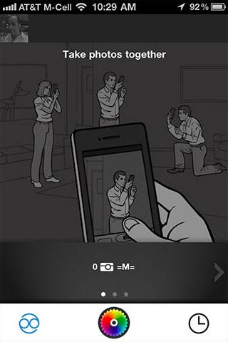
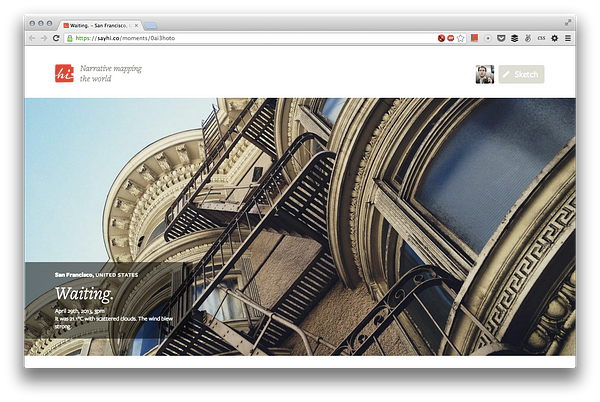
Hitotoki is a website. It lets you attach a snippet of text and a photograph to a location. We call that a moment.
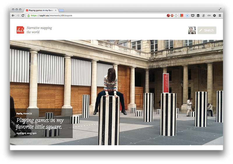
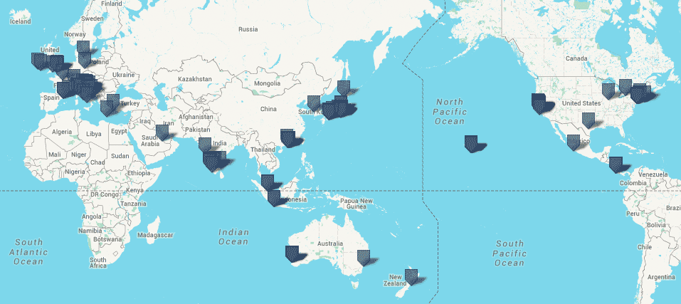
Moments are grouped by location. You can then choose to return to that moment later and extend it — write 100 or 10,000 words about it. That collection — moments tied to location, some short, some extended — is a narrative mapping.
How can narrative maps be used?
Well, for example: We wish we had a mapping for those first few hours after the Sendai Earthquake in 2011. Who said what, where, and when? What did it feel like to be in Tokyo or Sendai after that 9.0 quake?
Of course, mappings need not only be political or centered around natural disasters.
#The conceit
Within you exists a general mapping of New York City that’s different from my mapping of New York City. Your NYC street corners, storefronts, and river benches feel — psychically, emotionally — different than my street corners. Though physically, they’re the same.
Hitotoki helps us surface, layer, and share these narrative maps. Maps concerned with your corner in NYC or maps concerned with the protests after a trial or the energy in a city square after political upheaval.
This essay presents how we — the folks who made Hitotoki — think these maps can be made. And how digital creative tools could and should function. Or, if you like, you can think of hitotoki.org as a living version of this essay.
But we’re getting ahead of ourselves. Before jumping into the nitty gritty of Hitotoki, let’s start with an anecdote from Art & Fear. It concerns a ceramics class:
The ceramics teacher announced on opening day that he was dividing the class into two groups. All those on the left side of the studio, he said, would be graded solely on the quantity of work they produced, all those on the right solely on its quality.
His procedure was simple: on the final day of class he would bring in his bathroom scales and weigh the work of the “quantity” group: fifty pound of pots rated an “A”, forty pounds a “B”, and so on. Those being graded on “quality”, however, needed to produce only one pot — albeit a perfect one — to get an “A”.
Well, came grading time and a curious fact emerged: the works of highest quality were all produced by the group being graded for quantity. It seems that while the “quantity” group was busily churning out piles of work — and learning from their mistakes — the “quality” group had sat theorizing about perfection, and in the end had little more to show for their efforts than grandiose theories and a pile of dead clay.
Veracity of this anecdote aside, it is filled with dizzying truth: Anyone who creates for a living — is creative, has output — knows you need to produce more to get better. There are no shortcuts. The algorithm is painfully simple: Sit in the chair and write, paint, compose. Every. Damn. Day.
In doing so you will make mistakes. Travel writer Pico Iyer eloquently summarizes the power of mistakes and misimpressions as you move throughout the world:
Mistakes can, in their way, be as revealing as epiphanies, and even a wrong impression may say as much about a place as a right one. If Bali had not been so full of real magic, my false assumptions, no doubt, would have been very different. And wide eyes are, if nothing else, quite open.
Mistakes are fine. Quantity can blaze a path to quality.
#Our mappings, surfaced
The goal of Hitotoki is to narrative map the world. To achieve that goal, we’ve developed, and continue to iterate on, an editorial workflow we think is well suited to networked storytelling. To connecting narrative with place. To building habit. To making a purposeful mess, because the creative process is messy, and our platforms should be okay with that.
To narrative map the world you need to capture the world. And to be able to record with some discretion, you must be able to see things worth capturing. Seeing is a muscle like any other, strengthened by habit. And so — closing the loop — to narrative map the world well, you must foster the habit of seeing.
The capturing part is easy. Nearly everyone reading this essay carries in their pocket — or holds in their hands at this very moment — a tiny device that excels at just that.
We have the devices. What we don’t have is a strong framework for building habit. Or, more specifically, a system encouraging the habit of seeing. We don’t have a place to make a lot of bad ceramic pots (and hopefully some great ones, too).
#Principles
We designed and built Hitotoki on three core principles:
- Smartphones are exceptionally great devices for sketching ideas.
- Preciousness kills creativity; ergo, there is no such thing as junk.
- Public broadcast (“publishing”) should happen in tiered layers.
#Digital sketch pads & “junk”
The cost to experiment creatively and publish digitally is nearly zero. This is the same point naysayers bring up when they criticize these very tools.
When I have spoken publicly on digital publishing, the question most asked is: If publishing is made easy, how will we find the good stuff?
To which I respond: The entirety of the internet is generally junk. And yet we find the “good stuff” just fine, don’t we?
To optimize a product or platform to minimize the creation of “bad” or “junky” content misses the point. Space and bandwidth, while limited, are exhausted only in the most extreme use cases.
See: YouTube.
YouTube has grown from a primordial goop of low-quality, pirated videos to a bonafide high-quality platform for music videos, independent film, and TV. There’s still tons of low-quality gunk, of course. You just have to dig deeper before you run into it. YouTube has grown smarter and filters better.
So don’t blame the medium if you are bombarded by low quality; blame the system design. Find or build or demand better filters.
This means that if you’re building a platform you should allow your users to create. A lot. At will. Without fear. Smartphones are spectacular tools for this.
The need to continually create, to exercise that muscle of seeing, does not abate with age. Spend your entire life as a professional creator and, still, you’ve no respite from its demands:
“If I don’t do a set in two weeks, I feel it,” he said. “I read an article a few years ago that said when you practice a sport a lot, you literally become a broadband: the nerve pathway in your brain contains a lot more information. As soon as you stop practicing, the pathway begins shrinking back down. Reading that changed my life. I used to wonder, Why am I doing these sets, getting on a stage? Don’t I know how to do this already? The answer is no. You must keep doing it. The broadband starts to narrow the moment you stop.” — Jerry Seinfeld
Of all measurable parameters connected to creativity, quantity of output is the simplest, most straightforward objective metric. How many words have you written? How many sketches have you made? How many shows have you performed? There isn’t a one-to-one relationship between quantity and quality, but there is a connection.
Why, then, are so many mobile apps optimized for “fully-realized” output? When’s the last time you were comfortable posting a sort-of-OK-but-still-meaningful-to-you Instagram photograph? When’s the last time you felt like you were playing?
#A digression: Color
The last time I felt I was truly playing in an app was with — of all things — Color. Color, released over two years ago and promptly dismantled, was perhaps one of the most inadvertently fun smartphone experiences around. I realize I’m putting my reputation at risk by saying this, but stick with me for a minute.
Color was an “elastic social network” tied to your location, emerging spontaneously. By photographing what you were up to — with no regard for photographic quality — you were suddenly connected with other folks in walking distance, also photographing their environs. There was no reward for being good at photography. It was all about connection. Admittedly — writing these very words — this all sounds nonsensical, sounds ridiculous — and it was — but the emergent group dynamic was a blast.
No other app rewarded such recklessness of creation, such abandonment of craft or polish. I have never pushed more unrefined content to a network in my life and felt fine with it. Perhaps it skewed too heavily to the unrefined, but the fact remains: I produced more images, experienced more smiles, and generally had more fun with Color than anything else to this day.
It was all helped, of course, by my then living in the grandest tech echo chamber of all: Palo Alto. Surrounded by a high density of Color users, it was chaos — and the system rewarded chaos. Chaos produced an unexpected and intoxicating feedback loop.
These days, Snapchat and Facebook’s Poke app capture this feeling most closely, but their focus on ephemerality changes the dynamic ever so slightly.
#Creativity zones — public vs private
The way Color treated (and Snapchat treats) content — everything a throwaway or self-imploding jellybean — is one way to establish a safe zone in which to produce many bad pots. But these apps lack any semblance of discipline or accountability. They may be fun, but they aren’t places to become better at photography, or to be particularly thoughtful.
Another way to establish a safe, slightly more disciplined space is to default to private. At Hitotoki, we don’t think this is a good solution, in part because to make the subsequent shift from private back to public requires overcoming non-trivial psychic frictions.
Which is why companies like Facebook drive us nuts by defaulting to public; they know the small wrath incurred is nothing compared to the benefit of pushing us all into the deep end of sharing.
But there is another reason to create a public-by-default creative zone — defaulting to a less-exposed subset of public is good because it can create a sense of risk, however small. And balanced risk — publicly visible just enough to raise self-awareness, but not enough to paralyze — establishes a tension required to create well, to create interestingly.
Which is why the broadcast model of Hitotoki is not inherently private — but it’s also not totally public.
WAIMEA, HI
— Elle Luna
#Layered levels of publishing
Our social and creative networks tend to be built for top-tier publishing only. By this we mean: When you publish to Twitter, your tweet is pushed to the main stream by default. It carries as much weight as any other tweet (even those with many retweets or favorites). There are no sub-streams. There are no higher or lower tiers. We asked ourselves: Is this always the best way to publish?
At Hitotoki, we refer to our “pots” — the core units of creative output — as moments. Moments start as sketches. Sketches are comprised of a geographical coordinate, a small snippet of text, and an optional photograph.
Sketches are public by default, but live in a lower publishing tier. We won’t feature sketches in best of lists, and sketches get less design priority than a fully fleshed-out moment. You should feel okay collecting half-baked sketches in Hi. They’re your pseudo-public drafts.
Or, as Chris describes the crux of sketching: “There is a funny tension in Hi: we are co-opting a ‘look down’ device to encourage the habit of looking up, and down, and all around.”
A moment rises to the next publishing tier when it’s extended. We recommend extensions to be about 500 words. But they can be as long as you need them to be — ten words or 10,000. Each sketch page has an Extend this moment button. Clicking it opens an inline, auto-saving, editor.
Moments start as sketches and can be extended. That’s the system in a nutshell. It a system meant to strike balance between the spontaneous and the deliberate. Sketches embody spontaneity. Extensions are deliberations. In practice we’ve found this system to push us from seeing to noticing.
The above describes two-tier publishing. That is — the sketch tier is your quiet public stream. The extended tier is the more promotable top stream.
What’s nice about tiers is that there is an implicit amount of high-quality signal-to-noise filtering built into them. If someone takes the time to extend something, then that’s a good base indication of interestingness around that moment or place.
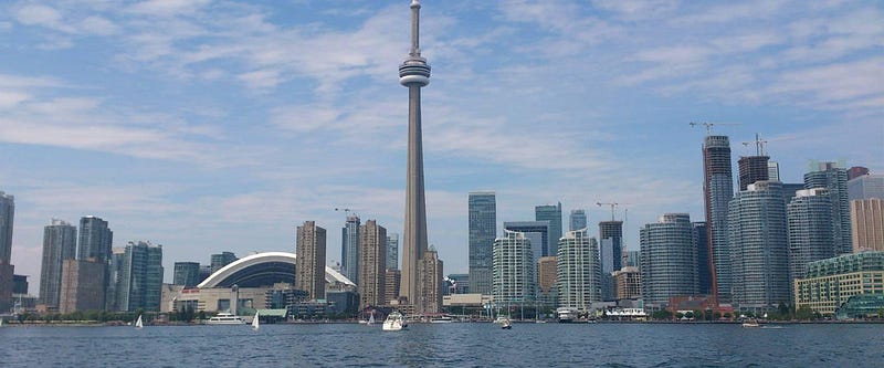
TORONTO, CANADA
— Oli Chance
#Single-serving subscriptions
An unexpected benefit of the tiered broadcast model is that it allows for temporary subscriptions. If you find a sketch that looks interesting you can ask the author to “Tell me more” about that moment. In doing so, you subscribe to that moment.
Those who do this — because the location is unique, the photo curious, the sketch text enigmatic — are placed on a one-off mailing list connected to that moment. If ten people want to know more about your sketch, then ten people will be notified when you extend it. Ten engaged folks who have opted in.
When they return to read your extension, they’ll then have the opportunity to add a one line, private message of “thanks.”
These single-line messages mitigate most problems with public comments while magnifying their best values. They nip public bashing and excessive pontification in the bud, while still allowing for a high-signal, human response to your work. And extending a moment — asking someone to write hundreds of words — is most definitely something that deserves a high-signal response.
A one-line private message is short enough that we find users almost always write something. It’s also purposely asymmetric — there is no way for the author to respond to the message. The more popular you become as an author, the more messages you’ll receive, but the burden of response will never increase. If you do want to “respond,” the best method is to ask that reader to “tell you more” about one of their moments, or to leave a message of thanks. But that’s hardly obligatory. And, in turn, when it does happen, it’s an even higher signal response than a cursory “Thanks for your thanks.”
This system of feedback loops is inspired by how content is so often created: It begins with the kernel of an idea and, over time, with a little prodding, can develop into something fuller.
#Rewarding work through design (cities, people, moments)
Hitotoki’s surface design responds to content. That is — the design of the pages reflects the amount, quality, and type of content in the system.
City pages, for example, currently have about four design levels. If there are only a few moments in a city, we show those most recent moments and a map. If there are more moments, some extended, and a photo or two, the city page gets a full bleed photo header. If there are twenty-plus moments and one or two highly engaged city users, then we create “[cityname] through the eyes of [username]” blocks to highlight those ambassadors.

There are also many engagement benefits to reactive design. Higher tiers of design refinement can be “unlocked” by gathering friends together to capture more moments in your city. Places with high-quality content (lots of extended moments covered in oodles of “thanks”) should certainly look richer and more refined than those without.
Individual moment pages, too, currently have three design manifestations:
- sketch-text only page
- landscape photo page
- portrait photo page
We’ll expand on these as the site grows.
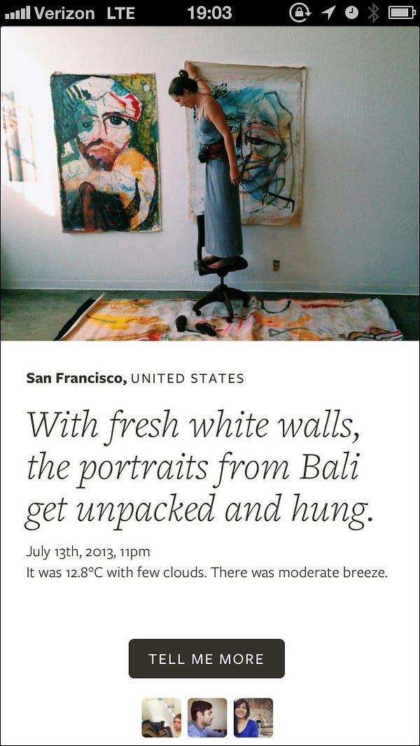
SAN FRANCISCO, CA
— Christine Herrin
#Lotsa pots
Hitotoki will be filled with stutters, half-baked ideas, doodles, noodles, blurry photos — a bit of that chaos mentioned earlier. But the hope is that from that chaos will emerge thoughtful, fully formed stories, narratives, monologues, missives, and meditations on place, people, and experience that otherwise wouldn’t have existed.
Hitotoki is a generic enough container that it need not be a place solely for capital “L” Literature, or big “T” Travel Writing. We hope for it to also be a place for scientific inquiry, field research, food documentation, shopping notations, journalistic sketching … anything about which location and narrative collide.
Hitotoki is open to all. We look forward to narrative mapping the world with you.
This essay, published March 2013. Thoughts? Email me@craigmod.com.
Craig Mod is a writer and photographer based in Japan. He's the author of the books Things Become Other Things and Kissa by Kissa and is a MacDowell, Ragdale, and VCCA writing fellow. His essays and articles have appeared in The New York Times, Eater, The Atlantic, California Sunday Magazine, Wired, Aeon, New Scientist, Virginia Quarterly Review, The New Yorker, The Morning News, Codex: Journal of Typography, and elsewhere.
He writes newsletters, oh yes, newsletters: Roden & Ridgeline.
The work on this site is supported 100% by paid memberships and book & print sales.
Whatever you do, don't follow @craigmod on Bluesky or Instagram.