Far Beyond Snowfall
Op-Docs and video and the future of the Times
Originally published by: The MessageIt was amidst an early morning miasma of jet lag, lying in bed, idly surfing the web that I first ran into an Op-Doc. It lived in that strange, neither here-nor-there place on Times’s homepage: the space below-the-fold with auto-advancing videos and Most Emailed, the space we all scroll to once we’ve seen the top news of the day.
That first Op-Doc I saw was “Solo Piano.” It was December 2012 and I didn’t give it much thought, really, because video on the Times didn’t feel like it was given much thought. I remember thinking, simply: Oh, this is interesting. Cute. And then that was that.

Over the year that followed, stray social media links would place me before a handful of other Op-Docs. They were like dense, wayward asteroids orbiting news reports and “real” Op-Eds, but they didn’t feel like part of the larger, overarching narrative of the Times. There was Reporting on the Times, and then there was video.
About six months ago I bumped into “November 22, 1963.” This was the first Op-Doc that made me think the Times had begun to reconsider video. To elevate it from asteroid to proper planet. Nearly 14 minutes long, smart, fun, human — “November 22” was fresh and, yet, also felt cut from the classic fabric of the voice of the Times. I was hungry for more of whatever this was, and thankfully, more has been delivered.
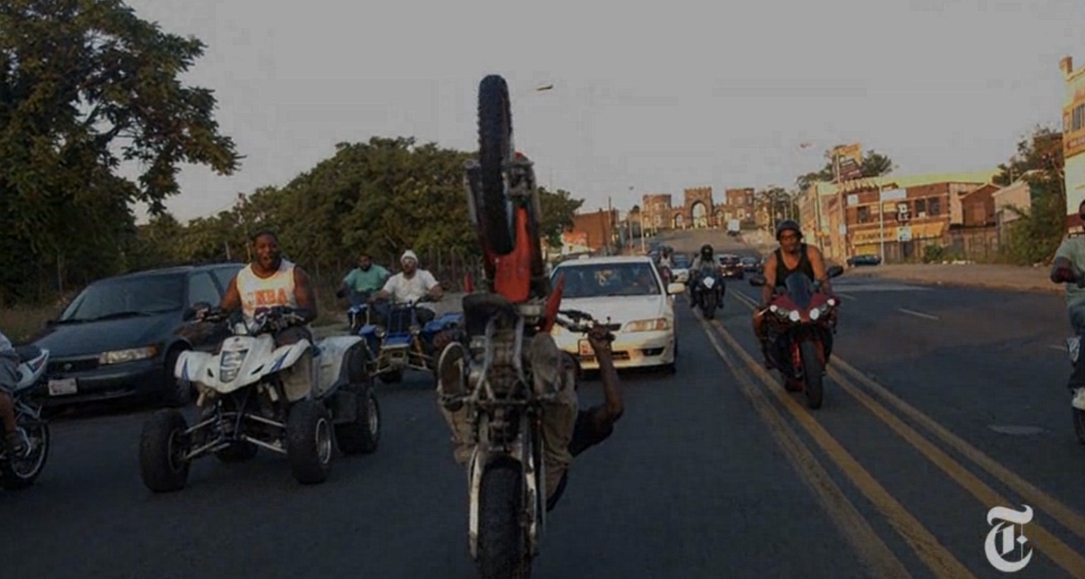
I’ve since balked at “Why Care About the NSA.” Have been mesmerized and delighted by “Riding with the 12 O’Clock Boys.” Cut to the bone by “35 and Single.” Made curious by “Spider Drove a Taxi.” Conflicted by “Daredevil on a Snowmobile.” Marveled at the transmedia alchemy of “Notes on Blindness.” Concerned by “Running on Fumes in North Dakota” and “China’s Web Junkies.” Cringed at “Chinese, on the Inside.” Thought, yes, this is a badly designed exit strategy by “Subway Alarm.” Smiled to the bizarro pathos of “Slomo.” And shared ad-infinitum the pitch-perfect “Verbatim: What is a Photocopier.”
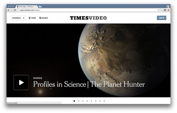
And then, as if to confirm my secret belief that the Times had gotten all serious about video, they recently pushed out an elegant update to their video page. Who knew there were so many videos, never mind video sections.
This points to what is now the biggest usability issues with the Times’s site: navigation. I had no idea video content inhabited the space not just below the fold of the homepage, but behind the fold, had no idea that video was lodged deep in the digital recesses of their labyrinthine site. Who knew Kristof had his own “show?” Or that “The Men of Atalissa” wasn’t an Op-Doc (as I had assumed), but, rather, a full-blown doc, a so-called Times Documentary ? Of which there are at least ten more.
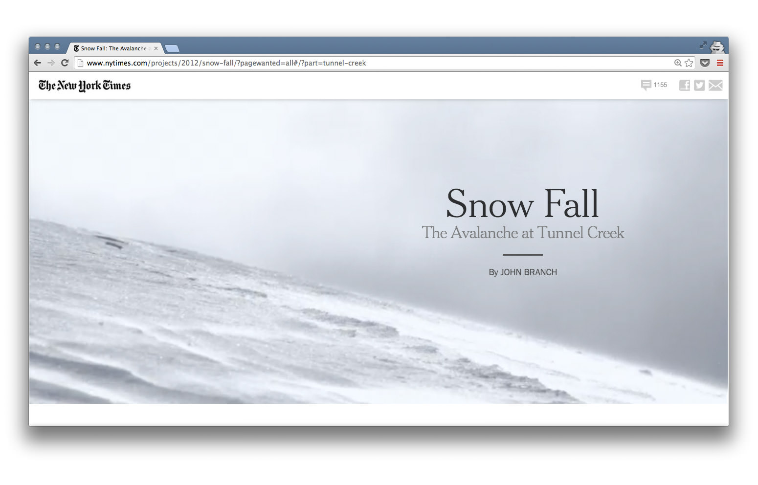
#The Snow Fall Fallacy
We love shiny things. We especially love shiny things in new mediums. Especially when they point to the so-called future.
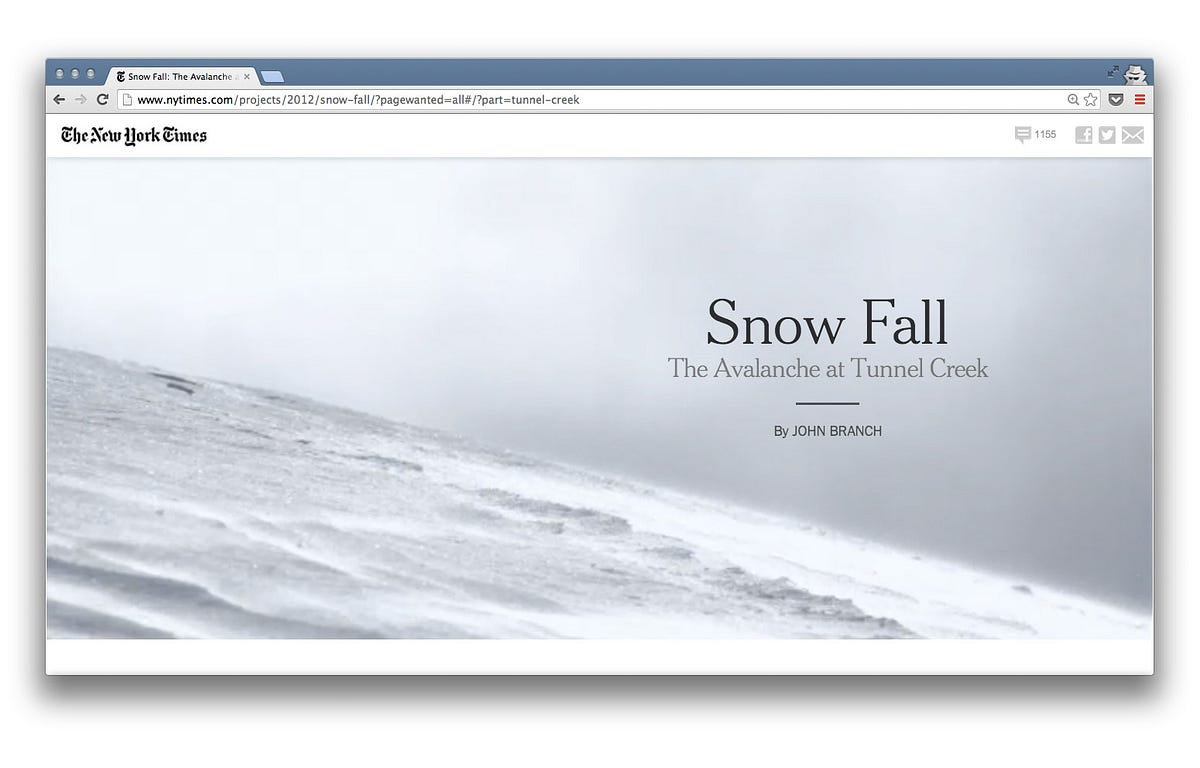
Everyone in media knows of “Snow Fall.” It was one of the first web-based “multi-media” articles from a major publisher to get widespread press. Boy is it shiny. So shiny that its very name has become synonymous with full-bleed, multi-media articles. An article or publication can be snow felled, or aspire to falling snow. It’s bandied about in design meetings, “Just snow fall it and call it a day.” Google “snow fall” and it’s the first hit, beating out even the weather.

“Snow Fall” has animated gifs, video interviews, complex data visualizations — pretty much everything you could throw into an article while still being able to call it an article. All split across multiple pages.
As Bobbie Johnson, co-founder of Matter wrote in his essay, Snowfallen , “Snowfall was a good story, but it felt as if getting you to read it was the story’s secondary ambition.”
When we explore new ground (or re-explore old ground, forgotten ground) in new mediums, we often find it necessary to swing the design and interaction pendulum to the baroque side of the scale. We do this to see what “too much” feels like in order to understand the edges of “enough.” We saw this happen with iPad “magazines.” We saw this happen with “Snow Fall.” “Snow Fall” was less about what felt natural in a web browser or what was best for the story, and more about what was maximally possible in a web browser. The experiment just happened to be attached to an article.
Great storytelling is not about maximizing technical possibility.

The Times’s recent, seemingly emboldened commitment to video is worth paying special attention to, and there’s two big reasons why.
- The Times hasn’t been known to do video, and to pursue it in earnest shows that there is some future-think happening within the organization.
- Video as a standalone nugget (as opposed to embedded in a giant article) is a powerful tool for telling stories. And it also happens to have become a near native part of the web. It works beautifully on desktops and tablets and smartphones. “Snow Fall,” in contrast, was a desktop-focused experiment that largely ignored how readers want to consume long-form content: not while sitting in front of a vertically oriented monitor.
It’s easy to throw the kitchen sink into a web site and call it the future. It’s much harder to use an obvious technology well and have it be part of your institution’s future. As Clive Thompson writes in a comment above :
“The big industrial publishers are realizing that the real challenge is thinking about what type of story you want to tell and what medium suits it best. Like rock-paper-scissors, the moving image does things print and audio can’t, and those two do things the other two also cannot.”

A post-“Snow Fall” Times has gotten better at sensibly mixing a sprinkling of video into an article when it truly adds context. For example, Hiroko Tabuchi’s, December 2013 article, “Japan’s Top Voice,” on the annual All-Japan Phone-Answering Competition would be far less impactful — What, exactly, is Hiroko describing? — without the slickly edited, punchy video accompaniment. And likewise, without Miss Tabuchi’s text, the video would be an inscrutable curiosity.
#“Innovation”
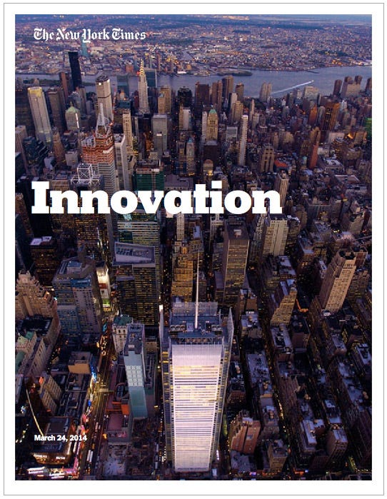
As I was finishing a final draft of this essay, the Times’s Innovation Report was leaked. It’s meticulous and well worth your time. Dig through it . (For a tl;dr edition, Joshua Benton and his colleagues have done a great job pulling out some of the best bits . But the whole thing really deserves a solid reading.)
Most gratifying about the report is nowhere does it say: The future of the Times is tied to complex, expensive, long-form, multi-media articles. Indeed, it’s future depends on much more prosaic — nay, obvious — experiments with a focus on “discovery,” “promotion,” and “connection,” to use the report parlance. All with the general goal of bringing more great stories to more people at more appropriate times.
Over the past few years, the design and content changes that have felt truly futuristic at the Times — the decisions that seemed to point to where an old company in a new medium could move visually — were much simpler and quieter than a “Snow Fall.”

The standalone data visualizations accompanying, for example, elections or the Olympics have always felt true to the web and genuinely useful, and the Times has done them better and with more authority than most anyone else. That Vox and Quartz and FiveThirtyEight are well-funded, data-friendly, media startups points to just how ahead of the game the Times was with their editorialized visualizations.
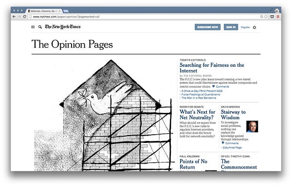
More generally, the subtle but iterative tweaks on nytimes.com have been heartening. Some of the talented design team’s best work can be seen on the Op-Ed pages, the successive refinements to white space and improved typography of article pages, and the moving of comment dregs to a side-bar.
None of these changes is sexy or verb-able, but together they formed a forward-moving, if not entirely compelling whole. For while data visualizations were neat a few years back, it’s clear the Times has lost its competitive advantage, and the entirety of the web has stepped up their whitespace and typography.
Which is why the Times’s recent video work is so captivating. It’s digitally native, and as far from a printed page as you can get. And yet, it feels like a space the Times can own in a meaningful way, and a space built squarely upon the company’s medium independent strength: telling stories.

#Bridging futures
Speaking of telling stories, John Jeremiah Sullivan’s latest essay for the TimesMagazine, “The Ballad of Geeshie and Elvie ,” feels close to defining best practices for an “interactive” article. The finished essay is everything “Snow Fall” aspired to be but wasn’t — responsive, mobile friendly, a single page, and interactive in elegant, understated, inline ways. Most of the enhancements in “The Ballad” don’t compete with the text, they support it, and as a whole, the essay is a wonderful thing to experience.
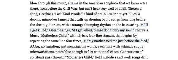
Unsurprisingly, most of the interactivity is sound related. There is the opening ‘soundtrack’ in the masthead and a full playlist at the end. But worth particular attention are the inline sound snippets sprinkled throughout. These snippets keep you firmly rooted in the text while multiplying context. They’re like sound sparklines. Tiny, but potent.
I read “The Ballad” on my laptop, tablet, and smartphone over the course of a few days. I suspect this is how many of us read an article of this length, with this level of craft and attention on the story — we discover it on a laptop or desktop and we savor it on more long-form-friendly devices.

Then, is “The Ballad” indicative of the Times beginning to get it? The Innovation Report shows that some people inside the company do get it, and maybe “The Ballad” is a manifestation of their wills. But as the Report outlines, the disconnect between the newsroom and the rest of the company is vast, threatening to undermine all the latent talent of the designers, engineers, editors, and writers who really do want to push the company far beyond its printed roots. Maybe this is why Times Video has felt so fresh, so fun — it lives somewhere outside of the formal structure that has defined the company and carries no incumbent print baggage.
As for “The Ballad’s” videos? They’re great, but I couldn’t help feel that they should be presented as standalone objects, not embedded distractions. The last thing you want when reading a Sullivan piece is to be interrupted.
So I’m keeping those “Ballad” videos in my pocket for a jet-lagged morning, when I’m up before the sun with no sleep in sight, and want nothing more than to be pulled back into the world Mr. Sullivan paints with his words. I’ll string together the four short videos into my own impromptu Op-Doc jumpstarting my return to the blues, and then start again on the text from the top.
This essay, originally published June 2014 by The Message. Thoughts? Email me@craigmod.com.

Craig Mod is a writer and photographer based in Japan. He's the author of the books Things Become Other Things and Kissa by Kissa and is a MacDowell, Ragdale, and VCCA writing fellow. His essays and articles have appeared in The New York Times, Eater, The Atlantic, California Sunday Magazine, Wired, Aeon, New Scientist, Virginia Quarterly Review, The New Yorker, The Morning News, Codex: Journal of Typography, and elsewhere.
He writes newsletters, oh yes, newsletters: Roden & Ridgeline.
The work on this site is supported 100% by paid memberships and book & print sales.
Whatever you do, don't follow @craigmod on Bluesky or Instagram.