“I see god in the instruments and mechanisms that work reliably.” — Buckminster Fuller
… Zip drives ate floppies.
CDs ate Zips.
DVDs ate CDs.
SD cards ate film.
LCDs ate CRTs.
Telephony ate telegraphy.
Text messaging ate talking.
Tablets are eating our paper …
Imagine a table:
Hundreds of meters long and wooden.
Worn and oiled.
Old and knotted.
Wide enough for a person.
Now — open the sky and dump down upon that table all the digital publishing tools we have. Let rain down the infrastructure and typography, the platforms and devices. Separate them into their smallest components. Spread them out evenly.
Grab a ladder.
Place it next to the table.
Climb it and look down upon it all.
What do you see? What can you build?

A magazine
When I first saw The Magazine I smiled.
I smiled because it was so sensible, so rational, and so immediately obvious.
It felt like a platonic mobile-publishing container. No cruft, all substance. A shadow on the wall. The kind of app that's doing nothing fancy but everything right. The kind of app deemed anathema by Future Publishing Authorities because, quite frankly, it’s boring.
We feel like we've seen this before, but — have we?
In a conversation with renowned Harvard Business School professor Clayton Christensen about the newspaper industry, Joshua Benton remarked, “The perception of the incoming disruptors is that they are low quality, and therefore not really worth paying attention to.”[1]
Let’s pay attention.
Cars & publishing
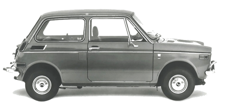
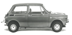
In 1967 Honda unveiled the N360.
The N360 was a kei, or light style car; a subcompact.
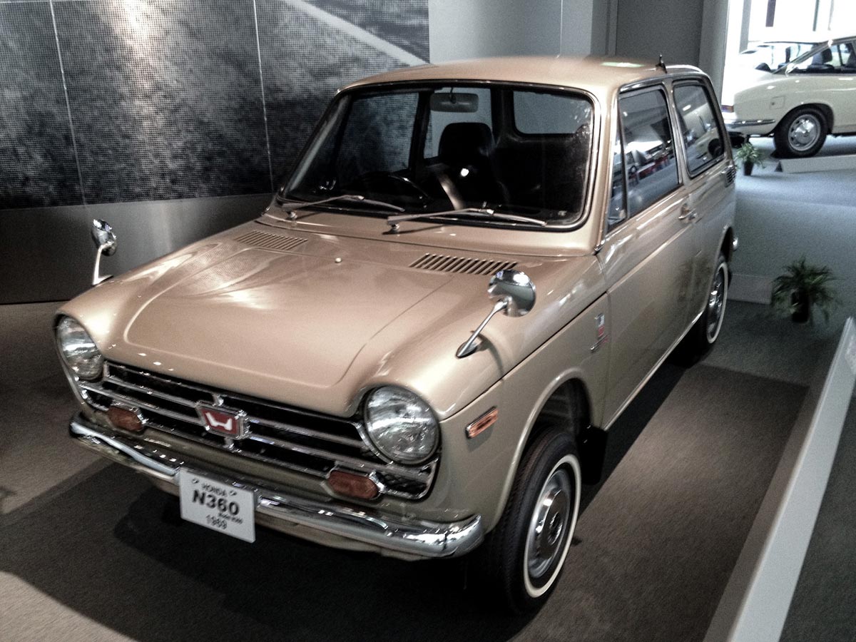
I like to imagine the engineers at Honda huddled together, dumping the sum total of all car design and production technology on our worn, wooden table. Around they gathered and together they asked, “What's the simplest thing we can build with this?”
With that question in mind, Honda — who had only been making motorcycles since 1949, and cars since 1963 — took one of their motorcycle engines and placed it in a Mini Cooper inspired body. It had 31 horse power. It was reliable. It was affordable. It got 39.4 miles to the gallon.[2]
The N360 was something an American car company would never dream of producing. You can’t blame them though: they had no incentive by which to dream such dreams. Unlike the American automotive industry, the Japanese automotive industry wasn't beholden to industry momentum or legacy. And when you’re not beholden to legacy, you can be excessively brazen.
In the software industry we talk about MVPs, or Minimum Viable Products. The N360 was a Minimum Viable Car.
The N360 didn’t make it to the States, but the followup — and near equally cute — N600 did. Next came the Honda Civic, then soon after, the oil crisis. We all know how the story goes from there.
“They started with cheap subcompacts that were widely considered a joke. Now they make Lexuses that challenge the best of what Europe can offer.”[3] — Christensen, Skok, Allworth
Honda was a nobody in the car industry. But they gained foothold and marketshare by building a car that was more appropriate for many consumers. They had built a subcompact.
So I ask: where are our digital publishing subcompacts?
Current offerings
There is an intuitive usability implicit to the physicality of our printed books and magazines. A reader is given two possible directions — which one depends on language and culture. And from there, a mostly linear, usually obvious interface.[4]
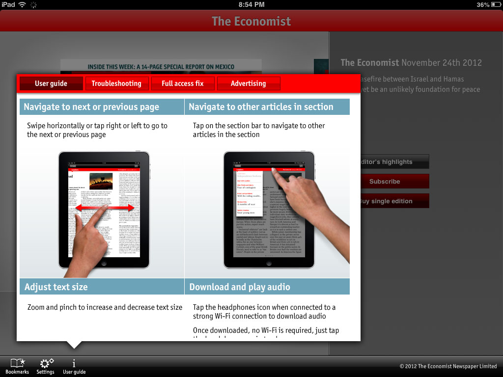
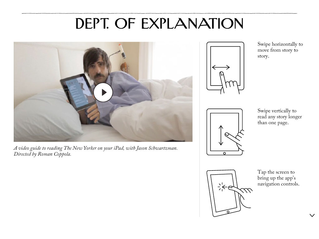
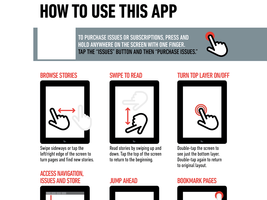
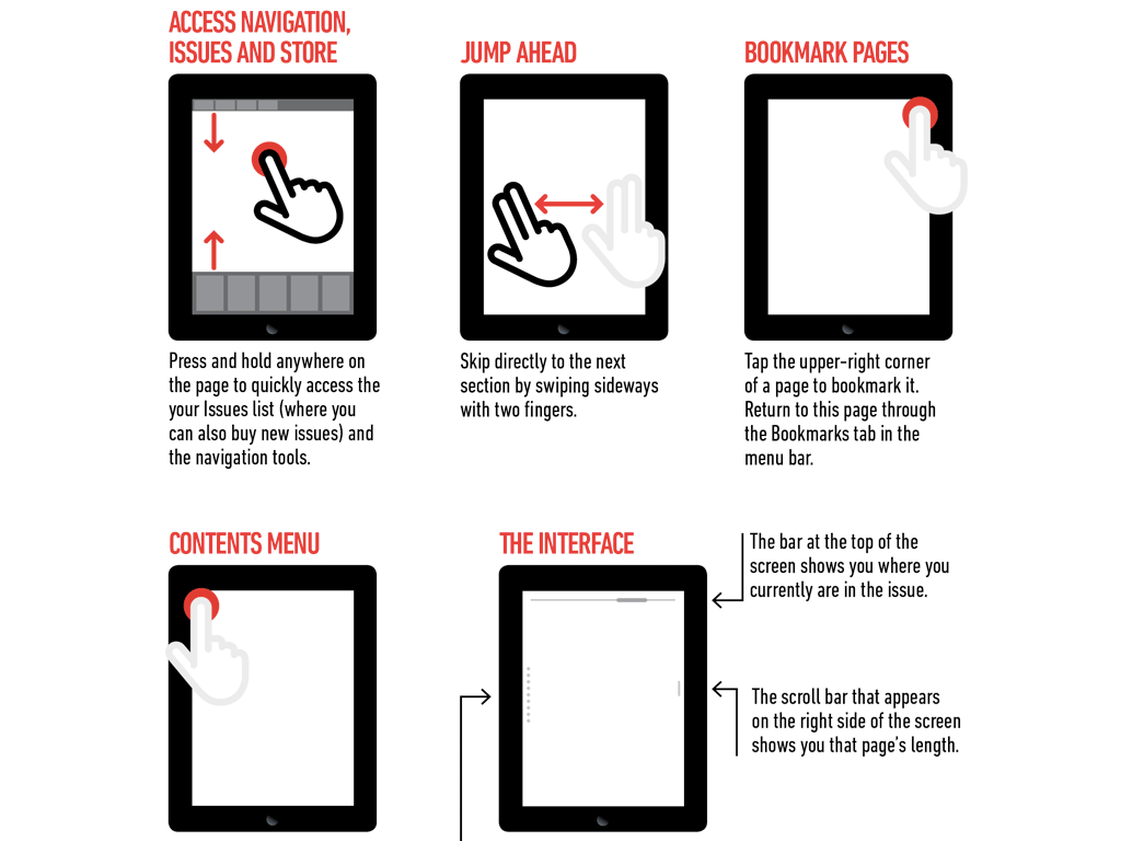
Tablet and smartphone books and magazines are not so obvious. They’re so not obvious that we often need tutorials explaining just how to use them.
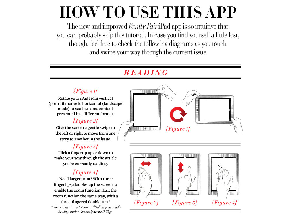
Why did we jump to such complex interfaces?
Homer
Perhaps we Homer’d.
When Homer Simpson was asked to design his ideal car, he made The Homer. Given free reign, Homer’s process was additive. He added three horns and a special sound-proof bubble for the children. He layered more atop everything cars had been. More horns, more cup holders.

In product design, the simplest thought exercise is to make additions. It’s the easiest way to make an Old Thing feel like a New Thing. The more difficult exercise is to reconsider the product in the context of now. A now which may be very different from the then in which the product was originally conceived.
Our now
Publishing incumbents have been faced with disruption for years. But a curious, natural thing is happening: another, increasingly difficult to dismiss publishing ecosystem — disconnected from and unbeholden to legacy — is emerging. Bubbling up.[5]
A few years back, ‘publishing’ startups[6] were usually launched by one of two types of individuals:
- Technologists disconnected from traditional content ecosystems
- Incumbents of traditional content ecosystems disconnected from technologists
What publishing startups really needed during that narrow window of time was both: Technologists who got infrastructure and product, coupled with the stewards of the content of the incumbents. What they needed — and often lacked — was a mutual empathy.
Now, it’s not so clear. The content of the incumbents becomes less important as new content creators emerge. And emerging they are. [7]
With history as our guide, it shouldn’t be a surprise when new entrants like The Huffington Post and BuzzFeed, which began life as news aggregators, begin their march up the value network. They may have started by collecting cute pictures of cats but they are now expanding into politics, transforming from aggregators into generators of original content, and even, in the case of The Huffington Post, winning a Pulitzer Prize for its reporting. — Christensen, Skok & Allworth
We can look to even more recent examples to see an evolution of this trend.
Matter
Launched on November 14, 2012, Bobbie Johnson and Jim Giles’ new publication MATTER may be indicative of the quality of publishers to arrive in this emergent space. In March, 2012, they raised $140,000 from 2,500 supporters on Kickstarter — the equivalent of an angel round of investing for a technology startup.[8]
With those funds they built their website, commissioned writers and photographers, and have set out to explore the somewhat uncharted intersection of paid content and high-quality journalism.
In their words:
MATTER isn’t quite a website, it’s not really a magazine and it’s not exactly a book publisher either. Instead, MATTER is something else — a new model for high-quality journalism, an area that’s been hit hard by the transition from print to digital media. We think that our focus on selling individual long-form stories for consumption on any device, whether it’s your computer, phone, e-reader or tablet, could be a sustainable way of paying for the hard work required to produce the best reporting.
What a great invocation: not quite website, not quite magazine, not quite book. It sums up well the liminal space in which we play as digital publishers.
The first article they published was 7,826 words. You can read a preview or buy it for $0.99. Buying the article gets you:
- Distraction free web edition
- eBook for Kindle, iPad or other readers
- Invite to a Q&A with the author
They also sell memberships — which includes a seat on their editorial board.
MATTER is building their most valuable asset: community. They're hungry and talented. And they're the tip of an iceberg.
Not quite website, not quite magazine, not quite book. Whatever they may be, we’re poised to see more like them — soon.
Skeuomorphic business models
Skeuomorphism is traditionally attached to design decisions. We bring the mechanical camera shutter sound to digital cameras because it feels good. We render paper page flips in our digital reading applications because it’s familiar.
But skeuomorphism also cuts into business models.
A publisher like MATTER brings the best of the old — an understanding of editorial ethics, storytelling, craft — and changes the shape of the content and distribution models of the content to match digital. This isn’t always the case.
Business skeuomorphism happens when we take business decisions explicitly tied to one medium, and bring them to another medium — no questions asked. Business skeuomorphism is rampant in the publishing industry. The simplest example is with magazines.
Just look at the covers in Newsstand:
Not a single cover is readable. This may seem like design skeuomorphism, but it’s not. No designer looked at those covers in Newsstand and said: "Perfect! Ship it!" It’s driven by business decisions and legacy-facing infrastructure.[9]
The farther out we zoom, the clearer this becomes. A generalized print magazine may be composed of the following qualities:
- Each issue contains a dozen or more articles.
- Issues operate on a monthly cycle.
- All articles are bundled and shipped at the same time.
Almost all of these qualities are the result of responses to distribution and production constraints. Printing and binding takes a certain amount of time. Shipping the issues takes another chunk of time. In order to find a balance between timeliness of content and shelf-life, a month makes a pretty sensible — if brisk — publishing schedule.
Old into new
So why do so many of our digital magazines publish on the same schedule, with the same number of articles as their print counterparts? Using the same covers? Of course, they do because it’s easier to maintain identical schedules across mediums. To not design twice. To not test twice (or, at all).
Unfortunately — from a medium-specific user experience point of view — it’s almost impossible to produce a digitally indigenous magazine beholden to those legacy constraints. Why? Not least because we use tablets and smartphones very differently than we use printed publications.
One of the great benefits of being part of the emergent publishing world is that you don’t have multiple mediums to publish across.[10] You can and probably should focus squarely on digital. Perhaps later — contingent on market demand and content quality — you can consider publishing a print anthology to give your publication a stronger literal edge.[11]
So what are these so called ‘indigenous’ qualities of digital?
A Subcompact Manifesto
Subcompact Publishing tools are first and foremost straightforward.
They require few to no instructions.
They are easily understood on first blush.
The editorial and design decisions around them react to digital as a distribution and consumption space.
They are the result of dumping our publishing related technology on a table and asking ourselves — what are the core tools we can build with all this stuff?
They are, as it were, little N360s.
I propose Subcompact Publishing tools and editorial ethos begin (but not end) with the following qualities:
- Small issue sizes (3-7 articles / issue)
- Small file sizes
- Digital-aware subscription prices
- Fluid publishing schedule
- Scroll (don’t paginate)
- Clear navigation
- HTML(ish) based
- Touching the open web
Many of these qualities play off one another. Let’s look at them in detail.

Small issue sizes
I’ve written quite a bit about creating a sense of ‘edge’ in digital space. One of the easiest and most intuitive ways to do so is to limit the amount of data you present to the user.[12]
It’s much more difficult for someone to intuit the breadth of a digital magazine containing twenty articles than a digital magazine containing, for example, five. By keeping article number low this also helps decrease file size and simplify navigation.
Small file size
Speed is grossly undervalued in much of today’s software — digital magazines inclusive. Speed (and with it a fluid and joyful user experience) should be the thing you absolutely optimize for once you have a minimum viable product.
One way to bake speed into a publishing product is to keep issue file sizes as small as possible. This happens naturally when you limit the number of articles per issue.

Reasonable subscription prices
Ideally, digital subscription prices should reflect the cost of doing business as a digitally indigenous product, not the cost of protecting print subscriptions. This is yet another advantage digital-first publications have — unlike print publications transitioning to digital, there is no legacy infrastructure to subsidize during this transition.

Fluid publishing schedule
With smaller issue sizes comes more fluid publishing schedules. Again, to create a strong sense of edge and understanding, the goal isn’t to publish ten articles a day, but rather to publish just a few high-quality articles with a predictable looseness. Depending on the type of content you’re publishing, days can feel too granular, and months require the payload to be too large. Weeks feel just about right in digital.
Scroll (for now)
When I originally presented these ideas at the Books in Browsers conference in 2012, the dismissal of pagination was by far the most contentious point. I don’t mean to imply all pagination is bad. Remember — we’re outlining the very core of Subcompact Publishing. Anything extraneous or overly complex should be excised.
I’ve spent the last two and half years deconstructing scrolling and pagination on tablets and smartphones. If your content is formless, then you might be able to paginate with minimal effort. Although, probably not.
Certain kinds of pagination increase the complexity of an application by orders of magnitude. The engineering efforts required to produce beautiful, simple, indigenous, consistent — and fast — pagination are simply too high to belong in the subcompact space.
Furthermore, when you remove pagination, you vastly simplify navigation and thereby simplify users’ mental models around content.
No pagination is vastly superior to pagination done poorly.
Clear navigation
Navigation should be consistent and effortless. Subcompact Publishing applications don’t require complex how-to pages or tutorials. You shouldn’t have to hire a famous actor to show readers how to use the app with his nose. Much like a printed magazine or book, the interaction should be intuitive, effortless, and grounding. The user should never feel lost.
By limiting the number of articles per issue, and by removing pagination, many of the routes leading to complex navigation are also removed.

HTML(ish) based
When I say HTML I also mean epub or

Open web
Simply: whatever content is published on a tablet should have a corresponding, touchable home on the open web.
Content without a public address is non-existent in the eyes of all the inter-operable sharing mechanisms that together bind the web.
Publishing jobs to be done
Clayton Christensen — author of The Innovator’s Dilemma — likes to look at the relationship between consumers and products from the perspective of the jobs-to-be-done theory.[13] In his words:
The basic idea is that people don’t go around looking for products to buy. Instead, they take life as it comes and when they encounter a problem, they look for a solution—and at that point, they’ll hire a product or service.
The key insight from thinking about your business this way is that it is the job, and not the customer or the product, that should be the fundamental unit of analysis.
In his recent Nieman Reports piece on disruption in the news industry, Christensen uses the contemporary example of “I’m waiting in line for coffee and have ten minutes to kill.” The person with the problem hires their smartphone to entertain or educate them for those ten minutes.
More contemporary jobs
Within the scope of contemporary digital publishing are many, many, many yet-to-be-satisfied jobs-to-be-done. One that has irked me for years is the lack of a great solution to ‘subscribe,’ for money, to a website or author or publisher. When I find a new writer with whom I’m enamored, there’s usually no effortless or indigenous way to pay for their content.
RSS may be fine for a backend protocol and packet structure, but from a ‘normal’ consumer facing point of view, RSS has never made sense. (It’s sort of like git without github.) In effect, creating a better kind of consumer facing RSS is to solve the above problem.
Connected with this generalized notion of subscription is that the output to which you’re subscribed should be quick, lightweight, predictable, reliable and cached locally. If you hire an author or publication to solve a problem, you may partially be paying for the content, but you’ll really be paying for a great reading solution with those attributes. It just happens to have their content.
Outlining a system
To begin, let’s sketch out the world’s simplest desktop editorial system.
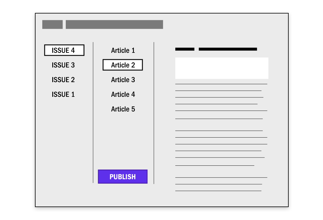
Our system has three columns: Issues, Articles, and Article Text. You click an issue, it shows you the articles. You click an article, you see the article text. There’s a button that says Publish. That’s it.
So where does it publish to?
The open web
For most content — in most contexts — a publisher will only benefit from giving their content a publicly referable address. So the first obvious place to publish to is the open web.
Easy. We’ve done that for nearly two decades now and have oodles of mature tools to handle open web publishing.
On the open web, optimize first for reading and second for one or two calls to action: an app download or an email subscription. But whatever you do, don’t undermine the reading experience. To undermine open web reading is to undermine open web sharing (no one wants to share something that’s hard to read) — and that’s the whole point of having our content out there.
Tablets and smartphones
Desktop — the open web — is easy. Tablets and smartphones are still hard.
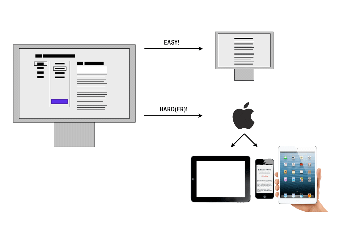
Tablets and smartphones are used differently than desktops and laptops. They’re frequently without an internet connection. Smartphone users ‘snack’ and want content quickly. The open web isn’t always the fastest way to get content: it (usually) doesn’t cache content, and it’s not accessible without an internet connection.
To simplify the tablet equation, let’s assume we’re only interested in publishing to iOS devices. If only someone had built a delivery mechanism to push content from our editorial system to readers seamlessly and in the background …
Newsstand
Ah! But someone did — Apple: Newsstand.
Apple’s Newsstand? "But isn’t that where all those horrible things live?" I hear you say. Or, "Oh? That folder I’ve never opened?"
Newsstand is perhaps the most underutilized, under-imagined distribution tool in the short history of tablet publishing. If you squint your eyes and tilt your head at just the right angle, you’ll notice something magical about Newsstand: given the proper container, it’s a background downloading, offline-friendly, cached RSS machine people can subscribe to. For money.
It handily solves our job-to-be-done.
The Magazine
Which brings us back to The Magazine.
In the words of Marco Arment, creator of the magazine:
I don’t consider The Magazine to be a member of “the magazine industry” any more than blogs are members of “the publishing industry”. Those terms evoke the old and established, while this is the new and experimental.
He goes on to say:
Many iPad magazines are carrying unnecessary and expensive baggage from their print days. Some born-digital magazines even took on print baggage simply because they thought they needed it.[14]
In one gesture Marco set loose an N360. He’s designed and programmed one of the first truly tablet-indigenous subcompact publications.
- Each issue contains only four or five articles.
- Each issue is less than a few megabytes, meaning they download in seconds, rather than minutes or hours like many other digital magazines.
- The subscription price is $1.99 a month.
- Subscribing is seamlessly baked into the platform via Newsstand.
- It’s published twice a month.
- It’s an unpaginated application.
- The navigation is consistent and completely intuitive.
- It’s HTML based.
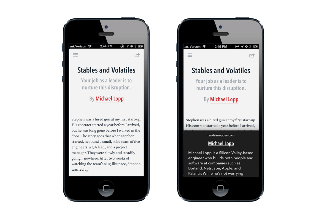
UI and UX
There is almost nothing to the app. On the main reading screen you have three options:
- Swipe up or down to scroll and read the current article
- Tap the top right button to share the current article
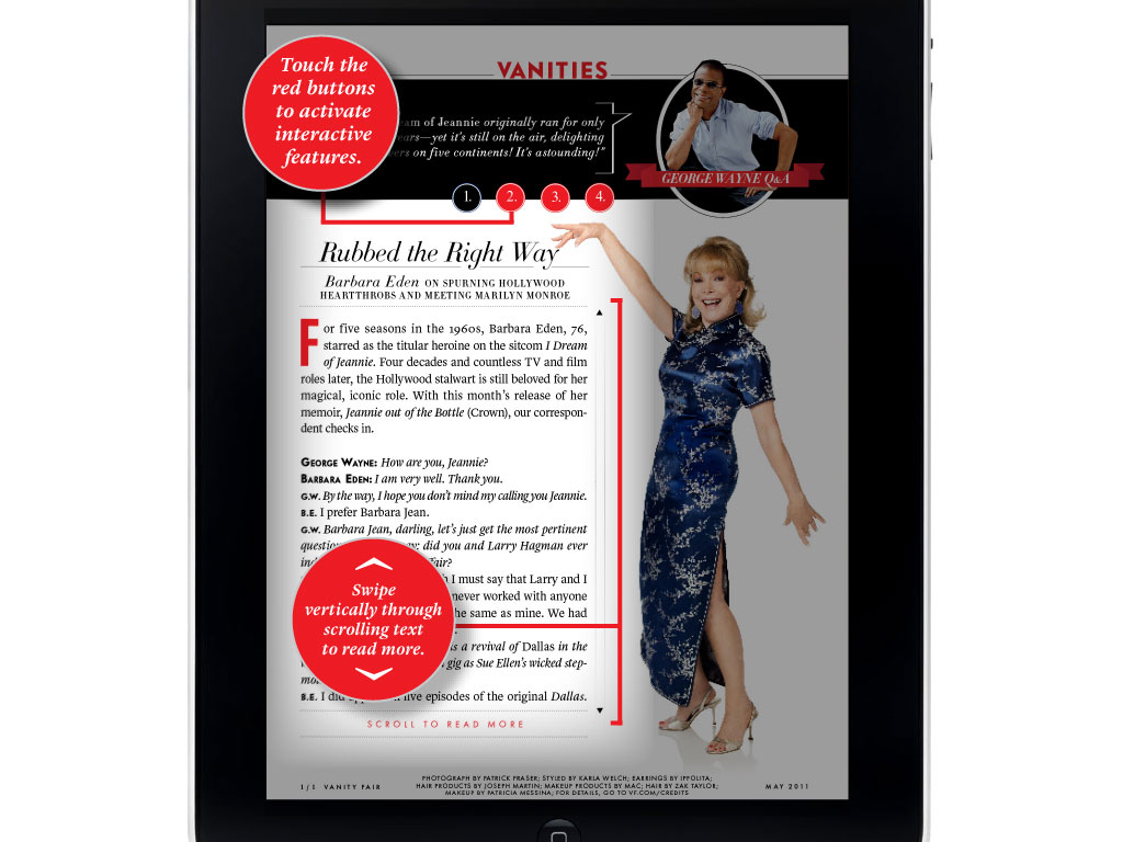
- Tap the hamburger button(Fig. 1) to slide in the Table of Contents
That’s it. You can’t do anything else.
There’s even less UI when you dig deeper: the share button will be rarely used, and the hamburger button is superfluous; the Table of Contents can be invoked at any time by swiping from left to right across the page.
The Magazine doesn’t need a how-to, an instructions page, or a fancy video. This app mimics the intuitive usability of a printed publication as well as anything else we’ve seen.

Issues
By keeping issue size small, The Magazine mitigates Table of Contents complexity. There’s no need to ‘zoom out’ or show a macro view of the length of each article. When there’s only four or five articles per issue, the user intuitively senses the edges. Navigation need not be more than a simple list.
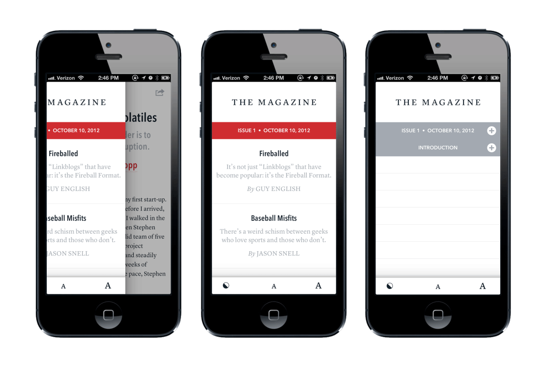
Swipe to delete an issue and it collapses down to a neat row. Tap a deleted issue and it downloads again in seconds.
Links
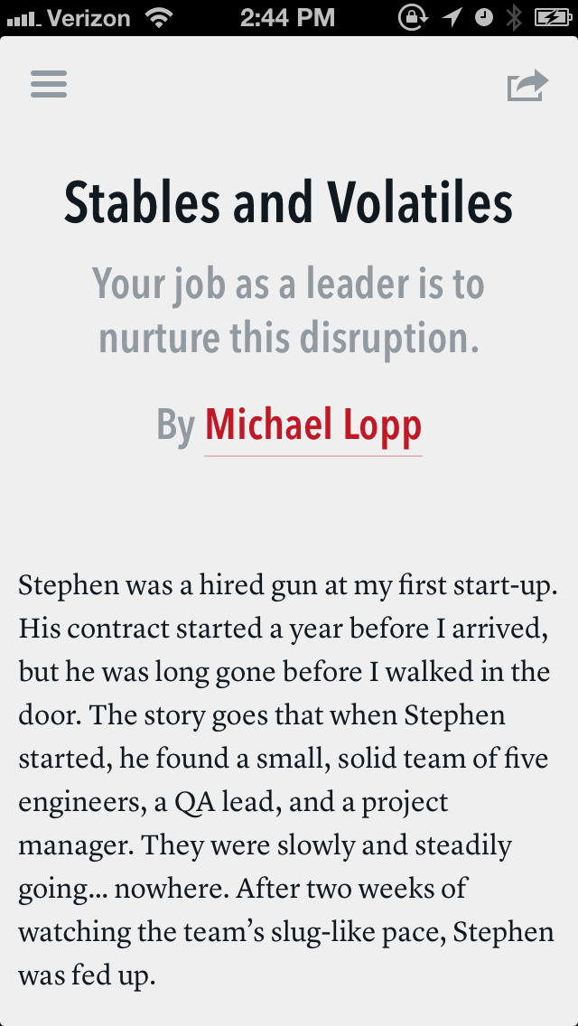
The Magazine also smartly handles links. Tap a link and you’re shown an annotated version of that link at the bottom of the screen (or in a pop-over on the iPad). Effectively, they’re footnotes. The author summarizes the link’s content and if you then wish to visit the URL, you can, by tapping again.
The result is a very solid reading environment. There are no accidental buttons to press. There’s no confusion as to where you are. There’s really only two places to be in The Magazine: reading an article or scrolling through the always succinct ToC.
Newsstand
Perhaps the most magical part of the entire experience is The Magazine’s integration with Apple’s Newsstand. Newsstand provides two critical functions:
- Background downloading of content
- Paid subscription conversions
Newsstand is the only place in iOS that allows 3rd party applications to download content in the background. What this means is that new articles are available almost immediately after Marco hits publish (or whatever his button says) in The Magazine’s backend. Which means as a reader you don’t have to preemptively load content before getting on an airplane or subway. If there’s new content, it will be waiting and cached for your offline pleasure.
Newsstand also mitigates all complexity and trust issues connected with payments — you’re paying Apple, not Marco. The infrastructure allows you to give readers a free starter subscription, and then later — seamlessly — convert them into a recurring, monthly, payments.
Open web
And finally — unsurprisingly — The Magazine also nails the web.
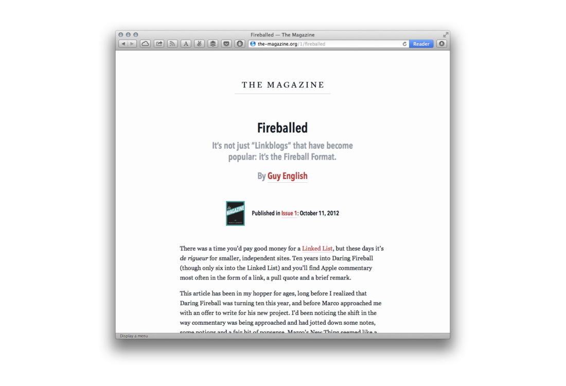
the-magazine.org is minimal and optimized for two actions: reading and converting to a The Magazine download.
Presently, the full text of the articles isn’t online. I would love to see an A/B test around full / truncated content conversion. My gut tells me that app downloads / subscription conversions wouldn’t change by switching to full content. But sharing would increase dramatically.
Users are much more likely to share a link to the full-text of an article than a truncated version. Increased sharing means more eyeballs, and more eyeballs — if conversion rates remain static — means more downloads and subscriptions.
Keep in mind Christensen’s jobs-to-be-done — users are probably more excited about paying for the cached, simple, svelte, eminently hirable reading experience The Magazine provides, than simply getting to the full version of any single article.
In just a handful of screens, The Magazine cleanly answers the question posed above in our subcompact editorial system: where does your content go when you hit Publish?
Clarity
The clarity of The Magazine is exciting. It’s doubly exciting because it’s precisely the sort of app at which incumbent publishers balk. This is expected. Again, from Christensen:
Generally, disruptive technologies underperform established products in mainstream markets. But they have other features that a few fringe (and generally new) customers value. Products based on disruptive technologies are typically cheaper, simpler, smaller, and, frequently, more convenient to use.
We are the new customers: The new readers, the new writers, the new publishers. The Magazine is indeed cheaper, simpler, smaller, and more convenient than most other publishing apps.
It doesn’t take much imagination to connect a minimal container like The Magazine with the deeper investigative editorial ethos of MATTER and get even more excited.
So why doesn’t a publication like MATTER just publish to Newsstand? Because the tallest hurdle before Newsstand is that you have to program an iOS application to use it. A cost prohibitively expensive endeavor for many publishers. And, complicating matters, publishers usually aren’t good at producing software.
The fact that Marco — a programmer — launched one of the most ‘digitally indigenous’ contemporary tablet publications is indicative of two things:
- Programmers are today’s magicians. In many industries this is obvious, but it’s now becoming more obvious in publishing. Marco was able to make The Magazine happen quickly because he saw that Newsstand was underutilized and understood its capabilities. He knew this because he’s a programmer. Newsstand wasn’t announced at a publishing conference. It was announced at the WWDC.
- The publishing ecosystem is now primed for complete disruption.
In Paul Graham’s essay Startup Ideas[15] he talks about the kind of programmer Marco is: the self-motivated producer.
Knowing how to hack also means that when you have ideas, you’ll be able to implement them. That’s not absolutely necessary (Jeff Bezos couldn’t) but it’s an advantage. It’s a big advantage, when you're considering an idea like putting a college facebook online, if instead of merely thinking “That's an interesting idea,” you can think instead “That’s an interesting idea. I’ll try building an initial version tonight.” It’s even better when you’re both a programmer and the target user, because then the cycle of generating new versions and testing them on users can happen inside one head.
Marco is not just a publishing-interested engineer, he’s a subcompact publishing magnate. He lives happily outside of anything resembling the incumbent big-P infrastructure. And from this removed stance he produces podcasts, a magazine, a reading application, and curated reading lists … all using simple tools wrapped in minimal containers.
You need technological awareness to be a future publishing disruptor; even if you don’t see yourself as such.
Distruptationalisticly
We’re on the precipice of a wave of tools and systems that have nothing to do with incumbents and everything to do with the bubbling new wave.
To quote again from Paul Graham’s essay:
When startups consume incumbents, they usually start by serving some small but important market that the big players ignore. It’s particularly good if there’s an admixture of disdain in the big players’ attitude, because that often misleads them.
The winter of 2012 will be the first holiday season where a broad swath of consumers will have both an awareness of tablets, and several good enough options to choose from (occupying multiple price points). If 2013 doesn’t prove to be an inflection year for digital publishing — and particularly for the non-incumbents — then I don’t know what market circumstances would be necessary to make it so.
Our current tools are a bit kludgey, a bit clunky, a bit too tied to the past. The Magazine is a great first example of a subcompact publication, utilizing Newsstand — an existing under-leveraged tool — to indigenously and ingenuously deliver content.
I’d be shocked if there weren’t a dozen other publishers prepping to launch similar magazines. Or, even better: someone building a system by which anyone could launch a Newsstand app like The Magazine — for minimal cost with minimal complexity.
It’s easy to dismiss.
There’s lots of disdain.
Why not be part of the group that shakes it up?
Take all of our digital publishing nuts and springs, bits and bolts and spread them out on the old table. Climb our ladder and look down and ask yourself:
“What can I build for subcompact publishing?”
Followup reading, inspiration and thanks
This essay — the entire concept of Subcompact Publishing — was obviously hugely inspired by:
- Clayton Christensen, David Skok, and James Allworth’s Mastering the art of disruptive innovation in journalism in the Fall 2012 issue of Nieman Reports. If any of the above interests you, I can’t recommend more highly going and reading that report.
- Marco’s The Magazine — an app that helped crystalize a lot of my thinking around these topics.
Christensen did a supplementary interview to the Report piece which is also worth your time. Somewhat related, but also unrelated, he has a wonderful TEDx talk on measuring your life. If, like me, you’re not particularly religious, just replace the word "god" with "Google" in your head, and suddenly it makes a lot of sense. ("Google will judge you when you’re gone." — oh, yes, yes Google will!)
There’s a bunch of links in the Noted section below on the N360 which really is a neat little car. I’ve become more than slightly obsessed with finding one to take for a drive.
Thank you to all these people (known and unknown — I’m looking at you, unsung post-war Honda engineers) for making these wonderful things.

Footnotes
- Clay Christensen on the news industry: “We didn’t quite understand…how quickly things fall off the cliff”, Nieman Reports, October 2012↩
- If you're interested in N360s start with Wikipedia. This guy is converting one to battery powered. When I told some Japanese publishing executives about using the N360 they chuckled — delighted — and went on to reminisce fondly about the car. The 'N' officially stands for 'norimono' (乗り物) or 'vehicle,' but, they said, the nickname was 'N-koro' (Nコロ), which means 'N-rollover' because the thing would flip so easily.↩
- Allworth, Christensen, Skok. Breaking News: Mastering the art of disruptive innovation in journalism. Nieman Reports, October 2012↩
- I gave a talk at Books in Browser 2011 called, Just Keep Swiping, discussing, briefly, the idea of imposing / embedding an intuitive, linear navigation into our reading apps.↩
- Has been emerging, really, for decades. One can argue that — technologically — we've been building and refining certain infrastructures and tools for digital publishing in anticipation of better consumption devices. Blogger was released in the late 90s. Live Journal. Geocities. All of those old platforms were ahead of their time. Twitter, too, is something of a platform built for the bubbling emergence, but with their reluctance to offer good archives, I'd place it more in the broadcast category than publishing category.↩
- As a follow up in contrast to the previous footnote: 'Publishing startups' here is in reference to things we'd associate with 'traditional' publishing. That is, companies whose output is concerned with 'books' (in whatever form they may manifest) or 'magazines.' Companies concerned with containers. With nurturing authors (or collections of publishers). Companies whose sole focus is on bringing old content to tablets, or producing new content specifically for tablets. It's a slightly different beast than the Bloggers or Wordpresses or the world; not a entirely semantic difference, but close. Distanced by small, specific technological decisions.↩
- I need to add, down here, that of course the vast and bountiful libraries of incumbents are important. But for a publishing startup beginning today, it makes less sense to build for that slow moving ecosystem than it does for the emergent new content producers. It makes more sense for a startup to become the platform for all new producers than it does to be the platform for the incumbents. If you can achieve both — you win! But history has shown us that this is difficult.↩
- An angel round wherein they give up no equity. Which is what's so powerful about Kickstarter. Checkout MATTER's website, readmatter.com, or visit their Kickstarter campaign.↩
- I've written a lot more about covers in Hack the Cover, craigmod.com, June 2012↩
- But you do have multiple platforms — another, slightly different, problem.↩
- More on edges: Mod, Craig. How magazines will be changed forever. CNN, October 2012↩
- Perhaps the company best doing this — limiting data to better aid in consumption, is Facebook. Their newsfeed is an often overlooked modern miracle of contextifying and data filtering. The algorithm adapts to each user, matching the velocity and density of the feed to the users needs. It's slightly tangential to our 'classic' publishing discussion, but well worth meditating on.↩
- Even more on jobs-to-be-done on jobstobedone.org.↩
- Arment, Marco. Foreword. The Magazine, October 2012.↩
- Graham, Paul. Startup Ideas. paulgraham.com, November 2012.↩
About the Author

Craig Mod is a writer and photographer based in Japan. He's the author of the books Things Become Other Things and Kissa by Kissa and is a MacDowell, Ragdale, and VCCA writing fellow. His essays and articles have appeared in The New York Times, Eater, The Atlantic, California Sunday Magazine, Wired, Aeon, New Scientist, Virginia Quarterly Review, The New Yorker, The Morning News, Codex: Journal of Typography, and elsewhere.
He writes newsletters, oh yes, newsletters: Roden & Ridgeline.
The work on this site is supported 100% by paid memberships and book & print sales.
Thank you
Peter, Erin, Ashley, and Max for lending your kind eyes and delicious brains.
Copyright
All images (where applicable, of course) and text © Craig Mod, 2012++.
This work is distributed under the Creative Commons Attribution-Noncommercial-Share Alike license. If you wish to use reproduce any of this context in a commercial context, explicit permission is required. Please contact me directly.

This work is licensed under a Creative Commons Attribution-Noncommercial-Share Alike 3.0 United States License.
Where this was written (because it's good to remember)
In surprisingly few places.
Mainly California. Well — entirely California, now that I think about it. It started after a lunch with Josh Quittner and then was rocket boosted by Marco's The Magazine. Then forcibly formalized by a presentation at Books in Browsers as The Internet Archive celebrated their tenth petabyte of stored data. And then worked over atop alternating tatami mats in Palo Alto and San Francisco. It was edited while violently shaking on the CalTrain as the CalTrain does. It was fueled mainly by Ethiopian coffee from a farm called Wata that makes just the most delightful beans — you can buy them at Four Barrel. Otherwise, by coffee from Cento in SoMa. Sometimes at Red Rock, sometimes at Coupa, sometimes at the new La Boulange on University. Thanks for reading.