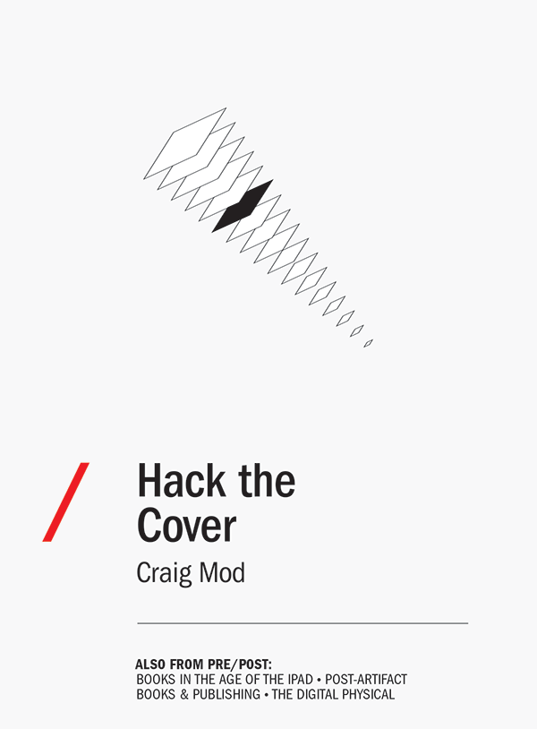
Muerto!
The covers are dead!
Dead!
Dead like the record jacket!
Dead like the laser disc sleeve!
Dead like the 8-track cartridge sticker!
Dead like the squishy Disney VHS container!
Dead like the cassette tape insert!
Dead like those damned CD jewel cases and their booklets!
Dead like DVD and Blu-ray box art!
Put 'em all in a box, burn 'em, and sprinkle their ashes over your razed local bookstore. Call it a day. Hang up your exact-o knifes and weld shut your drawers of metal type. The writing's not on the wall but it was on one of those covers you just lit on fire — so we'll never know what it said.
Next!
OK — phew. Still here? Great.
If digital covers as we know them are so ‘dead,’ why do we hold them so gingerly? Treat them like print covers? We can't hurt them. They're dead. So let's start hacking. Pull them apart, cut them into bits and see what we come up with.
This is an essay for book lovers and designers curious about where the cover has been, where it's going, and what the ethos of covers means for digital book design. It's for those of us dissatisfied with thoughtlessly transferring print assets to digital and closing our eyes.
The cover as we know it really is — gasp — ‘dead.’ But it's dead because the way we touch digital books is different than the way we touch physical books. And once you acknowledge that, useful corollaries emerge.
Leather-bound
Paula Fox writes in her memoir, The Coldest Winter: “I touched his signature as though it had been his face.”1 It's this kind of intimacy with which we touch physical books, too.
And so we don’t want the cover to disappear. And yet the cover as we have known it is disappearing, rather quickly (nearly eradicated on hardware Kindles). This doesn’t mean it won’t be replaced. Whatever it’s replaced with, however, will not serve the same purpose as the covers with which we’ve grown up.
This romanticism is curious, if only because the cover whose loss we lament is a recent invention. Matthew Battles writes in his book, Library: An Unquiet History:
“The people who shelve the books in Widener talk about the library’s breathing — at the start of the term, the stacks exhale books in great swirling clouds; at end of term, the library inhales, and the books fly back.”2
I can’t help but imagine all these flying books as leather bound. Thick, dusty, uniform and effectively ‘coverless’ by modern standards. Place them face-up on a table and they look identical: shielded and important but also anonymous. Only the scuffs and wear in the leather tell a story. And that story doesn't say much about what's inside.
Here, the cover is a protector of the signatures and the binding. It allows the books to fly in and out of the stacks a thousand times, and still be usable. In the digital world, our books are protected by ubiquity. They are everywhere and nowhere. They multiply effortlessly and can fly continuously without damage or rot. They don't need covers like printed book need covers.
Kinokuniya & Delight
My awareness and relationship with covers began almost a decade ago.
I was nineteen when I walked into Kinokuniya on the east side of Shinjuku station. At the time I knew nothing about Japan or making books. It was my first visit to a Japanese bookstore and, like most of my experiences then with things Japanese, I was amused, full of curiosity, and inspired. The place was bathed in a typically drab and corporate Japanese fluorescence, but drabness be damned, I distinctly recall the delight felt from picking up books at random. They were all so ... rational.3
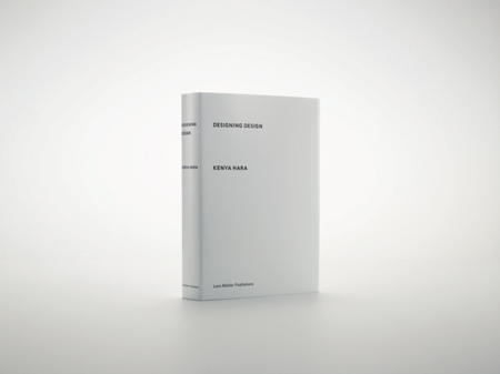
It wouldn't be until years later that I realized this sense of rationality stemmed from a respect for readers. The books were sized perfectly for your back pocket or bag. Giant volumes were split into smaller tomes. The paper was elegant. The binding strong. Bookmarks glued in. But looking back, I was struck most of all by the austere covers. Little Hara Kenyas everywhere. Expanses of whitespace splashed with well considered marks of ink. One color. Restrained photography. Pretty books. Lots of 'em.4
There were racks of these minimal bricks. In fact, the vast majority fell under this careful aesthetic. In aggregate, this aesthetic formed a unified cultural voice. A rational system. The impact of this experience has stuck with me this past decade and deeply informed all of my design work. I continually ask myself: “How does one develop a design language or ecosystem that tempers itself? That somehow keeps from spiraling out of control?”
Seeing this shed new light on book covers in the west. In contrast, the shelves of our bookstores seemed — and seem — far more chaotic. And as you trace back through the history of the cover, there's a sense that it's getting visually louder.
It's unsurprising, really. There are fewer bookstores. Less shelves. And therefore more competition around attention. This results in an ever escalating shouting match between covers. But with the present digital inflection, the role of the cover is changing radically; disappearing in some cases. It doesn't need to shout anymore because it doesn't serve the same purpose.
This shift presents a wonderful chance for designers to break from thinking of a cover as an individual asset, and certainly a chance to break from a tight coupling with the marketing department. In a sense, it's a chance to play again. To hack. And I can't help but feel that elements of the design of our future digital books should take to heart the craftsmanship and metered rationality embedded in so much Japanese book design.
Recent Covers
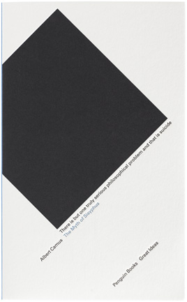
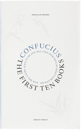
Of course, not all western covers shout. In fact, the past few decades have sheltered some astounding work. The iconic compositions of Chip Kidd, the art direction of John Gall, the illustrative touches of Grey318 or Ben Wiseman, the classic typography of Birdsall, and David Pearson's, Helen Yentus', and Peter Mendelsund's beautiful series design.
These designers find ways to make exciting — through illustration or creative debossings or other hacks — a space that's remained largely unchanged for a hundred years. Their covers occupy a point of convergence blending austerity, sensitivity, reverence for the text and, of course, marketing:5


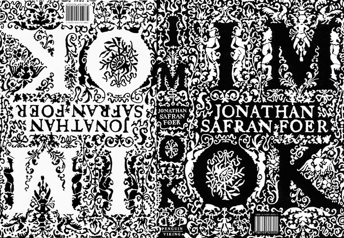

But covers like this are the exception.6
Which raises the question — if so much of what book cover design has evolved into is largely a brick-and-mortar marketing tool, then what place does a ‘cover’ hold in digital books? Especially after you purchase it? But, more tellingly, even before you purchase it?
Amazonium
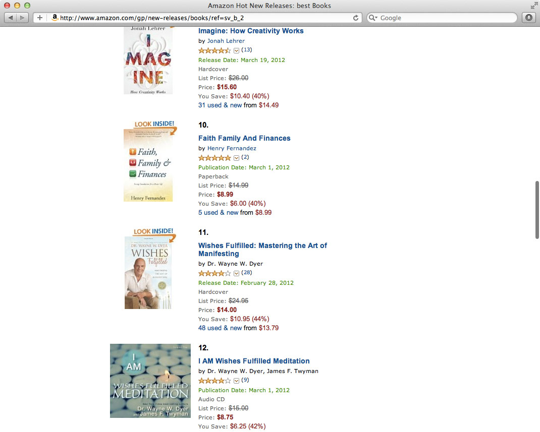
The collapse of Borders Books & Music shed light on what we already knew: we buy books online. Almost all of them. And yet, on Amazon.com the cover is nearly an afterthought.
Sure, it’s there, sort of:
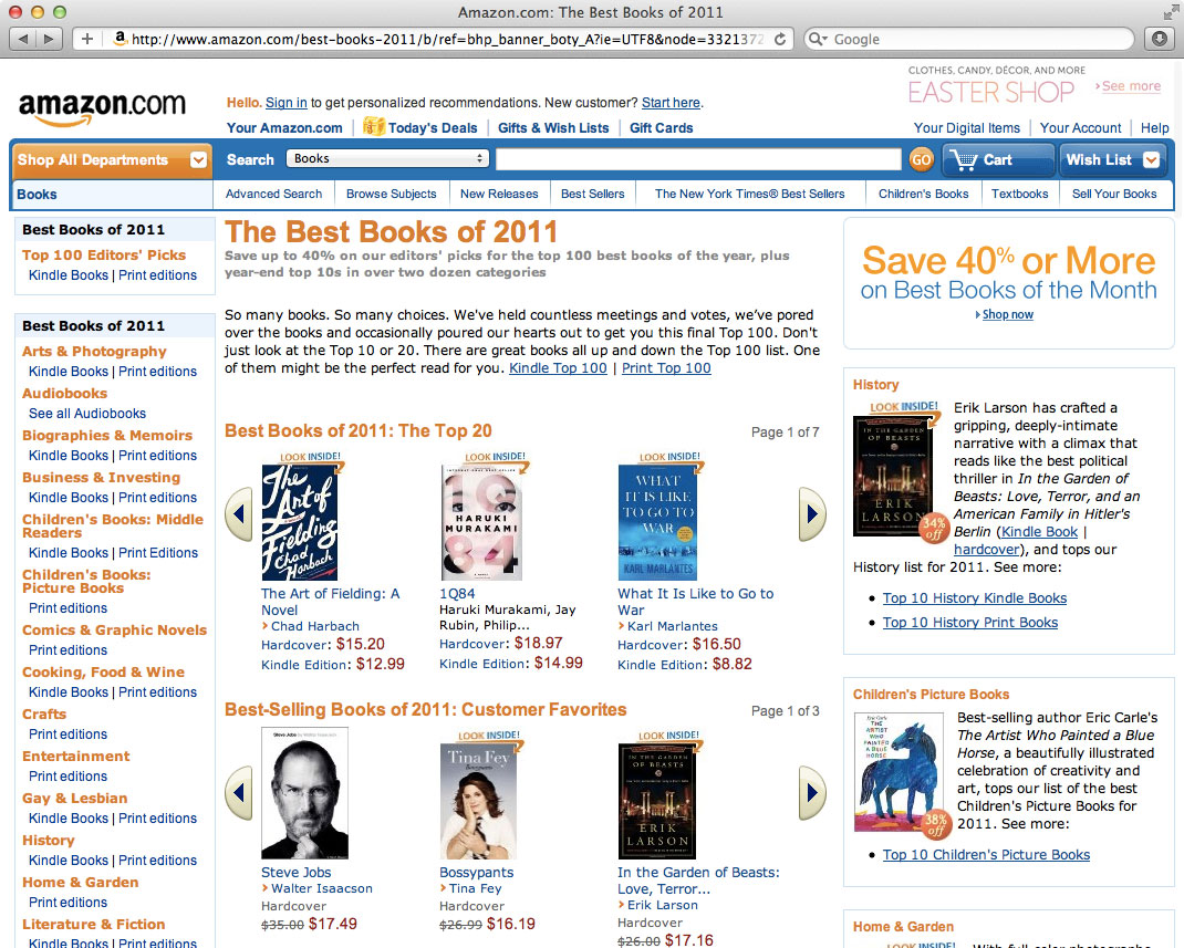
Looking at these images, it's clear: the cover is no longer the marketing tool it once was.
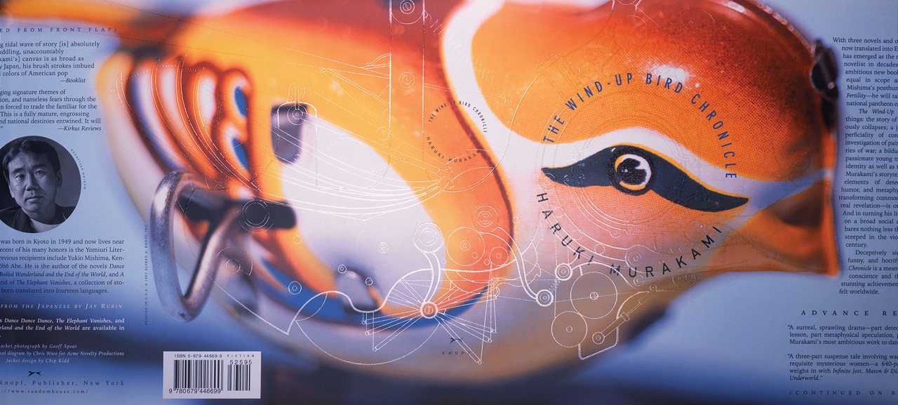
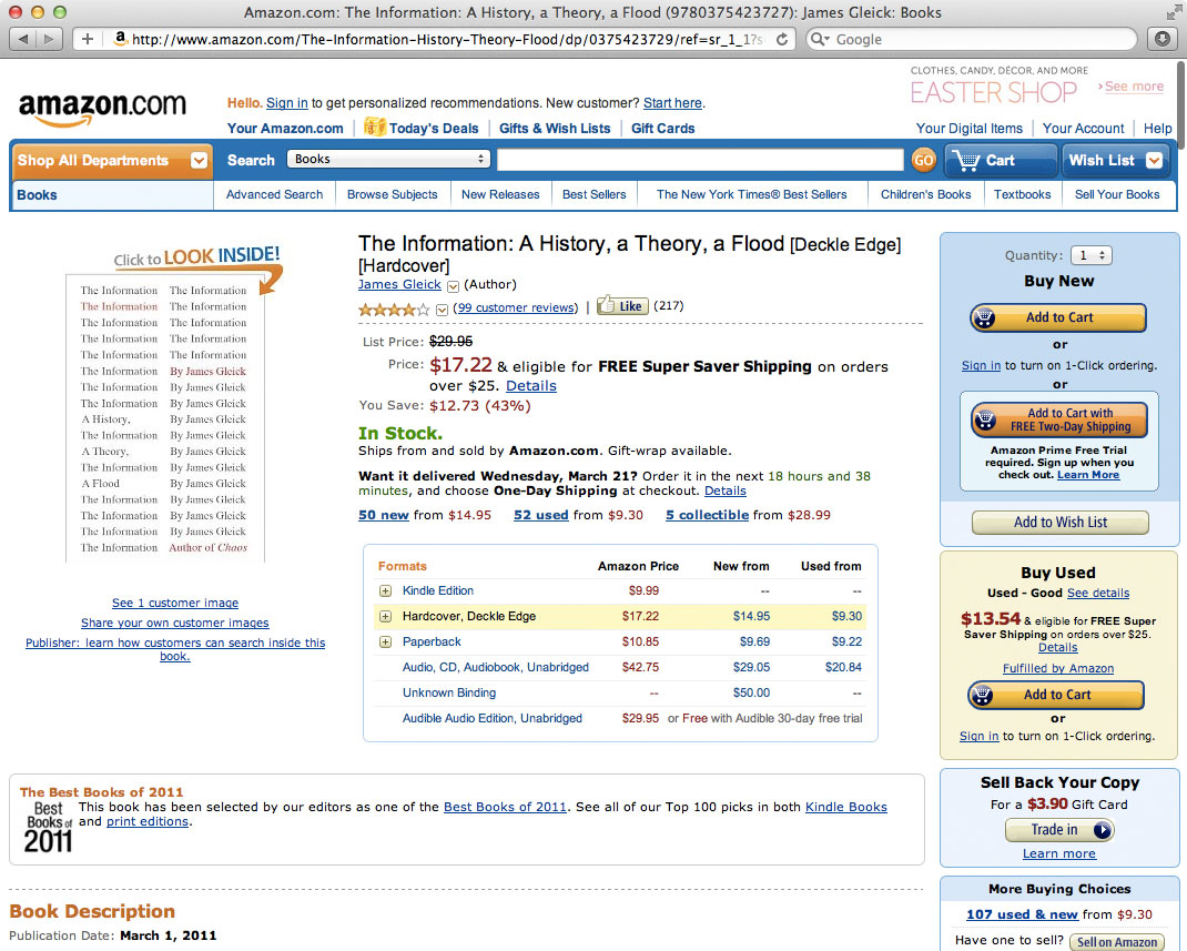
The covers here on Amazon.com are tiny on the search results page. Minuscule on new books page. And they're all but lost in the datum slush of the individual item pages. Great covers like Mendelsund's design for The Information disappear entirely.
Why? Because — What do we now hunt when buying books? Data.
The cover image may help quickly ground us, but our eyes are drawn by habit to number and quality of reviews. We’re looking for metrics other than images — real metrics — not artificial marketing signifiers. Blurbs from humans. Perhaps even humans we know! And within the jumble of the Amazon.com interface, the cover feels all but an afterthought.
Kindle Flow
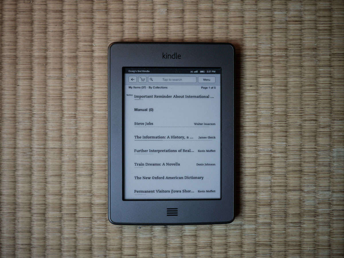
The hardware Kindle completely hacked — in the most common sense of the word — the cover out of the reading process.
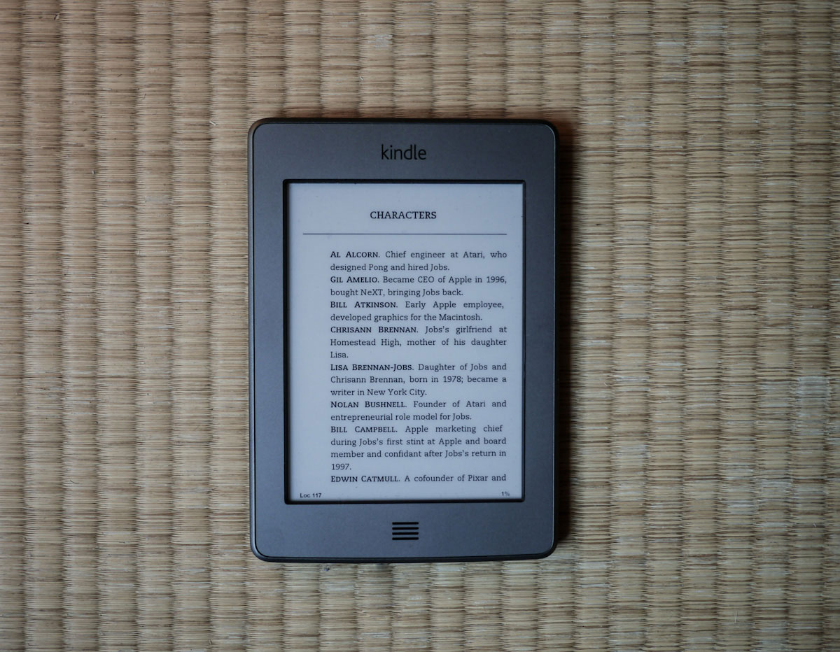
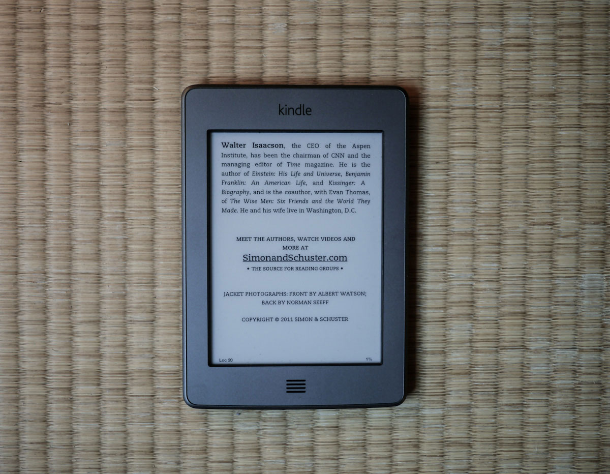
Clicking on a title in your Kindle’s text-only reading list (Fig. 1) thrusts you straight onto the first page of the first chapter. (Fig. 2) Front matter — copyright, table of contents — and, yes, the cover are skipped over. In the most recent Steve Jobs biography, you have to press the back button more than fifteen times (Fig. 3 — still not there) to get to the cover on a hardware Kindle. Which is a shame because certain black and white photography looks stunning on eink displays:

This user experience flow isn't a product of any hardware limitation. It's a set of decisions clearly designed around efficiency (and, possibly, data) — get us into the text as quickly as possible. Of course, this efficiency comes at the expense of intimacy.
We jump in and out of digital texts with little to no procession. In contrast, every time you set down a physical book, the cover is staring up at you. And every time you pick it back up, you have to go “through” the cover to get to the text. Do that five times and you'll never forget the title or author.7
The Birds
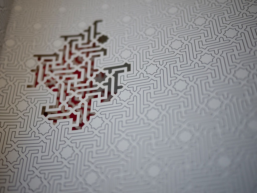
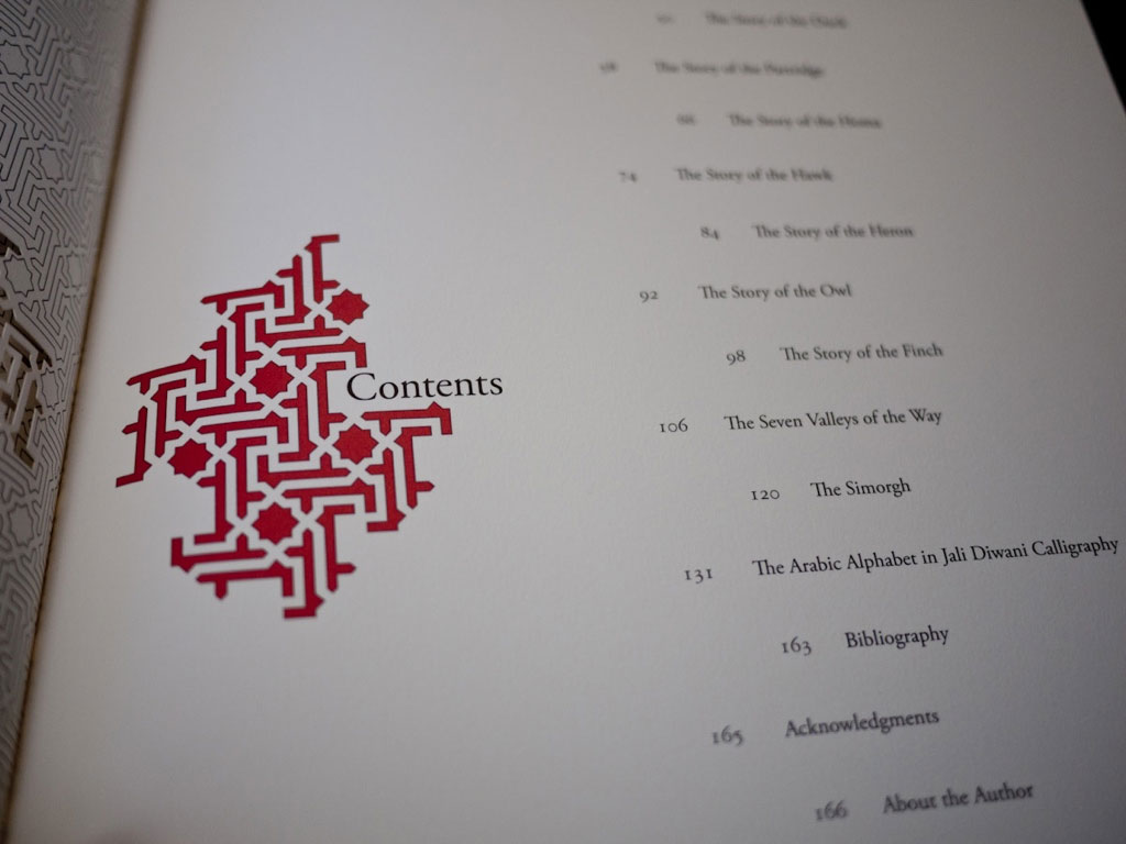
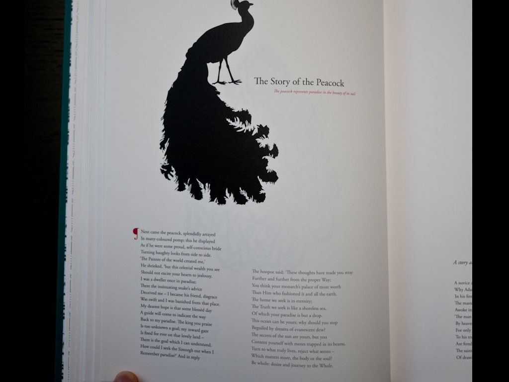
The Conference of the Birds8 — designed by Farah Behbehani and published in 2009 by Thames & Hudson, is an example of what covers (and the front matter into which they lead) do when executed masterfully: initiate procession.
After plying open the Amazon (of course!) box, you're greeted by an exquisite cloth slipcase (cover #1):

Inside that, the book. The design on the cloth cover (cover #2) plays off the design of the slipcase. And inside that, wonderful end papers.

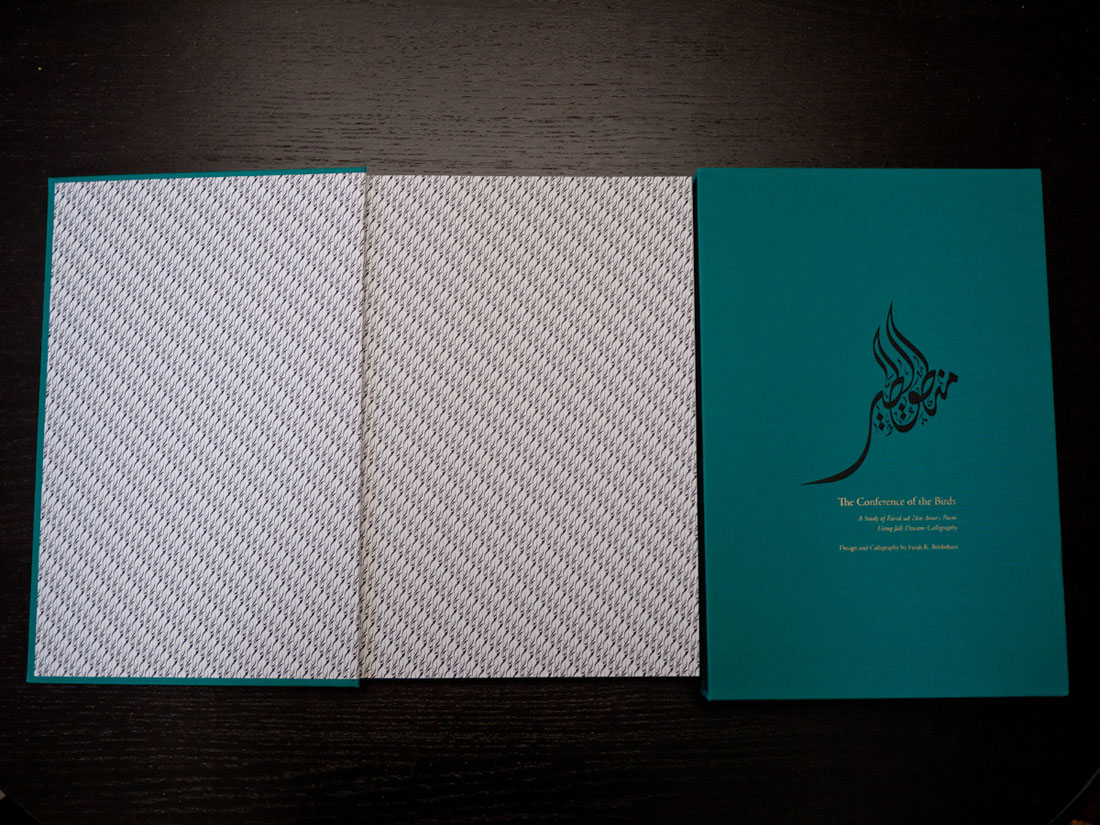
Tick. Tick. Tick. Tick. We're brought into the book. Each subsequent spread sets the tone as we're led into the front matter. The papers, the quality of printing, the balanced design cues; before you reach the table of contents, you know Farah Behbehani does not fuck around.


Once you're finally in the book — the Kindle equivalent of ‘page 1’ — you've gone from opening a cardboard box to a place of understanding. This is achieved through design nuance and production decisions — all of which are a response to the constraints defined by the physicality of books.


This isn't to say digital books need to have a faux slipcase, cloth textures, ‘endpages’ or half-titles. These parts of a physical book exist because they're functional. They're born from precedent. These are facts often overlooked in digital book design. Very rarely do we ask, Why?
Why the cover? To protect the innards.
Why a half-title? It's a hold-over from when there weren't covers.
Why cloth? Cloth is a damn fine material in which to wrap stuff you want to protect.
There is a tremendous opportunity for book designers and software engineers to figure out what our digital book procession should be. There's clearly something lost when you're thrown into a text without context — but how should that context be delivered? What 'function' should a cover serve in the digital book space? And even: What is the cover?
The Cover, Today
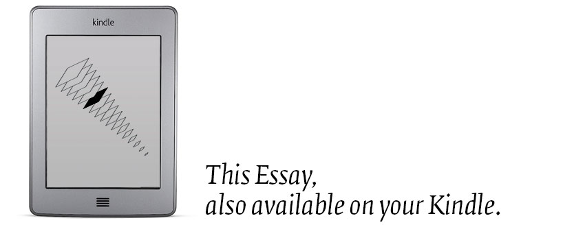
In iBooks and the iPad Kindle app, covers are reduced to thumbnails barely 200 pixels high. Most typography is rendered nearly illegible. And as certain books become applications, their covers become icons.
There is symmetry of loss shared among all physical media as it shifts digital. The ever shrinking book cover parallels the long, slow compression of music jackets. The designers of records must have felt a similar sense of constriction with cassettes and then CDs and now Rdio/iTunes thumbnails. So much lost canvas.
In a 20109 essay on covers, James Bridle smartly points out: publishers relinquish control when books go digital.
[W]e need to recognize that [cover] reproduction is out of our control: they will be copied, linked, and reposted, at different resolutions and sizes … We might also recognize that there are potentially many different jobs for the cover to do.
So how do you combat this lack of control? You design for total flexibility.
Domino

Seth Godin’s Domino publishing imprint embraces and codifies the diminishing cover.
The first Domino book, Poke the Box, has no words on the cover, just a line drawing of an excited man. To which Mr. Godin explains to readers confused by the lack of words:
“Who needs them? When you see the book online, it's always accompanied by lots of text. You read the text on the screen, the cover is the icon.”10
This is an ethos embracing book covers in the context of an Amazon.com sales page.
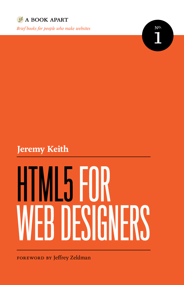
A Book Apart
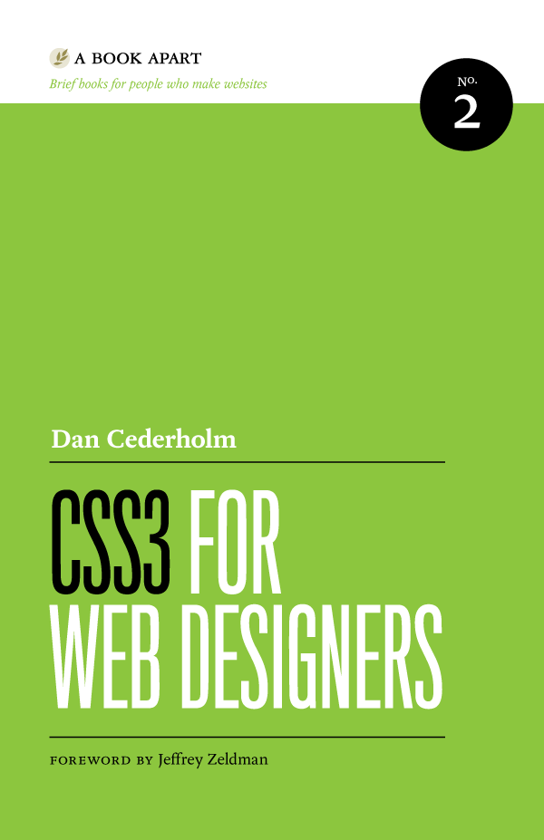
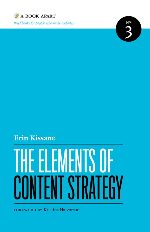
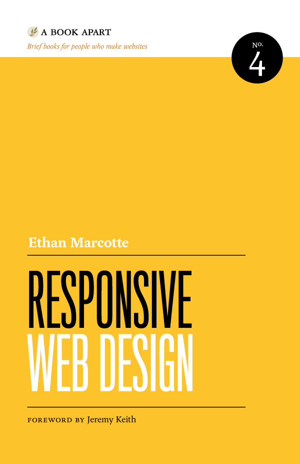
On the flip-side of this is Jason Santa Maria's minimalist design work for the A Book Apart imprint.11 Type and bold colors; large, condensed, sans-serif letters on a bright background. And these, too, work well at almost any size.


In Between
During our present, fleeting, pre/post period of publishing, many books will still flow through traditional retail distribution channels. As such, certain covers will need to serve both digital and physical contexts.
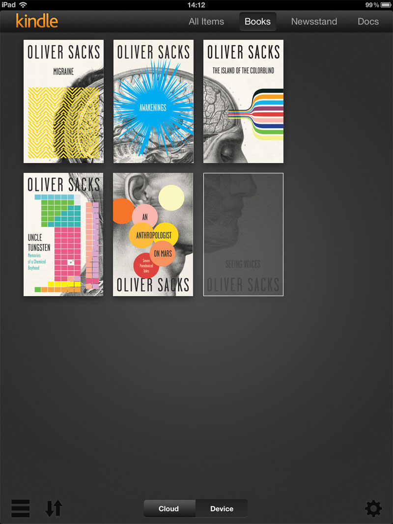
Cardon Webb's work for a series of Oliver Sacks books is stunning in print. But more importantly, shrunk down to icons, it forms a compelling whole:
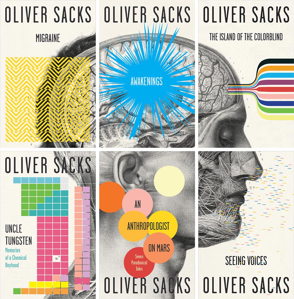
This is the kind of design solution that plays nice in digital space (even better than on your bookshelf — after all, where do you have space to place six books face-out?) and could invite collection in your iPad Kindle.app library, if the Kindle.app had such functionality:
At an O'Reilly conference in 2011 I remarked that covers as we know them are devolving into the vestigial tails of books. A coccyx of codex.
I thought the venue apropos because O'Reilly’s art directors so clearly understand the power of codification and brand that can be captured in covers. These are precisely the holdover cover qualities most organically transmuted into digital form. No other publisher of computer literature has so instantly recognizable cover branding as O'Reilly. And few other print publishers have a cover brand so readily applicable (with a few tweaks) to digital contexts.


Qualities
So what are the qualities of the above covers?
- Iconographic
- Large typography
- Bold
If you're going to create top-stack digital covers, these are qualities worth embracing. That these qualities are applicable to printed books, too, makes them the cornerstone of holistic design for covers in the age of the iPad.
Kindle first design: if your cover looks great on the Kindle, it'll probably also look great in print.
Notification Hacking
But why stop there?
‘Bold,’ ‘iconographic,’ and having ‘large type’ describe surface qualities of digital covers. But what about hacking the system behind the cover?
In realizing this essay, I went back and redesigned and rereleased three other essays — The Digital-Physical, Post-Artifact Books & Publishing, and Books in the Age of the iPad.
Here's the resulting series:
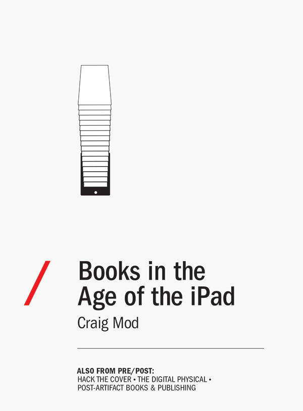
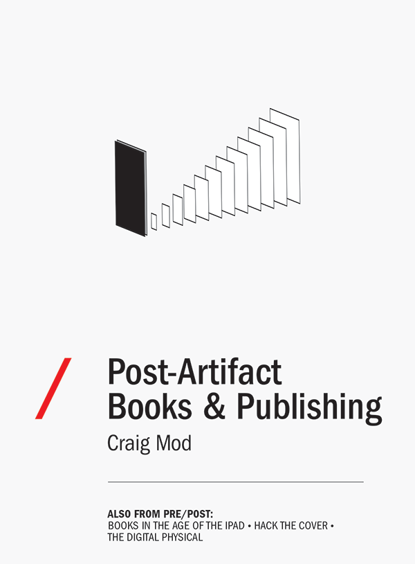
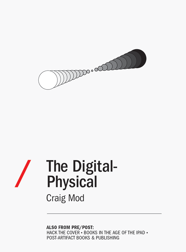
The small text at the bottom of each of these covers is the trojan horse — the hack.
Frictionless, nearly zero-cost distribution is one of the great qualities of digital publishing. We can update a book as much as we like. If the cover is no longer a visual marketing tool, why not leverage these digital distribution systems and make the cover a notification tool?
When I publish a new essay I can update all the previous essay covers. If you've bought one of the other essays, you'll get a ping — “Books in the Age of the iPad has been updated.” 12 The covers will change, incorporating the title of the latest essay (highlighted in red, for example). It's kludgy, but we're hacking iOS-style notifications into the Kindle platform, using the cover as a delivery mechanism.
Is it ideal? Of course not. It's a hack. If you're reading on an eink Kindle, you probably won't notice the update. But you may on an iPad or Kindle Fire or iPhone.
Can I imagine a more elegant solution? Of course. But if we want our digital publishing systems and tools to evolve, we need to push against the edges of what's currently available.
What a hack like this really illuminates is the vast and artificial digital distance between authors and their audience on a platform like Kindle or iBooks. As an author you would think these platforms would do a better job at fostering community between writers and their audience. Or between fellow readers. Perhaps, someday.
Innards
Of the physical books I’ve designed, my platonic goal was to evoke a classic sense of cover. Functional covers. Unrippable covers. Covers for books you can toss in a bag and not worry about. Simple covers that bleed into the bodies of books.
These are covers not designed independent of the rest of the book. They are part of the whole. Covers meant to ease the reader into the story. To help establish a tone (but not have final say). They are important but not critical (which is critical) to giving the book an identity. They are but a piece within a larger design system.
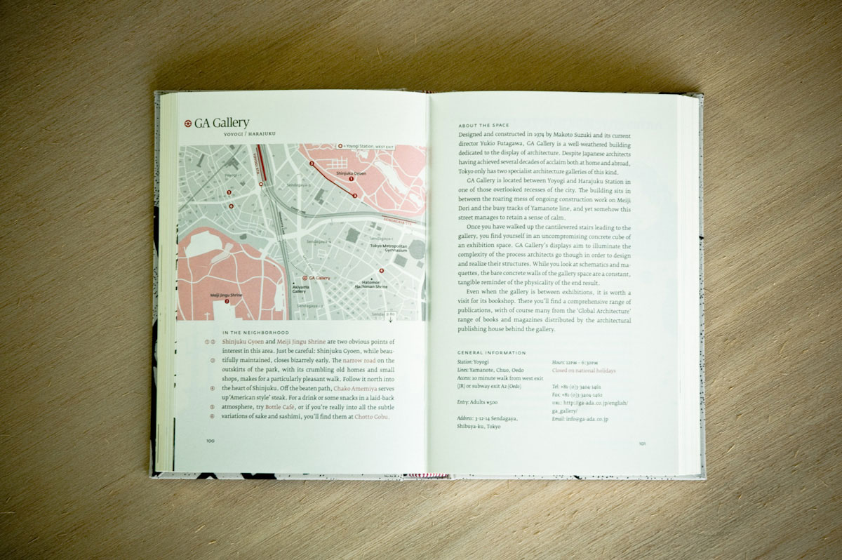
In fact, for me, more than designing the book covers, I far enjoyed designing the interior blocks. The interior — this is the meat and potatoes of a book. Unlike the cover, there isn't much glory in interiors. But in that neglect lies the fun: it's in the interior you get to play mind games with your readers. Shift the tone. Affect meaning. Give life and form to the text.
Here are four books I designed. If you open any of these books without looking at the cover, you'll notice they each have a unique and confident visual identity. Through typographic, illustrative, or layout choices I attempted to string a common thread between the cover and the interior. In doing so, the cover, as it were, is everywhere:


The Shape of the Digital Interior
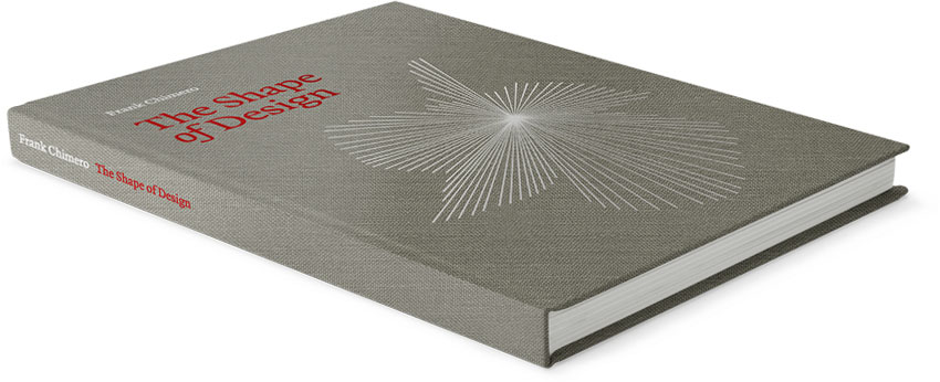
Frank Chimero's The Shape of Design13 is one of my favorite recent examples of a digital book that masterfully threads a singular design vernacular from cover to interior.

Jump into Frank's ebook willy-nilly — any of these chapter opening images could be a cover. He has, on the most base level — within the constraints of our current ebook systems — distributed the cover throughout his entire book.
Even within iBooks' limited selection of typographic options, Frank's chapter openings, headers, and spacing all mimic his print edition. He's built his text upon a holistic design system tying The Shape of Design between mediums.
Digital Wrap
I like to think that digital is forcing our hand back into this classic, holistic book design ethos. An ethos that considers the design of a book in its entirety instead of in pieces.
The covers for our digital editions need not yell. Need not sell. Heck, they may very well never been seen. The reality is, entire books need to be treated as covers. Entry points into digital editions aren't strictly defined and they're only getting fuzzier. Internet readers don't casually stumble upon books set atop tables. They're exposed through digital chance: a friend tweeting about a particular passage — and linking, directly, into that chapter.
I wrote about this very phenomenon in A pointable we, a series of essays explaining why it's critical for publishers to understand the way in which digital texts are discovered and what happens when you wrap them in the wrong interfaces:
This lack of platforminess is what makes many iPad magazine apps impotent. They end up in no better a position than a printed magazine. There are no routes by which you can directly get to their content. You can't point in. You're forced to go through the “front door” to get anywhere. And it's a door usually weighing several hundred megabytes and infuriatingly difficult to unlock.
To treat an entire book as a cover means to fold the typographic and design love usually reserved for covers into everything. Type choices. Illustration styles. Margins and page balance.
Again, see: The Conference of the Birds.
Or, this:14

All the Covers
Dead! Sure, they are. In the same way that glue for a paperback binding is dead, or sewn in bookmarks are dead. There's a digital glue holding our electric pages together, but it's different. And there's a way to bookmark your Kindle ‘page,’ but that's different, too.
Of course digital books will have a static visual — a ‘cover’ — to represent their contents. But that visual will be smaller rather than larger, and often it will compete with other, more powerful data.
The classic notion of a cover made digital is more like a book's .favicon rather than a gateway into the text. It's at best a small piece within a larger design system, and at worst, never seen.
Procession
About the ‘procession’ mentioned earlier? As designers and engineers, we need to find a way to bake in a context specific procession. Just as we're led so masterfully into The Conference of the Birds, so too must we be led into our digital books.
Books of definite content have embedded within their DNA a certain amount of visual context. But even formless books require procession regardless of how the reader may enter the text.
Tools
Readers and authors alike would benefit from tools and containers that understand how a reader got to the text, if they've been there before, and what they may be looking for. If this sounds a lot like web design, it's because the two — digital book design and web design — are, on some levels, melding.
Sadly, our digital book production tools don't yet allow designers to engage digital books like this. Nook and Kindle all but completely eschew the hand of the designer. iBooks Author begins to move us there in fits and starts.
Retina screens on tablets mean letterforms look great. The hardware has caught up to our design desires. The onus now lies on the software to allow us to realize these design visions.
To Delight
And so with this great digital flood — and the Death! Death! Death! of the cover — comes a chance to reconsider how we think about covers. To break from nostalgia. Or, even better: to lay the foundation for a new nostalgia.
But perhaps most importantly, embedded within all of this is the chance to delight readers undelighted. I think back to my first visit to Kinokuniya — to that delight — and embrace that emotion.
Consider the readers — the readers who have slogged through poorly considered digital editions. Readers who may have never known a well considered cover. Who have yet to experience a tome — digital or physical — of rational size, crafted with comfort and intimacy in mind. Something with ample white space, a mark of ink, the perfect splash of data.
Let's build our digital books for them; delighted, starting with the cover, hacks and all.
An earlier version of this essay appeared in the first issue of Codex Magazine.
Further, recommended reading:
Has Kindle Killed The Book Cover?, Betsy Morais, The Atlantic, April 16, 2012
Scan This Book!, Kevin Kelly, The New York Times, May 14, 2006
The End of Authorship, John Updike, The New York Times, June 25, 2006
Referenced or Noted
- The Coldest Winter: A Stringer in Liberated Europe, Paula Fox ↩
- Library: An Unquiet History, Matthew Battles ↩
- There's an intoxicating (addictive? reductive? inspiring?) sense of rationality in so much of the design (food? culture?) Japan produces. Fukasawa's work for Muji. Heck, nearly everything Muji produces. Hario's coffee products. Kamawanu's tenugui. Tatami flooring … I remember while serving as a judge for the Art Directors Club years ago, nearly every poster that knocked us down with elegant minimalism came from Japan. Then, of course, Japan also produces websites like this: http://biccamera.com. ↩
- I had a similar experience nearly a decade later when I walked into La Hune bookstore, Paris. Perfect little white books, everywhere. ↩
- For the unequivocal compendium of beautiful covers, look no further than The Book Cover Archive ↩
- There are, of course, oodles of horrible covers in the Japanese market. Ones garish and obnoxious. And Japanese covers, too, are marketing tools. However, the overall sense seems to be — true or false — that everyone agreed to not introduce the equivalent of super-sized meals to the market. They agreed to generally keep the fight clean. To maintain some semblance of grace. To not make marketing a strict screaming match. I've always felt England exhibited a similar sensibility towards cover design. I've often found British covers of books to be more thoughtful and elegant (with higher paper quality, too) than their American counterparts. ↩
- This also speaks to the cognitive distances we face with digital stuff. Sure — I can press the home key and see the title and author of the book on my Kindle but the screen updates slowly. What takes 1/10th of a second to perform with a physical book — flipping the cover into view — takes 3-4 seconds on a hardware Kindle. We're weird like that. Lazy. Why do you think Google is so obsessive over milliseconds? Because our monkey brains are impatient and fickle. ↩
- The Conference of the Birds, by Farah Behbehani, 2009 (There are several versions, but trust me — you are looking for the expensive, hulking, hardcover version.) ↩
- I found James' essay while hunting O'Reilly book covers. The fact that there's nearly two years of distance between his post and this one speaks to both the tremendous speed by which publishing is changing (systems) coupled with the tremendous reluctance to change (surface). ↩
- Why Aren't There Words on the Covers of Our Books? ↩
- A Book Apart ↩
- Some technical implementation details: normally, updated books are only seen by new customers. If you want old customer to get the new book you have to email Kindle Direct Publishing and notify them that you've made a significant change to the file. They will then send an opt-in email notification to existing customers, letting them know the title has been updated. They may lose highlight / note data. Like I said: it's a hack. ↩
- The Shape of Design, Frank Chimero ↩
- The Gutenberg Bible. Thanks, Wikipedia ↩
About the Author

Craig Mod is a writer and photographer based in Japan. He's the author of the books Things Become Other Things and Kissa by Kissa and is a MacDowell, Ragdale, and VCCA writing fellow. His essays and articles have appeared in The New York Times, Eater, The Atlantic, California Sunday Magazine, Wired, Aeon, New Scientist, Virginia Quarterly Review, The New Yorker, The Morning News, Codex: Journal of Typography, and elsewhere.
He writes newsletters, oh yes, newsletters: Roden & Ridgeline.
The work on this site is supported 100% by paid memberships and book & print sales.
Thank you
For editing and advising the first draft for Codex: Carolyn Wood and John Boardly. For those Illustrator tips: Frank Chimero. For reading: Peter Collingridge.
Copyright
All images (where applicable, of course) and text © Craig Mod, 2012.
This work is distributed under the Creative Commons Attribution-Noncommercial-Share Alike license. If you wish to use reproduce any of this context in a commercial context, explicit permission is required. Please contact me directly.

This work is licensed under a Creative Commons Attribution-Noncommercial-Share Alike 3.0 United States License.
Where this was written (because it's good to remember)
On the Cal Train. At a wooden Ikea table late a night in Prospect Heights, feeling the Q and R and 2 and 3 rumble deep down below. Gazing out at the Brooklyn and Manhattan Bridges at Studio Mates. In the Blue Shala atop tatami.
Throughout March 2012 in Japan — At Cafe Muji, Omotesando, early in the morning as the kitchen staff suspiciously eyed the frequently lingering, coffee loving foreigner. Bear Pond. A smokey bakery inside of Yoyogi Uehara station. On the second floor of the new Tsutaya in Daikanyama. A few paragraphs at Cafe Facon in Nakameguro. The Denny's on Kyu Yamate Street just for old time's sake — and yes, it's still full of the sort of folks you expect to encounter deep into a Thursday night.
The KP ventures space in SOMA. Samovar. Red Rock. Venetia.