
A not-so-long time ago in a publishing landscape kinda nearby, in a universe before Kindles spat fire, when epub was a bar in east London and ‘mobi’ was still a whale, when we carried bound bricks of paper, covers out for everyone on the F Train to see, a time when young girls spinning vampire tales on their blogs had yet to become publishing darlings, before British housewives were unknowingly getting off to Twilight fan fiction, and when we had yet to flip boards, be zite read or book pressed — back in this time, the year of 2010, the iPad emerged and we — Ashley Rawlings and I — ran a Kickstarter campaign to breathe life back into a book called "Art Space Tokyo" and, oh sweet lord, have things changed.
When we ran our Kickstater campaign, raising $25,000 was a pretty big deal. Now if you don’t hit $100,000 you’re a nobody, and if you don’t amass $1,000,000 you’re not worth blogging about. Crowdfunding went supernova and digital publishing, too, has shifted from a niche backwater to very soon becoming the way most books are sold.1 While it’s easy to see the material changes produced from crowd funding, some of the transitions, foibles and triumphs in publishing might be less obvious.
Platforms
And so, in the last two years a simple, strong truth has emerged: The future of books is built upon networked platforms, not islands. More than any surface advancement — interface, navigational, typographic, or similar — platforms define how we read going forward. Platforms shape systems — those of production, consumption, distribution — and all critical changes happening in digital books and publishing happen within systems. Post-artifact books and publishing2 is not just about text on screens.
As part of our Kickstarter campaign, we promised a digital edition of "Art Space Tokyo". We’re finally delivering on that promise today. But more than dump some files in your lap and run off, we want (as we are wont) to fully open the kimono.
With an eye towards platforms, let’s look back on what has happened in the past two years, and make some sense of how we arrived here.
"Art Space Tokyo", digital
We’re publishing the digital edition of "Art Space Tokyo" in several formats, across multiple platforms, within two distinct ecosystems:
- open (the web)
- and closed (iBooks, Kindle & other ereaders)
The web
"Art Space Tokyo" needed a touchable home. An online, public address for all its content. We gave it just that: http://read.artspacetokyo.com. The entire book is there. All the interviews, essays and art space information. Everything has an address to which you can point.
Why do this? I strongly believe digital books benefit from public endpoints. The current generation of readers (human, not electronic) have formed expectations about sharing text, and if you obstruct their ability to share — to touch — digital text, then your content is as good as non-existent. Or, in the least, it’s less likely to be engaged.3
I also believe that we will sell more digital and physical copies of "Art Space Tokyo" by having all of the content available online. The number of inbound links to the site should increase exponentially. read.artspacetokyo.com is one of the largest collections of publicly available text about the Tokyo art world online. Organic search traffic should increase accordingly, and by having upsells on every page, the conversion to paid users should follow suit. We'll report back with numbers in time.
Just because a collection of text is called a ‘book’ doesn’t mean it can’t act like a website. On read.artspacetokyo.com we purposely broke the strict linearity of the physical "Art Space Tokyo". The ambition is to extend the content indefinitely in more organic ways.
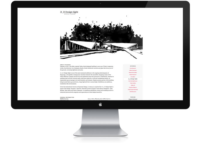
Here’s the website on a 27" desktop:
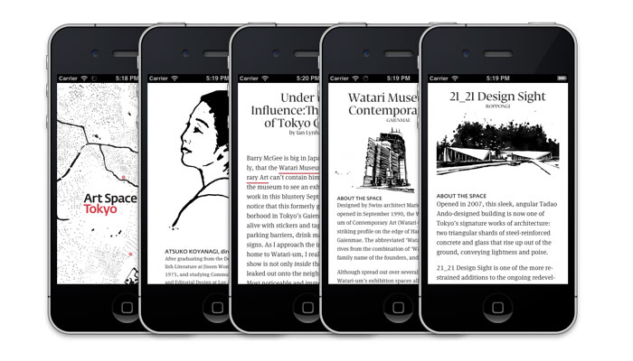
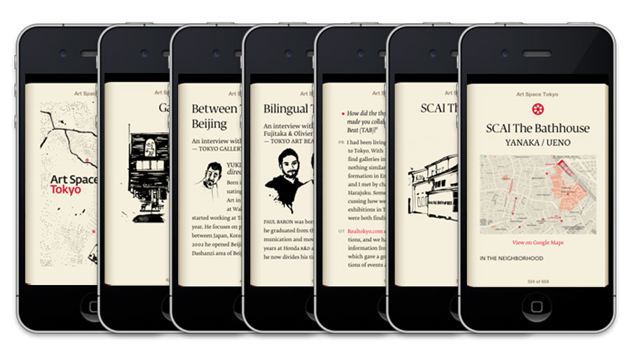
Here’s the same site on an iPhone:
More details:
- read.artspacetokyo.com is optimized for mobile — a given these days but doubly important for a guidebook like "Art Space Tokyo".
- If you "Add to Your Home Screen" on an iPhone or iPad, you get a retina home icon and retina startup screen.
- By using a simple javascript library, we are able to keep you in that homescreen ‘app’ despite the use of hyperlinks to jump between pages.
- We continue the use of Fedra Sans and Display between print, pdf, .epub and .mobi files on the web thanks to Typotheque’s @font-face support.
This brings up a great question:
If all of this is available for free, how do we make money?
Platforms and premium products.
Platforms and premium products
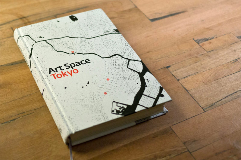
Our keystone premium product is the physical edition of the book. But we also feel that there is value in buying a ‘real’ digital edition of a book tied to an ecosystem (or DRM free for you to add it to an independent ecosystem).4
For example buying a Kindle book directly from Amazon means the text is hooked into all the goodness (note saving, sharing, community highlighting) of the Kindle platform. There is real value in that connection. Value worth paying for and value that carries the promise to become more useful over time.
Kindle & iBooks & PDF
"Art Space Tokyo" is available for purchase as an official Kindle, iBooks or Nook book. You can purchase it individually on each platform for $8.99. But if you prefer to use a different platform, then we offer an all inclusive digital package containing DRM free .mobi, .epub and .pdf files. That package is $14.99.
Physical + Digital
If you buy the physical edition, let us know and we’ll send you the digital bundle for free. And, of course, if you’ve purchased a physical copy in the past, we’ll happily send you the bundle, too. Just mail us: support@prepostbooks.com
Landing here
When we announced an ‘iPad edition,’ we made a very conscious decision not to say ‘iPad application.’
Think back: In May 2010, the iPad had just been released. The landscape for publishing on the iPad was nonexistent and we had lots of reservations about books-as-apps as the correct model. It seemed overly complex, especially for a book originally conceived of as a printed object. So at the time we decided to focus on the physical part of the Kickstarter campaign — update, print, and redistribute the clothbound, hardcover edition.
It took a few months of full-time work but we shipped the books. They looked great. Our backers were happy. We then spent a month taking all the knowledge gained during the campaign and gave the community a full post-mortem: Kickstartup. Kickstarter even gave us a ‘Best in Show: Post-Mortem’ award which made us smile.
App what?
Fall of 2010 arrived and the more we looked into developing a custom app for "Art Space Tokyo", the less rational it seemed. Even ‘simple’ apps are hard. Really hard.5 And whether simple or complex, almost no one was doing it right.
By this time, several major publishing houses had released magazine applications. Wired, Popular Science, and The New Yorker were among the first few. They were disappointing. The text was images. The file sizes huge. The download process for each issue was awkward. They weren’t friendly to screen readers. This certainly didn’t feel like the right direction for digital reading, never mind our humble "Art Space Tokyo".
To worsen matters, the navigation was confusing — each application a little different. The clarity of physical magazine usability — ‘just keep swiping’ — was lost in an effort to ‘innovate on’ and shoe-horn print workflows into a digital box. The apps just didn’t work.
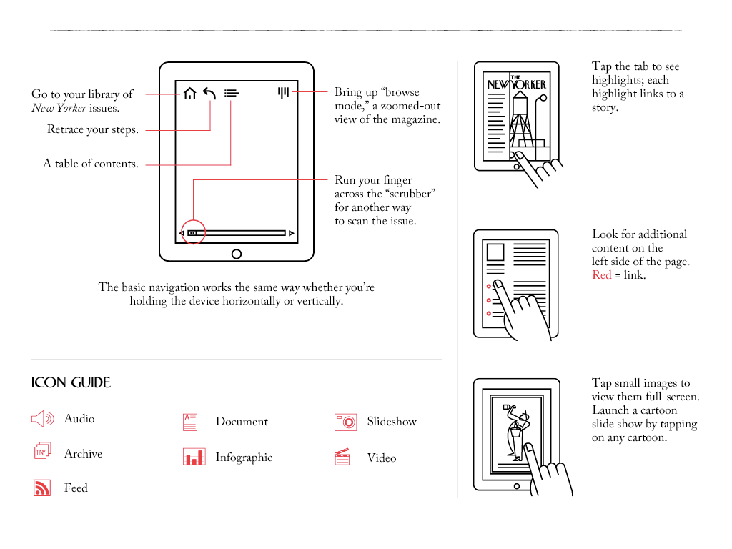
In fact, the more we looked at these frankenstinian magazines, the more we realized that a PDF would be a better solution. A PDF would at least be made of ‘real text.’ It would be inherently searchable. It would compress well. Navigation would be consistent: Just. Keep. Swiping.6
Simple PDFs
So we began to play with "Art Space Tokyo" as direct-from-InDesign PDFs formatted for portrait and landscape. They worked, sort of. The text was a little small, and they were a bit clunky, but you know what? They offered a better user experience than most of the standalone apps we had seen.
What out-of-the-box advantages do you get with PDFs?
- No development cost.
- Relatively small file size.
- Ability to read / search in iBooks on all iOS devices.
- Real text.
If you drop the PDF in Dropbox, you get a completely cross platform, cross device, always synced digital book. Sure, it’s a bit of a hack, but it was still better than the standalone app solutions.
Of course, PDFs as a decent way to read on an iPad was hardly a find worth writing about, let alone releasing as the ‘iPad edition’ of "Art Space Tokyo". I wanted to dig deeper.
EPUB
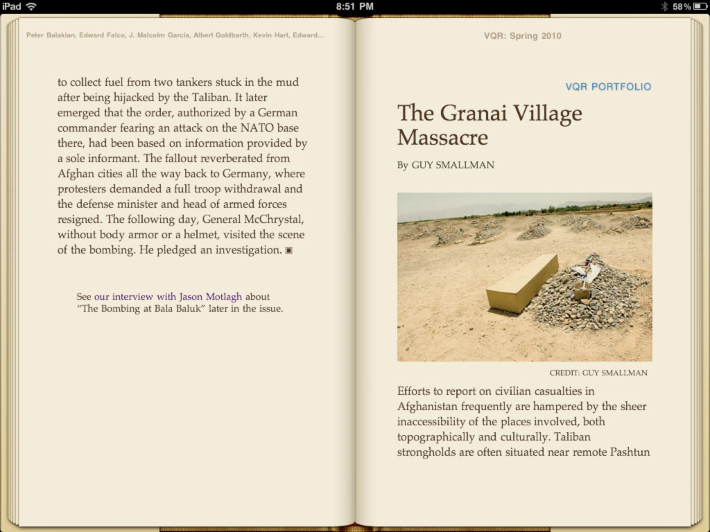
The first time epub excited me was when I saw Waldo Jaquith’s work in late September, 2010.
I had largely written off iBooks. It was so horribly skeuomorphic — all fake pages and page curls, sophomoric typography and no hyphenation. I wanted nothing to do with it. But Waldo’s work for Virginia Quarterly Review piqued my otherwise lost interest. He had spent time producing what was by far the most promising iBooks publication I had yet seen.
There were proper page breaks and headers. Clearly defined typographic hierarchy. Strong photography. Sure, VQR was simple, and compared to the visual complexity of custom apps it was easily dismissed. But within his markup was the germ of something special. Furthermore, it was produced with little overhead and adhered to open standards: two qualities not present in any of the standalone magazine applications.
Simultaneously, rumblings of ePub3 began to surface. While in attendance at the 2010 Books in Browsers conference, Bill McCoy held forth on the recently ratified status of upcoming epub3 standards.7 The digital book world and web design world were on a collision course. HTML/CSS/JS looked to be the core of epub3. This was geeky stuff of the best kind for digital content folks. Especially those of us who knew how to make websites.
eink
Soon after, in November 2010 I bought my first hardware Kindle. I was in love. Even today, the hardware eink Kindle is one of my favorite pieces of technology. It’s one of the most quiet tech objects I own.8 It gets out of the way when reading, has worldwide cellular connectivity, and the battery lasts nearly forever. It’s magic.
My attention was captured by these two pieces of technology: iBooks coupled with ePub3, and the elegance of hardware Kindles coupled with the promise of their Kindle ecosystem.
Book platforms
Throughout 2011, iBooks incrementally improved its handling of complex layouts, custom fonts, and proper hyphenation. It would generally come to feel much more design-friendly than Kindle. On the other hand, Kindle would establish itself as a true reading platform with cross-device integration, a web presence, social reading hooks, and innovative lending and sharing capabilities.
By adhering to epub standards and building atop these preexisting, well defined platforms, you get a lot of great functionality for ‘free.’
- They’re true, self-contained reading platforms.
- As such, they’re built specifically for selling & consuming book-like content.
- They’re based on real text: no images-as-text nonsense.
- Interaction is standardized between all of their books. Readers don’t need to re-learn how to read. Up-down-left-right? Nope: Just. Keep. Swiping.
- The Kindle has hooks into social networks allowing readers to effortlessly share highlights and notes.
- Both iBooks and Kindle contribute to a psychological sense of building a "library" or reading space, as opposed to "adding just another app."9
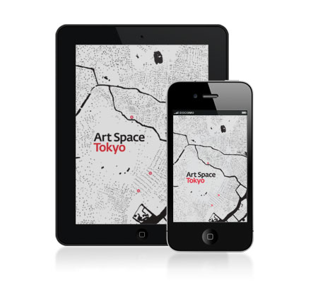
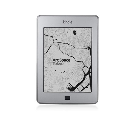
- Nobumasa Takahashi’s illustrations look stunning on an iPad, iPhone and even eink Kindle.
- @font-face support: We licensed Typotheque’s gorgeous Fedra font family to carry the "Art Space Tokyo" "brand" between print and digital.
iBooks only:
- Slightly more complex layouts — we were able to eke out an impressive amount of typographic nuance in chapter openings, author bios, interviews and other key points of the publication. Combined with Typotheque’s fonts, it’s a great looking formless digital book.10
Kindle only:
- All the recognition, trust, and simplicity that comes with buying from Amazon.
- Reader highlights and notes are added to Art Space Tokyo’s Kindle corpus of data …
- … resulting in community metrics like 'most-highlighted passages.'
- If a user has public notes and highlights turned on, then their reading status and marginalia are broadcast to followers on kindle.amazon.com.
- The Kindle edition works across more devices — iOS and Android. Buy once, read everywhere.
- The highlights Kindle users share on Facebook and Twitter have unique landing pages. This creates and closes a share-view-buy loop presently lacking in iBooks' ecosystem.
What do you give up? Well, you give up extensive interactivity. Your publication must bend to the “page” model (as opposed to scrolling). You have less control over the visual language of your book (in the case of non-Fire Kindle devices, almost no control).
For some books, these disadvantages are showstoppers. And if you have a book that’s breaking the way stories are told, then by all means make an app.11 But "Art Space Tokyo" is a pretty “normal” book. It was written with a classic print ethos in mind. The structure is, if not explicitly linear, then well defined. And any “interactivity” can be augmented with links to external resources.12 In our case, the advantages of the iBooks and Kindle platforms outweighed the inherent disadvantages. And far far outweighed the disadvantages of designing, engineering, and maintaining a standalone application.
I believe this to be the case for many books out there. And so that’s why I’m so bullish that what we have done with "Art Space Tokyo" can act as a template for other publishers. And for the publishers already publishing in this manner, I hope this account affirms your choices in platforms.
Massaging the medium
I was introduced to Ron Bilodeau of O’Reilly Media after asking around for 'the best' EPUB guy. A dubious search term, but one which Ron absolutely fulfilled. After a few phone calls he agreed to take our InDesign files and rejigger them to output beautiful .epub (iBooks) and .mobi (Kindle) compatible files, with a fully linked-up PDF thrown in.
The reality is: it’s no simple process to get a somewhat complex InDesign document to cleanly output into .epub. I asked Ron to share with us a complete outline of his process. It’s incredibly detailed and, quite frankly, petrifying. It involved rebuilding our InDesign files with an eye towards digital output, custom shell scripts, and lots of non-obvious tweaks to get the output looking great. Here, take a peek:
Crazy, right?
And so what did we end up with? A pretty gorgeous iBooks publication and a very functional Kindle edition. It looks great on iPad and iPhone. And thanks to Kindle, the book is accessible and present on all Android devices. There’s also a well formed, fully linked up PDF thrown in, too, if you purchase the digital bundle.
Unified design
The goal of the iBooks and Kindle editions isn't to perfectly replicate the print edition. It is to take the design cues and layout ethos of the print edition, and bring it to digital in as unaffected way as possible. We wanted to draw a line connecting the digital and physical editions without compromising either experience.
The design connection is made through the following elements:
- Typography: because iBooks and Kindle (Fire) support @font-face, we were able to license the same fonts we used in the print edition. The headers and body text are all unified.
- Iconography: we use the same AST 'location' icons — the red circle with the typographic white petals — prominently throughout all editions.
- Illustration: Nobumasa Takahashi's ink drawings and our hand-crafted maps display equally well no matter the medium: print, eink, retina or desktop.
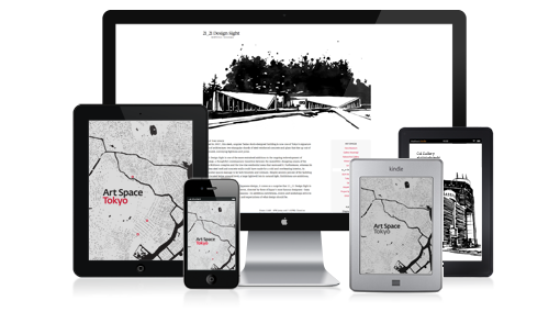
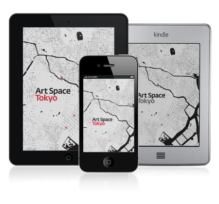
These connections become obvious when you start to look at the editions next to one another:
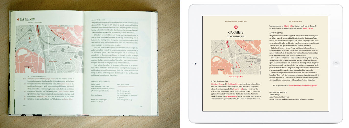
You can see all three points above: alignment in header and body text type, iconography and illustration. But also note that we aren't attempting to force every print layout decision into the iBooks edition. A very simple example: because iBooks keeps running, centered headers at the top of every page, we opted to shift the header positioning for 'space' pages to center- from left-aligned.
And if you look at the iBooks edition on iPhone, the same design and typographic elements are clearly present.
And of course all of these elements are present in the online edition, too.
Transitions from physical to digital don't need to be one-to-one forced representations. A defining quality of good design is one in which the essence of a thing can be transmitted between mediums while staying true to the new medium. Or, in Mr. Chimero's words, "What is the marker of good design? It moves." 13
Is everything perfect? No. But it's pretty good. Certainly acceptable. These platforms are still young and evolving. As they mature, we'll be watching and making more beautiful, better formatted digital editions.
Two years from now
Nearly two and half years ago, iPad went on sale. Kindle sales were growing but had yet to hit their sharp inflection of 2011. 14 Our thoughts around digital books and magazines were largely grounded in: "How do we put books and magazines into these devices?" rather than, "How does digital affect books and magazines?" 15
If you look at iBooks and Kindle (iOS/Android apps and hardware) today and compare them to iBooks and Kindle (apps and hardware) from 2010, superficially they aren’t that different. They both display basic formatted epub-like files.
Everywhere
The massive shifts in publishing in the past two years have been those of adoption and distribution. Crowd funding can help provide publishing capital. If you create just one file — one file — an epub, you can publish to nearly every single mobile device in the world. Amazon, iTunes, and B&N handle mass market distribution and sales. Provide a download link for your epub and individuals in Africa, India, South America, Thailand and Vietnam (to name just a few markets) can download and read your book on their feature phones. Ereading devices are quite nearly everywhere.16 And the support, distribution and consumption layers are all in place.
More readers read digitally. More authors sell books directly to those readers.17 Outside of digital, small presses embrace stockless print-on-demand relationships with national distributors (something unthinkable even five years ago). In other words: the systems have changed.
Dot dot dot
With device ubiquity and strong sales, it’s now time for platforms to mature. kindle.amazon.com has sat largely unchanged for years. iBooks doesn’t provide an online (or offline) home for your highlights, nor even the slightest grumbling of a social reading experience. Startups like Readmill are building beautiful social solutions, but because they can’t tie directly into the iBooks or Kindle ecosystem, there’s a lot of friction between wanting to use and actually using their services.
If you’re a publisher wondering what to do, the lowest investment, highest return action in this liminal stage of digital publishing is to embrace open epub standards. Unless you want to architect a cross-device platform with cloud syncing, hire a full dev team to support that platform, and iterate relentlessly as standards are hacked apart and reconstituted, then your best bet is to build off existing platforms.
A not-so-long time ago there were no digital books. There were no Kindles or iPads. There were self-contained objects. Objects unnetworked. The only difference now is that they're touching, they're next to one another. The content is the same. But that small act of connection brings with it a potential sea change, change we'll explore as we continue to platform books.
TweetReferenced or Noted
- Amazon: Kindle Ebooks Now Outsell All Paper Books Combined in UK, Cult of Mac, August 2012 ↩
-
Post Artifact Books & Publishing, craigmod.com, June 2011 ↩
Of course many surface advancements have also pushed digital reading forward. Retina displays and font families formatted for those displays have made digital reading easier on the eyes. As have eink displays, although there seems to be an inevitable decline in their adoption as near retina-quality tablets continue to drop in price. - I believe one of the reasons The Daily had to lay off a third of its staff in July 2012 was because its content was so walled off. Most Daily content was accessible only from within the app. They had some articles leaking out under close control on their website, but largely, it was impossible to frictionlessly share anything on Twitter or Facebook. This wasn't their only problem, but it certainly didn't help.↩
- Independent platforms such as Henrik Berggren's wonderful Readmill. ↩
- It doesn't make sense to build a one-off application for most books — especially if you're a publisher. You need to be thinking in terms of platforms, not just individual titles. And building a platform for books is a very tall, very arduous order, with little benefit or functionality that doesn't come 'for free' with making books for pre-existing platforms such as iBooks or Kindle. To put it in perspective: the Our Choice app, built by some of the best designers and engineers in the industry, took nearly two years of continuous development. Part-way through they realized they needed a fully functioning platform, not just a single book. And! Even after all that work, they saw their best exit strategy as being acquired by Facebook! ↩
- I discuss the 'Just keep swiping' ethos in this talk from Books in Browsers, 2011. ↩
- Books in Browsers, Bill McCoy's epub3 talk. ↩
- Tom Armitage writes about quiet tech and the difference between the Kindle and iPad beautifully over on the BERG Blog. ↩
- This may seem trivial but I think a sense of ownership, or edges, around digital content is psychologically very important to consumers. I sell thousands of copies of my essays on this website as Kindle Single, despite the same essays being available for free on my website. I think those sales are due in large part to the sense of ownership that comes with purchasing something like a Kindle edition — a sense unattainable on the open web. ↩
- This is becoming less of an iBooks specific advantage, however. Kindle’s KF8 format allows for much more typographic control, but is presently only fully supported on the Kindle Fire. ↩
- Robin Sloan does this with his Fish book. It's a great example of a simple idea executed well with a form not attainable in iBooks or Kindle. He has a follow up essay in Contents: House of Cards. ↩
- We augmented the iBooks / Kindle editions with links to custom Google Maps. We also provide links to the online version of each chapter. ↩
- The Shape of Design, Frank Chimero, 2012. ↩
- Kindle books official take over print sales at Amazon, engadget, May 2011
Amazon Kindle selling more than 1MM per week, Bloomberg, December 2012 ↩ - A dichotomy I explored in Books in the Age of the iPad. ↩
-
E-books for smart kids on ‘dumb’ phones, Yahoo!, April 2012
“Almost 90 percent of people in South Africa own a mobile phone”, Frog Design, project-m ↩ - A list of 170+ authors who have sold more than 50,000 self-published ebooks to date. ↩
About the Author

Craig Mod is a writer and photographer based in Japan. He's the author of the books Things Become Other Things and Kissa by Kissa and is a MacDowell, Ragdale, and VCCA writing fellow. His essays and articles have appeared in The New York Times, Eater, The Atlantic, California Sunday Magazine, Wired, Aeon, New Scientist, Virginia Quarterly Review, The New Yorker, The Morning News, Codex: Journal of Typography, and elsewhere.
He writes newsletters, oh yes, newsletters: Roden & Ridgeline.
The work on this site is supported 100% by paid memberships and book & print sales.
Thank you
Ashley for being a crazy pants motivated and unstoppable partner in all this Tokyo Art crime. Frank and Rob for the continued pulsing-brain inspiration. Joseph and Mina for the brunch laughs.
Copyright
All images (where applicable, of course) and text © Craig Mod, 2012.
This work is distributed under the Creative Commons Attribution-Noncommercial-Share Alike license. If you wish to use reproduce any of this context in a commercial context, explicit permission is required. Please contact me directly.

This work is licensed under a Creative Commons Attribution-Noncommercial-Share Alike 3.0 United States License.
Where this was written (because it's good to remember)
In Tokyo on the tatami; in Palo Alto, also on the tatami. On the balcony of Benesse House, Naoshima. On Shinkansens flitting back and forth from Kyoto. In various Milanese cafés. On the train to Zurich, early July, sitting across from the once CEO of LG, now in his 80s, now traveling through Eastern Europe for five weeks. At Einstein House in Berne. In the 2nd floor Parisian apartment. Beside a lake in Bretagne, just before consuming a bucket of moules next to a dock with a rainbow — yes rainbow — in the distance.
All over NYC, often sitting next to Ashley, bringing back memories of four years prior, when we holed up in that laughably small tatami room in Tokyo and cranked the very first edition of this fucker out. In Manhattan mainly at Cafe Minerva, West Village. Also at Studio Mates, DUMBO, using F.'s desk, looking out at the Brooklyn Bridge while thunder and lightning overtook Manhattan, dreaming about mushroom sandwiches on Fridays at the bridge hole. At Ground Support, McNally Jackson (as I listened to an Espresso Book machine print away in the background and where the strange old woman with two sets of glasses got up when I sat down and moved across the room — what did I do?!). At SVA — thanks, L. At the little D&D below The New York Times. At the MoMA. Sadly, not at all at the NYPL. And of course, at the apartment on Grand next to the surly cleaning ladies.
Finishing up here, right now, in Coupa Café, the CalTrain and whatever desk Enrique's got.