Print is dying. Digital is surging. Everyone is confused.
Good Riddance.
As the publishing industry wobbles and Kindle sales jump, book romanticists cry themselves to sleep. But really, what are we shedding tears over?
We’re losing the throwaway paperback.
The airport paperback.
The beachside paperback.
We’re losing the dregs of the publishing world: disposable books. The book printed without consideration of form or sustainability or longevity. The book produced to be consumed once and then tossed. The book you bin when you’re moving and you need to clean out the closet.
These are the first books to go. And I say it again, good riddance.
Once we dump this weight we can prune our increasingly obsolete network of distribution. As physicality disappears, so too does the need to fly dead trees around the world.
You already know the potential gains: edgier, riskier books in digital form, born from a lower barrier-to-entry to publish. New modes of storytelling. Less environmental impact. A rise in importance of editors. And, yes — paradoxically — a marked increase in the quality of things that do get printed.
From 2003-2009 I spent six years trying to make beautiful printed books. Six years. Focused on printed books. In the 00s.
And I loved it. I loved the process. The finality of the end product. I loved the sexy-as-hell tactility of those little ink and paper bricks. But I can tell you this: the excitement I feel about the iPad as a content creator, designer and publisher — and the potential it brings — must be acknowledged. Acknowledged bluntly and with perspective.
With the iPad we finally have a platform for consuming rich-content in digital form. What does that mean? To understand just why the iPad is so exciting we need to think about how we got here.
I want to look at where printed books stand in respect to digital publishing, why we historically haven't read long-form text on screens and how the iPad is wedging itself in the middle of everything. In doing so I think we can find the line in the sand to define when content should be printed or digitized.
This is a conversation for books-makers, web-heads, content-creators, authors and designers. For people who love beautifully made things. And for the storytellers who are willing to take risks and want to consider the most appropriate shape and media for their yarns.
The Core of Things
For too long, the act of printing something in and of itself has been placed on too high a pedestal. The true value of an object lies in what it says, not its mere existence. And in the case of a book, that value is intrinsically connected with content.
Let's divide content into two broad groups.
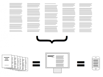
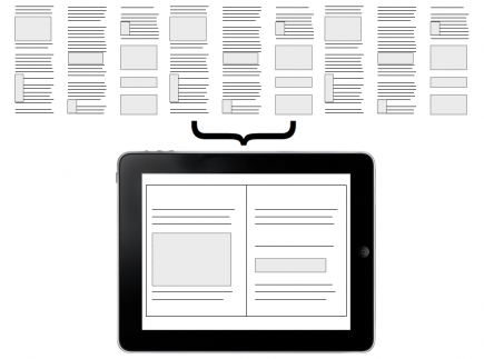
- Content without well-defined form (Formless Content (Fig. 1))
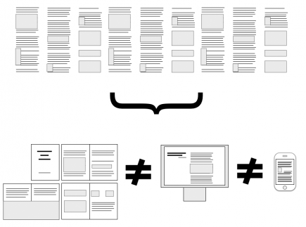
- Content with well-defined form (Definite Content (Fig. 2))
Formless Content can be reflowed into different formats and not lose any intrinsic meaning. It's content divorced from layout. Most novels and works of non-fiction are Formless.
When Danielle Steele sits at her computer, she doesn't think much about how the text will look printed. She thinks about the story as a waterfall of text, as something that can be poured into any container. (Actually, she probably just thinks awkward and sexy things, but awkward and sexy things without regard for final form.)
Content with form — Definite Content — is almost totally the opposite of Formless Content. Most texts composed with images, charts, graphs or poetry fall under this umbrella. It may be reflowable, but depending on how it’s reflowed, inherent meaning and quality of the text may shift.
You can sure as hell bet that author Mark Z. Danielewski is well aware of the final form of his next novel. His content is so Definite it's actually impossible to digitize and retain all of the original meaning. Only Revolutions, a book loathed by many, forces readers to flip between the stories of two characters. The start of each printed at opposite ends of the book.
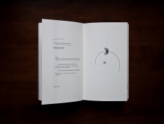
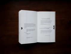
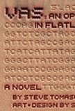
A designer may, of course, working in concert with the author, imbue Formless Content with additional meaning in layout. The final combination of design and text becoming Definite Content.(See specimen: Vas)
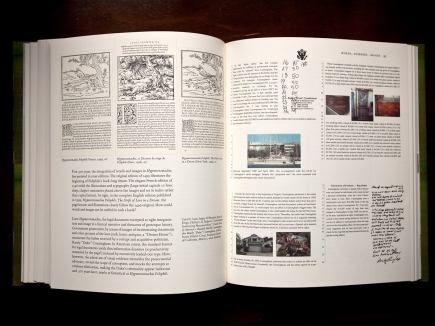
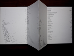
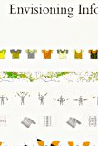
For an extreme and ubiquitous contemporary example of Definite Content, see Tufte. Love him or hate him, you have to admit he's a rare combination of author and designer, completely obsessed with final form, meaning and perfection in layout.(Fig. 3)
In the context of the book as an object, the key difference between Formless and Definite Content is the interaction between the content and the page. Formless Content doesn’t see the page or its boundaries. Whereas Definite Content is not only aware of the page, but embraces it. It edits, shifts and resizes itself to fit the page. In a sense, Definite Content approaches the page as a canvas — something with dimensions and limitations — and leverages these attributes to both elevate the object and the content to a more complete whole.
Put very simply, Formless Content is unaware of the container. Definite Content embraces the container as a canvas. Formless content is usually only text. Definite content usually has some visual elements along with text.
Much of what we consume happens to be Formless. The bulk of printed matter — novels and non-fiction — is Formless.
In the last two years, devices excelling at displaying Formless Content have multiplied — the Amazon Kindle being most obvious. Less obvious are devices like the iPhone, whose extremely high resolution screen, despite being small, makes longer texts much more comfortable to read than traditional digital displays.
In other words, it’s now easier and more comfortable than ever to consume Formless Content in a digital format.
Is it as comfortable as reading a printed book?
Maybe not. But we’re getting closer.
When people lament the loss of the printed book, this — comfort — is usually what they’re talking about. My eyes tire more easily, they say. The batteries run out, the screen is tough to read in sunlight. It doesn’t like bath tubs.
Important to note is that these aren’t complaints about the text losing meaning. Books don’t become harder to understand, or confusing just because they’re digital. It’s mainly issues concerning quality. One inevitable property of the quality argument is that technology is closing the gap (through advancements in screens and batteries) and because of additional features (note taking, bookmarking, searching), will inevitably surpass the comfort level of reading on paper.
The convenience of digital text — on demand, lightweight (in file size and physicality), searchable — already far trumps that of traditional printed matter.
The formula used to be simple:
stop printing Formless Content; only print well-considered Definite Content.
The iPad changes this.
iPad

It’s no wonder we love our printed books — we physically cradle them close to our heart. Unlike computer screens, the experience of reading on a Kindle or iPhone (or iPad, one can assume) mimics this familiar maternal embrace. The text is closer to us, the orientation more comfortable. And the seemingly insignificant fact that we touch the text actually plays a very key role in furthering the intimacy of the experience.
The Kindle and iPhone are both lovely — but they only do text.
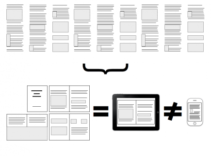
The iPad changes the experience formula.(Fig. 5) It brings the excellent text readability of the iPhone/Kindle to a larger canvas. It combines the intimacy and comfort of reading on those devices with a canvas both large enough and versatile enough to allow for well considered layouts.
What does this mean? Well, most obviously that a 1:1 digital adaptation of Definite Content(Fig. 6) books will now be possible. However, I don’t think this is a solution we should blindly embrace. Definite Content in printed books is laid out specifically for that canvas, that page size. While the iPad may be similar in physical scope to those books, duplicating layouts would be a disservice to the new canvas and modes of interaction introduced by the iPad.
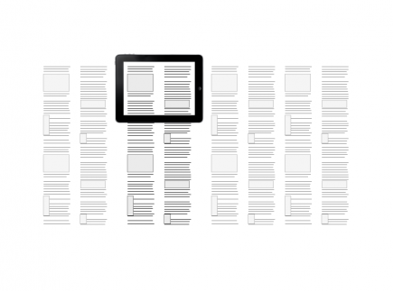
Take something as fundamental as pages, for example. The metaphor of flipping pages already feels boring and forced on the iPhone. I suspect it will feel even more so on the iPad. The flow of content no longer has to be chunked into ‘page’ sized bites. One simplistic reimagining of book layout would be to place chapters on the horizontal plane with content on a fluid vertical plane.(Fig. 7)
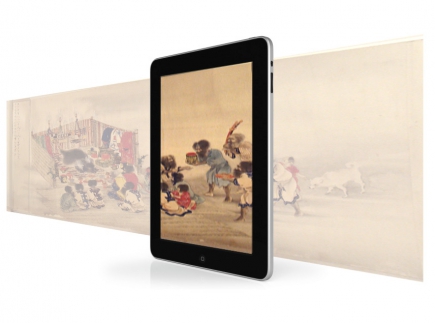
In printed books, the two-page spread was our canvas. It's easy to think similarly about the iPad. Let's not. The canvas of the iPad must be considered in a way that acknowledge the physical boundaries of the device, while also embracing the effective limitlessness of space just beyond those edges.
We're going to see new forms of storytelling emerge from this canvas. This is an opportunity to redefine modes of conversation between reader and content. And that's one hell of an opportunity if making content is your thing.
The Books We Make
So: are printed books dead? Not quite.
The rules for iPad content are still ambiguous. None of us has had enough time with the device to confidently define them. I have, however, spent six years thinking about materials, form, physicality and content and — to the best of my humble abilities — producing printed books.
So, for now, here's my take on the print side of things moving forward.
Ask yourself, "Is your work disposable?" For me, in asking myself this, I only see one obvious ruleset:
- Formless Content goes digital.
- Definite Content gets divided between the iPad and printing.
Of the books we do print — the books we make — they need rigor. They need to be books where the object is embraced as a canvas by designer, publisher and writer. This is the only way these books as physical objects will carry any meaning moving forward.
I propose the following to be considered whenever we think of printing a book:
- The Books We Make embrace their physicality — working in concert with the content to illuminate the narrative.
- The Books We Make are confident in form and usage of material.
- The Books We Make exploit the advantages of print.
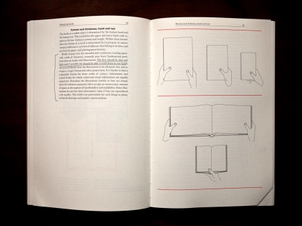
- The Books We Make are built to last. (Fig. 9a, 9b)
The result of this is:
- The Books We Make will feel whole and solid in the hands.
- The Books We Make will smell like now forgotten, far away libraries.
- The Books We Make will be something of which even our children — who have fully embraced all things digital — will understand the worth.
- The Books We Make will always remind people that the printed book can be a sculpture for thoughts and ideas.
Anything less than this will be stepped over and promptly forgotten in the digital march forward.
Goodbye disposable books.
Hello new canvases.
Specimen table
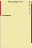
This is a small collection of images of books from my library that I feel embody the above ethos. They're books that embrace their physicality or have stood the test of time. They're the kinds of books the iPad can't displace because they're complete objects.
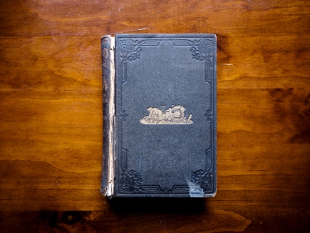
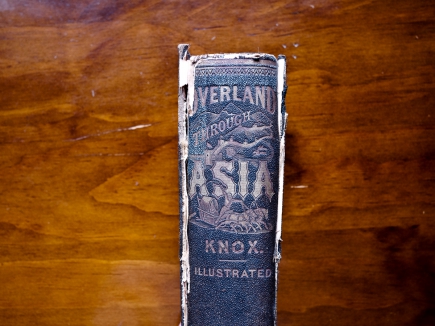
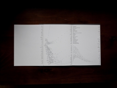
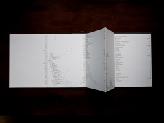
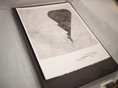
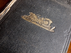
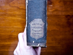
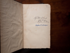
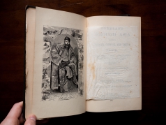
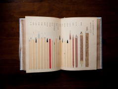
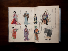
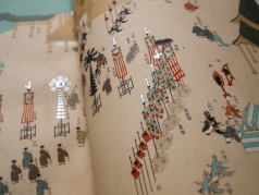
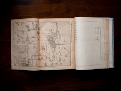
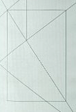
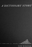
Some utilize painstaking hand printing atop exquisite paper (Heian). Some smell (also, Heian). Others are 100+ years old but still hanging on (Overland Through Asia). Others are very new but are either beautiful collaborations between writer and designer (Vas) or artistic objects in and of themselves (A Dictionary Story).
Whatever they may be, they are not going to be thrown away anytime soon.
Highly Recommended
About the author
Craig Mod is a writer, designer, publisher and developer concerned with the future of storytelling (whatever that means). He is co-author of Art Space Tokyo, an intimate guide to the Tokyo art world. He is also co-founding editor and engineer behind TPUTH.com, co-founder and developer of the storytelling project Hitotoki, and frequent collaborator with Information Architects, Japan. He's lived in Tokyo for almost a decade and speaks frequently on the future of books and media and lives for great food and no-bullshit coffee.
An extensive collection of images of books he's designed is available here.
Thanks
A huge thanks to the following people for their comments, insight and conversations while working on this: Ian Lynam, Hiroko Tabuchi, Liz Danzico,, Julia Barnes, Oliver Reichenstein, Mark Stephen Meadows, Chihiro Suda and that drunken, nameless (but insightful and challenging) angelic barfly in, of all places, Hiroo.


