
I look at my inbox: three hundred new messages in the last day.
My Twitter stream: five thousand new tweets.
Facebook timeline:
seven bumptillion new baby pictures.
Regarding the infinite, Einstein is famously quoted: “Only two things are infinite, the universe and human stupidity, and I’m not sure about the former.” Had he seen the internet, Einstein most certainly would have considered it a proof of our limitless, collective idiocy.
Our near endless stream of stuff is why I welcome — nay, embrace — anything that brings a semblance of an edge to the great fuzzy daily blob of text and images and videos that pass before our eyes. It’s why I’m willing to try any piece of software or service that makes me feel, however falsely, as if I’m in control. As if the great swirling galaxies of information really could be meaningfully distilled to a few tiny jujubes lined up in a row on my smartphone.
According to the New York Times’s Innovation Report, the newspaper publishes more than 300 URLs each day. Which, while not infinite, is more than a normal person can hope to read in a day. The report then continues:
Because of this bounty, readers easily miss stories and features. This has long been true for readers who come to our home page, because of limited real estate and constantly shifting presentation. This is also true on our mobile apps, where a tiny screen makes it even harder to sift through our offerings.
If you dig a bit further into the Report you’ll notice the homepage (http://nytimes.com) of the Times is not-so-slowly dying:
Our home page has been our main tool for getting our journalism to readers, but its impact is waning. Only a third of our readers ever visit it. And those who do visit are spending less time: page views and minutes spent per reader dropped by double-digit percentages last year.
So how does one fix this?
First of all, I think the word “fix” is misleading and dangerous, although it’s the one we tend to reach for in these situations. To say fix is to imply brokenness. Nothing is broken — simply the way in which readers read digitally, the way in which we all graze the internet, has changed and continues to change. A better way to frame this is: How do we respond? How do we respond to disinterest or disuse of a homepage? To too many links?
Well, we can start by drawing boundaries and acknowledging contexts.
#Consider the edge
One of my favorite original iPad apps was New York Times Editors’ Choice. Nobody else seemed to like it, but I did. I adored that it provided some kind of edge — arbitrary or not — to a day’s worth of content on nytimes.com. Ostensibly, the articles in Editors’ Choice were chosen by humans. Maybe even editors. Regardless, it bounded the boundless, and simply knowing I could “complete” the Times made it a joy to return to day after day.
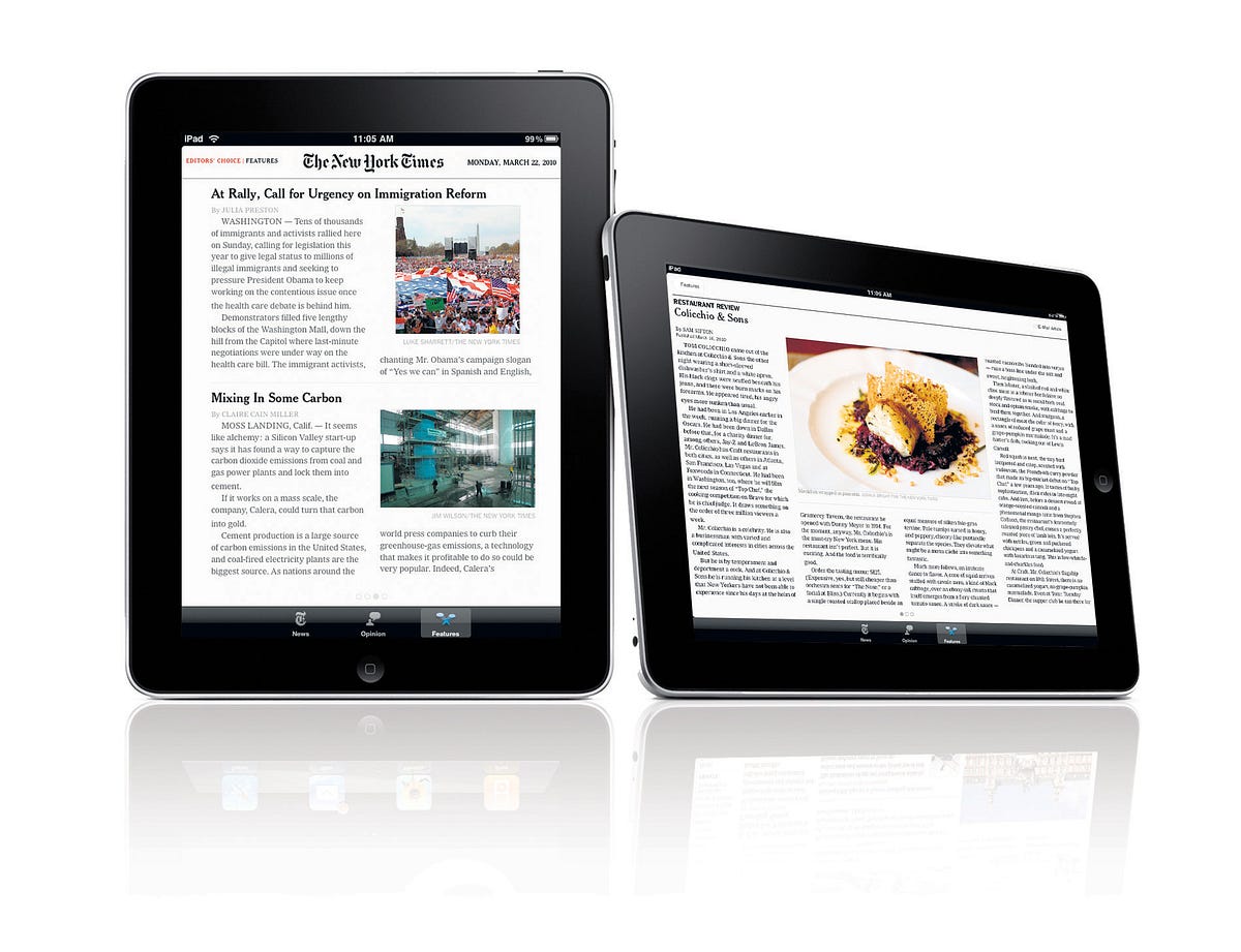
The app was hardly perfect, though. It was rushed (built just weeks before the keynote in a secret Apple bunker) and, for whatever reasons, never gained enough internal political clout to be properly iterated on. So it never had a chance to delight the Times’s readers. In fact, they were quite confused: “Where’s the rest of the Times?” they demanded. This despite the app description quite clearly stating:
“The Editors’ Choice application offers a limited selection of news, opinion and features that are automatically updated to your device.”
Instead of undergoing progressive refinement, Editors’ Choice was removed from the app store, replaced by a more comprehensive iPad clone of the nytimes.com homepage. Gone were the edges. Back in their place were 300 clickable boxes.

Fast forward three and a half years: What a delight it was to hear that the new Times iPhone app, NYT Now, released just a few weeks ago, brought back real edges.
NYT Now is essentially Editors’ Choice for iPhone, but fully realized and sandboxed (internally and externally, politically and technically) in its own little universe. This sandboxing is smart, and I suspect it gave the team that built the app a lot of leeway. Tellingly, the app isn’t even called New York Times — just NYT — as if to signal to users: Hey-o, this is not the real deal, don’t expect everything. Even the app icon is playing coy.
Real deal or not, I’ve opened NYT Now multiple times a day, everyday, since the day it was released. Which is not something I can say about the “full” NYTimes iPhone app, nor many other apps on my phone.
The “full” NYTimes iPhone app works as one kind of mobile interface to allof the Times’s content. Unfortunately, it doesn’t provide much guidance for me as an on-the-go reader. At present count there are over sixteen so-called “Top Stories.” In other words: the scale at which the app operates is disproportionate to the device’s contexts. Because of the way we read on phones — during short bursts — we usually don’t have time to parse, or attempt to parse, all of the Times’s stories. If we’re lucky, we have time for a few, and we want to be sure those few are great.
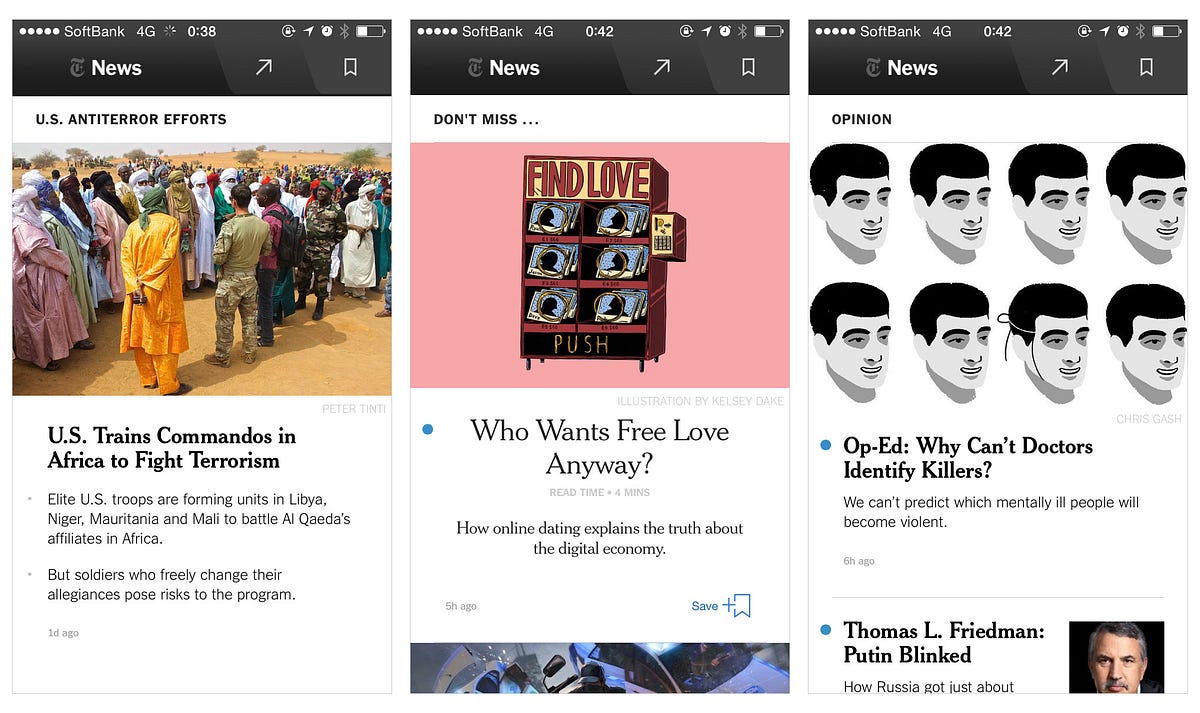
This is where NYT Now steps in.
What’s so great about the app? Let’s enumerate:
- Similar to how Editors’ Choice filled me with a belief that I could reach the end of the day’s necessary news, so too does NYT Now. Its rolling daily volume is eminently reasonable.
- The small summary snippets below titles feel human and considered, lending a sense of import to the selection (as opposed to a sterile, algorithmic selection) of the day’s stories.
- Because it doesn’t live in Newsstand — NYT Now is a “normal” app — it doesn’t suffer from the usual Newsstand Curses: being boxed off far from the home screen in that weird non-folder, left largely untouched, forgotten, crying itself to sleep on a mattress of exceptional, yet unread writing.
- The built in read-it-later functionality mitigates the stress of finding a curious article but not having the time to read it immediately. (A frequent case on a phone.)
- By boldly recommending articles beyond (!!) the Times, there’s always something to read, even if you’ve finished the day’s news.
- But most importantly: The app is simple and fast, making it feel cognitively lightweight, creating a space into which we can easily dip in and out.
The design and editorial decisions of NYT Now show great restraint and we, the readers, are all the better for it. The Innovation Report notes, “On NYT Now … the editors and product managers have worked really well together. It’s really been the ideal partnership.” You feel this positivity of collaboration as a reader when using the product.
Not only does the thoughtfulness in design make the app fast, but it also makes it quick to parse. No blue dots next to articles? No new articles.
The above decisions and features culminate into the kind joyful mobile experience any publication with high-quality content should aspire to. NYTimes Now is perhaps the first true mobile-friendly, multiple-times-a-day interface to the Times .
I’ve written about digital content and edges before, and in one previous article I quoted Nicholas Carr. Allow me to quote my quoting, if only because I’m so fond of the way he frames completion:
One of the advantages of embedding culture in nature, of requiring that works of reason and imagination be given physical shape, is that it imposes on artists and thinkers the rigor of form, particularly the iron constraints of a beginning and an ending, and it gives to the rest of us the aesthetic, intellectual, and psychological satisfactions of having a rounded experience, of seeing the finish line in the distance, approaching it, arriving at it.
The physical paper used to provide the medium or frame into which the reporting culture of the Times could be embedded, but digitally that framing is lost. Carr’s beautifully described ‘rigor of form’ is what an app like NYT Now forces the Times to do to its otherwise formless 300 daily links.
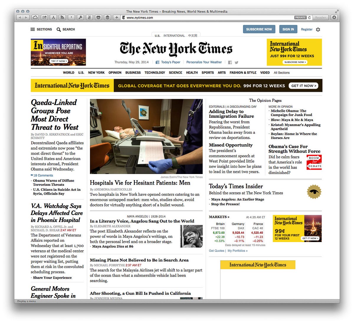
While you can’t blame information overload as the only (or even main) culprit behind lost traffic on the Times’s homepage, it’s certainly one contributing factor. As we deal with increasing numbers of higher density information streams, one of the most respectful things a media organization can do for their readers is to create a clear hierarchy of information. Even better is to say, Here are the five things we really think you should peek at. You can do this any number of ways — implicitly through design or statistical ranking (e.g., Most Emailed), or more explicitly through human editorial selection. In mimicking a printed layout, the current homepage of the Times tries to apply the physical curatorial qualities of print (bounded and immutable) to a digital frame (boundless and always changing). As the numbers show, given a better or more digitally native entrance to the content, readers will take it.
But the main reason the homepage is losing ground (as the Innovation Report touches on) is simply because the idea of a formal “entrance” to a publication has been subverted by social media. A publication’s entrance is defined by the destination of a link on Twitter or Facebook or Flipboard (the third highest referrer for traffic to nytimes.com). This is a natural byproduct of the non-linear nature of the web. Smart discovery and reader guidance now has to happen everywhere, not just on a publication’s root URL. The Times needs to consider every page a home page.
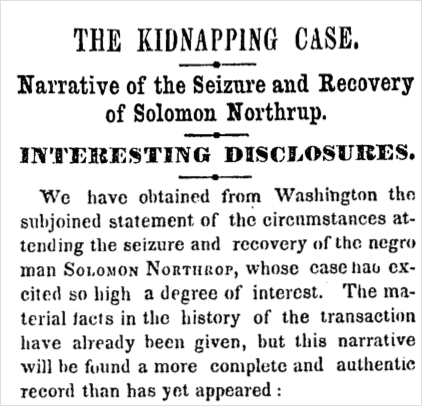
The Times also sits atop an iceberg of evergreen, high-quality journalism. “14,723,933 articles, dating back to 1851” to be exact. The Innovation Report goes on to suggest ways to curate or give edges to this content, citing as a motivator Gawker’s usurpation of their 161 -year-old article about Solomon Northup of 12 Years a Slave:
After [the article] started going viral on social media, Gawker pounced, and quickly fashioned a story based on excerpts from our piece. It ended up being one of their best-read items of the year. But little of that traffic came to us.
They then go beyond examples of one-off archive plundering into deeper, more inclusive collation, citing cooking.nytimes.com (freshly opened in beta) and a theoretical “Book Review Complete Archive” (which I would love to see — I actually did a couple Google searches to make sure it didn’t exist because it seems like such an obvious and useful resource).

For all of us with an interest in the future of media, watching the Times navigate their current transition may very well be the most instructive (and last, if not largest) example in our lifetimes of a media company moving from a wholly physical mindset to one digital.
As the Innovation Report outlines, the Times still has a long way to go. But the reviews for NYT Now have so far been deservedly excellent: “Great, simple, well curated news app.” “Outstanding!” “I like the app a lot.”
So while our Facebook streams may still feel bottomless, Twitter still like dipping a teaspoon into a raging information river, and our inboxes messes best deferred to another lifetime, the news, at least, once again, feels somewhat conquerable, and the Times finally has a true home on our homescreens.
This essay, originally published June 2014 by The Message. Thoughts? Email me@craigmod.com.

Craig Mod is a writer and photographer based in Japan. He's the author of the books Things Become Other Things and Kissa by Kissa and is a MacDowell, Ragdale, and VCCA writing fellow. His essays and articles have appeared in The New York Times, Eater, The Atlantic, California Sunday Magazine, Wired, Aeon, New Scientist, Virginia Quarterly Review, The New Yorker, The Morning News, Codex: Journal of Typography, and elsewhere.
He writes newsletters, oh yes, newsletters: Roden & Ridgeline.
The work on this site is supported 99.9999% by paid memberships.
Whatever you do, don't follow @craigmod on Threads or Instagram.