
The Potential of Web Typography:
@font-face and Firefox 3.5
by Ian Lynam & Craig ModFirefox 3.5 is out. And the more users download it, the more designers will be able to take advantage of the @font-face CSS rule. How can @font-face be used with currently implemented CSS selectors to create engaging, nuanced and more mature typography? Let's find out.
@font-face — what it is exactly?
B @font-face is a CSS rule implemented in Firefox's latest 3.5 browser release. It allows web designers to reference fonts not installed on end user machines.
(NOTE: John Daggett has written a lovely primer article on @font-face. It serves as a fine reference into the nitty gritty of @font-face implementation and usage.)
Fine typography has always been one of the stumbling points of web design. Limited at most to a handful of cross-platform specific fonts, web designers have often found it necessary to hack their way into typographically nuanced territory. Technologies such as sIFR and Cufon utilize Flash and Javascript techniques to achieve typographic variety, but often at the expense of clumsy technological implementation. @font-face brings with it the hope of a standard, cross-platform, cross-browser, lightweight method for referencing font-files not found on end users' computer. In other words: it allows web designers to store fonts on their server and reference them in CSS, regardless of what fonts the user browsing the page has installed.
— Dorothy AbbeTrying to bring taste and skill into a branch of artistic endeavor which had sunk to the lowest possible depths.
Achieving nuanced type with @font-face
D By focusing on the true basics of typography: font-size, line-height, font-variant, column width, and letter-spacing, one can create truly stunning effects using @font-face.
Here's a list of universally available, fundamental CSS properties upon which great typography can be constructed:
This demo page uses these CSS properties in combination with smart @font-face choices to create a nuanced layout. Some combinations and tricks we find particularly useful include:
Small caps
- When applying small-caps via the font-variant property, it's often more visually appealing to also apply text-transform: lowercase or uppercase to the block. This ensures uniform visual weight independent of who or what generates the text. Also, depending on the font in question, you should take time to track the letter-spacing out an appropriate amount.
first-line Pseudo Element
- Using small-caps on the first line of a new section is a fairly classic typographic standard. The above small-caps notes work great in combination with the first-line pseudo selector.
Text Decoration
- CSS offers the ability to overline or underline text using the text-decoration property. Unfortunately there's no control over the distance between the text and the decoration. The CSS border attribute allows for more control while achieving a similar decorative result. When you use border in combination with padding, you can control precisely how close the visual effect is to your text.
By mixing a well-considered selection of fonts with the above CSS properties and thoughtful semantic markup, you can achieve beautiful, nuanced results.
— Ed FellaNothing exceeds like excess.
Most of all it's about taste and restraint. Great typography is built on choosing the right family of typefaces for the job.
What we'd like to see added
A Here are some typographic controls we'd love to see implemented in the CSS specifications:
Baseline-shift
- It's sometimes necessary to nudge the baseline of certain glyphs in a line. We'd like to have control over this as a CSS attribute and to be able apply it selectively through span tags and classes.
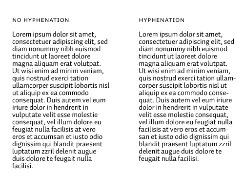
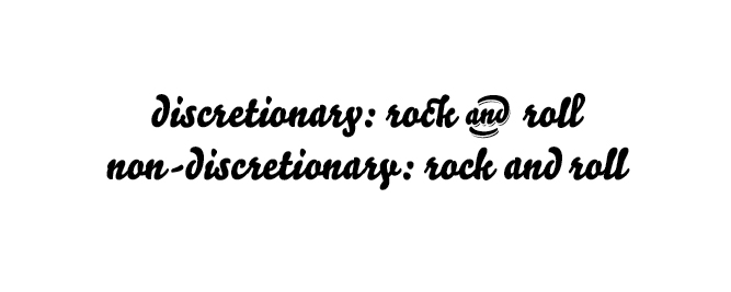
Hyphenation
- Having granular control over hyphenation would instantly and drastically change the perceived visual texture of online typography. (You can read about the current state of the hyphenation specification on the W3C homepage.)
Numeral selection
- Most contemporary typefaces are offered with both lining and non-lining numerals. Having access to these alternate characters would be great.
And more wistfully …
- We'd like to see more control over OpenType-specific features such as contextual alternates, fractions and swashes.
The fundamentals
- We'd much rather see a solid, well-considered implementation of hyphenation than any more drop-shadow controls. We implore those producing the CSS specifications to consider pushing for strong, consistent implementations of these less flashy, fundamental typographic building blocks.
It just so happens that the implementation of some of the above advanced font CSS features and more are presently being discussed on the W3C mailing list.
Where are the fonts?
C The main issue foundries have with @font-face is that it exposes the files containing the font data for anyone to download. There’s no digital rights management currently associated with the way @font-face works. Foundries currently only have two options: to blindly trust that professionals will pay for their fonts even if they are openly accessible. Or to wait for some DRM solution to shield the font files from restricted access.
Web designers are clamoring for an elegant solution they can begin to implement that doesn’t break EULAs. We see this as a tremendous opportunity for small foundries that have the guts and foresight to take a chance — dare to trust professional users and change their EULAs. If foundries are truly worried about piracy, perhaps glyph-limited web specific editions of some of the faces is a viable, stop-gap solution.
Most recently, Typekit has made waves in the online design industry by announcing a solution to the @font-face piracy problem. You can read more about this on their blog. Judging by the sheer number of comments, the foundries that move into this market early stand to profit greatly.
Piracy will always be a problem but foundries that provide a simple, easy path to legal font usage will have a big competitive advantage.
Closing remarks
E Until now we've lacked access to an elegant, widely implemented technical solution for referencing font files in CSS. We urge designers, agencies, foundries, distributors and misfits alike to review the possibilities that @font-face offers. Exciting things are afoot in the online typography world — we're on the cusp of a convergence between the nuance of print typography and the dynamic nature of the web. A universal, strong implementation of the @font-face rule has opened the floodgates for foundries to find ways to embrace this emerging market. We may still be stuck with Verdana and Georgia for the meantime, but hopefully not much longer.
The Discussion
Got something to add? Join in on the @font-face discussion over at mozilla.org.
Resources
General Web Typography
- The Elements of Typographic Style Applied to the Web
- Deciphering Baseline Rhythm
- Setting Web Typography to a Baseline Grid
- Open Source Font Library
Grid Systems
@font-face Font Resources
@font-face Docs
- John Daggett's @font-face primer
- MDC @font-face documentation
- CSS2 Fonts specification
- CSS3 Fonts draft
- Cross-Origin Resource Sharing Working Draft
@font-face Examples
- CSS @ Ten: The Next Big Thing
- Example layout using Graublau Sans
- Examples of Interesting Web Typography
- The Elements of Typographic Style Applied to the Web
Font Politics
- Microsoft’s Bill Hill about Font Embedding
- Microsoft’s Chris Wilson about direct linking to TrueType fonts
- Robert O’Callahan’s blog post on web font formats
- Discussion of font formats at W3C TPAC meeting
- Mark Pilgrim’s post critical of font foundries
- David Baron’s thoughts about downloadable font formats
About the authors
Ian Lynam
 http://ianlynam.com
Ian Lynam is a graphic designer and writer living in Tokyo. He runs a multidisciplinary design studio that focuses on pan-cultural identity design, motion graphics, and editorial design. He is a graduate of Portland State University (B.S. Graphic Design) and California Institute of the Arts (M.F.A. Graphic Design). His most recent book is Parallel Strokes, an inquiry into the crossroads of graffiti and type design. He is adjunct Graphic Design faculty at Temple University Japan.
Craig Mod
 https://craigmod.com
Craig Mod is a Tokyo based print and online designer/developer. He is coauthor and designer of the acclaimed Art Space Tokyo, a one of its kind guide to Tokyo through its contemporary art spaces. He is also a cofounder of Hitotoki, a website creating literary experience maps imbuing otherwise anonymous cityspaces with individual experiences. He was awarded a Fabrica Fellowship in 2005 and served as a judge for the 85th ADC awards.
About the type used on this page

http://underware.nl
All of the type on this page was kindly licensed by Underware for specific use in this @font-face demo, as commissioned by the Mozilla foundation. With Underware's approval, we created glyph-limited editions of some of their typefaces for this one time use only. This page is intended to show what will be possible once foundries revise their EULAs allowing for high-quality professional level fonts to be referenced in CSS. The fonts on this page are copyright protected. Using these fonts requires purchase of an End User License from Underware at www.underware.nl.
Underware are German Akiem Helmling, Dutchman Bas Jacobs, and Finn Sami Kortemaki. They respectively reside in the cities of Den Haag, Amsterdam, and Helsinki.
Their work is among the most popular of up-and-coming independent type foundries — happy-go-lucky, high-quality, text-friendly typefaces for both display use and comprehensive typesetting. Underware’s typefaces stand out thanks to unique aesthetics, finished quality, and a considered collective presence. Currently, they work as a “virtual studio” from each of their home offices. The members unite regularly in one of their three base cities to hold a series of type design workshops and work together on their collective projects. Their typeface families are available for extensive viewing, trial, and purchase from their website. Underware’s typeface designs have been honored by the Type Directors’ Club and awarded the TDC’s Certificate of Excellence in Type Design.
This is Liza
Used in: h1 header
Liza is an upright script face that couples luscious display characters with extremely fancy contextual alternate options in order to simulate actual hand-painted signage characters.
This is Auto
Used in: body text, lead, h3 & h4 headers
In addition to being an excellent, highly readable body face, Auto offers three different italics, each with their own flavor. The italics span from a humanist version to a more expressive and unique hybrid that incorporates elements of stencil lettering and calligraphic elements.
This is Dolly
Used in: resources subheads, blockquotes
Dolly is a sweetheart — a rugged workhorse family of text fonts for book typesetting. The family's mix of the lighter italic, airy small caps, and dense roman is extremely legible at small point sizes. The final result is a lively interpretation of classical book typefaces.
A Typographic ornament
Used in: section drop ornaments, top-right title ornament
These assorted fleurons used are pulled directly from a number of Underware typefaces. Using glyphs in lieu of pixel imagery (with the exception of the portraits of the handsome and stylish authors) illustrates the use of embedded vector imagery from fonts.