"There is no style store."
— William Zinsser on unnecessary embellishment
"The commonality between two people who have read the same book is a profound and deep intervention."
— Richard Nash, Cursor
It's a rainy Sunday afternoon and I'm sitting in a cafe in central Tokyo, desperately trying to enjoy a book on my iPad. Distractions abound: sloppy typography, misspelt words, confusing page breaks, widows, orphans, broken tables. These and more pull me from the narrative spell. In that moment I realize, although I've had this substantial object of glass and metal for a few weeks, I haven't managed more than ten pages of anything.
What, then, is the problem?
It's not the screen — I've happily read several novels on my iPhone.
It's not the weight — it feels fine when resting on a table or my knee.
The problem is much simpler: iBooks and Kindle.app aren't good e-readers. They get in the way of the reading experience and treat digital books like poorly typeset PDFs.
We can do better.
But there's something beyond interface and design issues nagging at me: these applications are ignoring the meta-data created as we move through and mark our e-books.
This essay considers two sets of questions:
1) What's wrong with our current e-readers and how do we rebuild them?
2) What meta-data do we create when engaging digital text, how can our e-readers embrace it and how does that change our relationship with books?
Let's first look at our e-readers from a design and usability perspective. Then consider how they can really begin to embrace the 'digital' of digital books.
The state of our e-readers
Place iBooks and Kindle.app side-by-side and core design differences emerge:
Instead of allowing the text to breathe, iBooks jams the readers’ field of view with the detritus of a 3D ‘book.’(fig 1) Whereas Kindle.app opts to use the iPad's large canvas to float the text block in generous white space.
Kindle.app's page design places navigation elements in their proper contexts: meta actions like returning to your library and bookmarking live in the left and right margins, away from the text; direct actions like changing font size and navigation live below the center text block.(fig 2)
iBooks, instead, lumps meta and direct elements together in a chrome soup. Screen real estate outside of the text block is filled with lazy metaphor.
Fig. 1
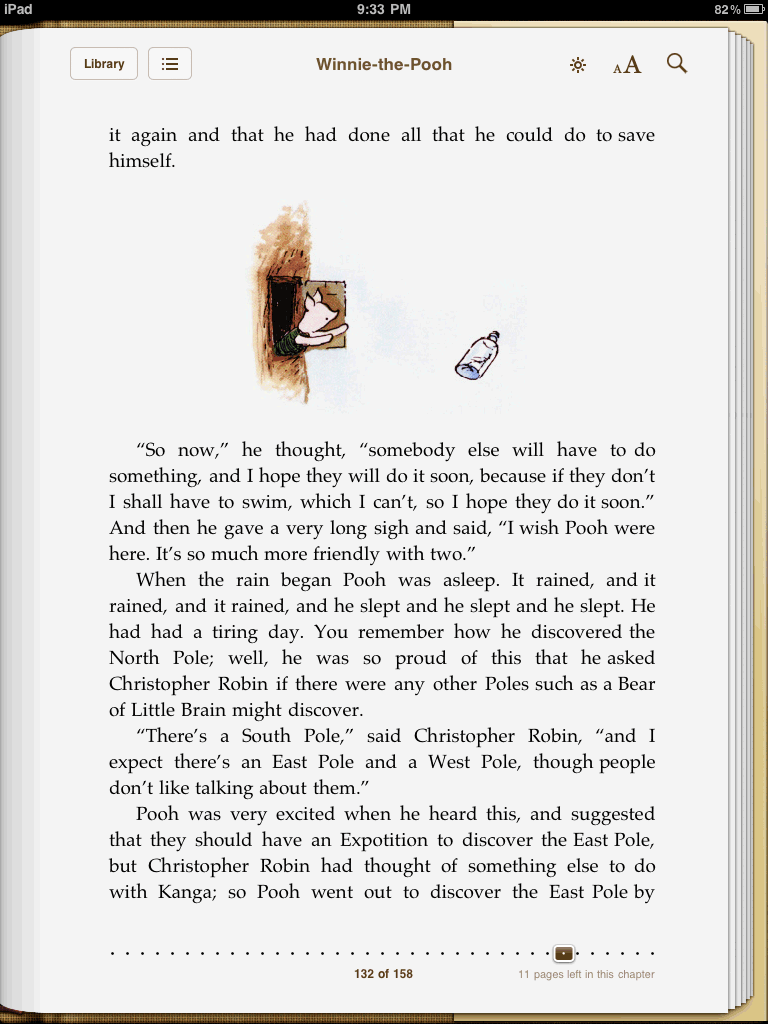
iBooks — with navigation chrome
Fig. 2
Kindle.app — with navigation chrome
Oliver Reichenstein at iA Inc.[1] aptly calls this general metaphor overload on the iPad ‘kitsch,’ and particularly dangerous in iBooks:
Having the same static thick paper stacks left and right in your e-reader application, on the first as well as on the last page is not just visually wrong, is also confusing; it feels wrong and it is wrong. It’s kitsch.
Metaphor in design that adds real value — changing the background paper stacks to represent actual pages left in a book, for example — is arguably useful, but the mindless embrace of metaphor based on Apple's user interface guidelines is a mistake. Especially when these metaphors yell loudly and grow old quickly — precisely the opposite goal for which great interface design strives (be quiet and age gracefully).
Kindle.app's interface manages to avoid the kitsch trap. It’s as minimal as possible while still retaining a ‘book’ feel. It doesn’t jar us with superfluous page-turning animations. It doesn’t clutter the edges of our screen with meaningless metaphor. Even the clock disappears when hiding Kindle.app's navigation chrome. (Of all things distracting, Dear iBooks, is the clock not the worst?) It lets us focus, somewhat, on the one thing we came to do: read.
Fig 3 and Fig 4 show these application in their most minimal states. Which would you rather read?
Fig. 3
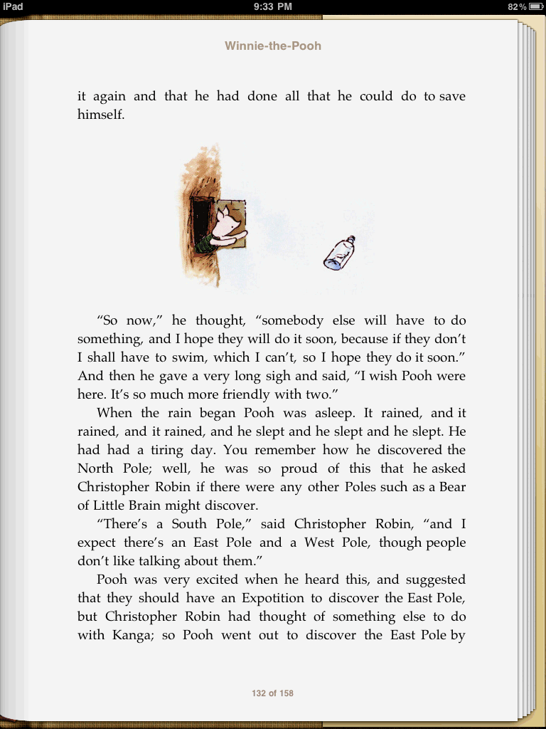
iBooks — without navigation chrome
Fig. 4
Kindle.app — without navigation chrome
Fonts
iBooks also brings with it a host of typographic issues. Font Feed’s Stephen Coles[2] on the font selection of iBooks (and the iPad overall):
If you’re not going to let the publisher/book designer select the book’s typeface — and Sam Wieck explains[3] why that alone is wrought with problems — the user’s options better be good. Unfortunately Apple offers just five: Baskerville (Monotype), Cochin, Palatino, Times New Roman, and Verdana. Of these, I’d say Palatino is the only legitimate choice for reading a book on a screen.
Kindle.app isn't a font wonderland either, but it is slightly better. Coles continues:
Unlike Apple, Amazon clearly did their research here. PMN Caecilia[4] isn’t well known outside the typorati, but it’s one of the more readable typefaces ever designed and its low stroke contrast and slab serifs serve the Kindle very well.
Device ubiquity
iBooks also lacks what is quickly becoming a core feature of contemporary software design: cloud syncing. Tim O’Reilly comments on the general lack of dependable syncing by Apple in a recent New York Times essay:[5]
Media and application syncing across iPhone and iPad is poorly thought out. MobileMe, which should be Apple’s gateway drug for lock-in to Apple services, is instead sold as an add-on to a small fraction of Apple’s customer base. If Apple wants to win, they need to understand the power of network effects in Internet services. They need to sacrifice revenue for reach, taking the opportunity of their early lead to tie users ever more closely to Apple services.
Currently, I can open Kindle.app on my iPhone and read a book before bed. The next morning I grab my iPad and begin reading — effortlessly — where I left off over coffee. If I had a Kindle Reader, I could then open the same book on the train to the office and once again pick up on my last page.
In an increasingly multi-device landscape, this sort of ubiquity plays a greater role in defining which apps feel good to use (always synced Google Docs) or a chore (trying to get documents out of Pages[6] on iPad).[7]
Shopping
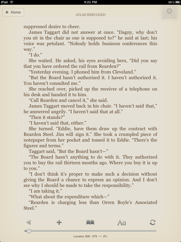
If iBooks does only one thing right, it's iBookstore. iBookstore — seamlessly embedded in iBooks — provides an interface for browsing, purchasing and reading. Kindle.app requires you to open a web browser on your iPad or iPhone in order to browse their selection: a serious barrier between an impulse buy or a shoulder shrug.
However, Amazon has an exceptional online bookstore capable of quickly sending Kindle books (or free previews) to your iPad, iPhone or Kindle. This is a function I use regularly on my laptop computer and I suspect Apple's in-app store advantage is short-lived: it’s easier for Amazon to implement an in-app bookstore than it is for Apple to develop a full-featured online bookstore.
Embarrassing
Of course, who cares how great the bookstores are if it's painful to read the books? I barely prefer Kindle.app over iBooks — it's simply the less horrible of two bads. Both of these applications treat e-books little better than cheap PDFs made from scanned physical books. If we want an e-reader capable of fully embracing the digital advantages of our e-books, we need to start rebuilding.
The e-reader we want
I assume people are generally good. That when given the choice between stealing a DRM-free version of a book, or purchasing a reasonably priced, DRM-free version, they will mostly choose to pay. And that they won’t copy and paste the entirety online. If we don’t assume this then much of the potential of digital books will never be realized.
What, anyway, defines a modern e-reader? Liza Daly provides a nice summary:[5]
A truly modern e-reader is one that is intimately connected to the Web and allows a user to make queries as a series of asides, while reading or after immersive reading has ended.
I like this description. And I like that the word ‘query’ is properly ambiguous. Because I don’t think she’s talking about web searches. There’s a whole network of data being created every time we open our digital books — data to which these e-readers should be allowing us access.
But first, let’s not forget what these applications are: spaces for consuming text. If we don’t get the fundamentals right, we might as well give up.
E-reader fundamentals
Physical books and e-books are both text at their cores. Book designers long ago established rigorous rules for laying out text blocks so they disappear to the reader. They took pride in turning the physicality of a book into a tool for efficiently and elegantly getting information into the mind of the reader. As any good typographer knows: the best typography goes unnoticed.
Our e-readers seem to have forgotten this heritage. They've forgotten that their core purpose is simply to present text as comfortably as possible; to gently pull the reader into the story. Every other aspect of experiencing a book is predicated on this notion.
At the very least, this is what our e-readers need to improve:
Hyphenation
Why hyphenation is proving to be so elusive is beyond me. Eucalyptus on the iPhone does a fine job with it. If they can, then so should Apple and Amazon.
Hyphenation isn’t as big a deal for longer line lengths. But if one advantage of digital books is large font-sizes for the visually impaired, then hyphenation must be implemented. The impact hyphenation has on readability multiplies as the point size increases.(Fig 5)
Ragged Right Text
I'm going to pretend I don't even have to mention this. There's something sociopathic about major e-readers not including this option.
Smarter Margins
Line length and margins are intrinsically tied to the type and size of font being used, and the shape of the page (or screen).(fig 6) Like Instapaper,[8] you could give readers a choice of leading, margins and font size. But readers aren’t typographers. They shouldn’t have to choose. These are page design fundamentals, based on rational proportions. Our e-reader layout algorithms should be competent in balancing these variables.
Fig. 5
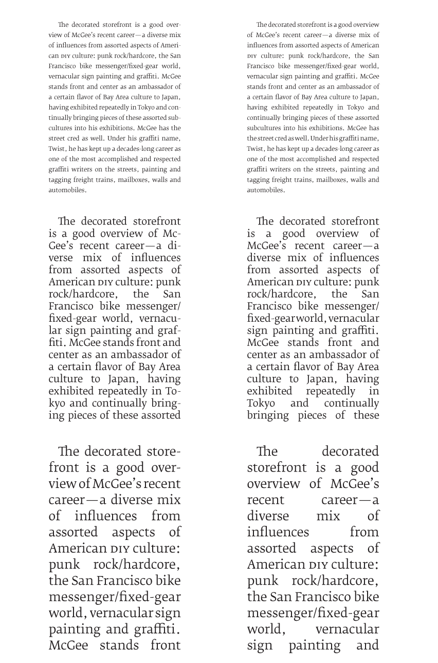
hyphenation —
showing effect on readability with increase in point size
Fig. 6
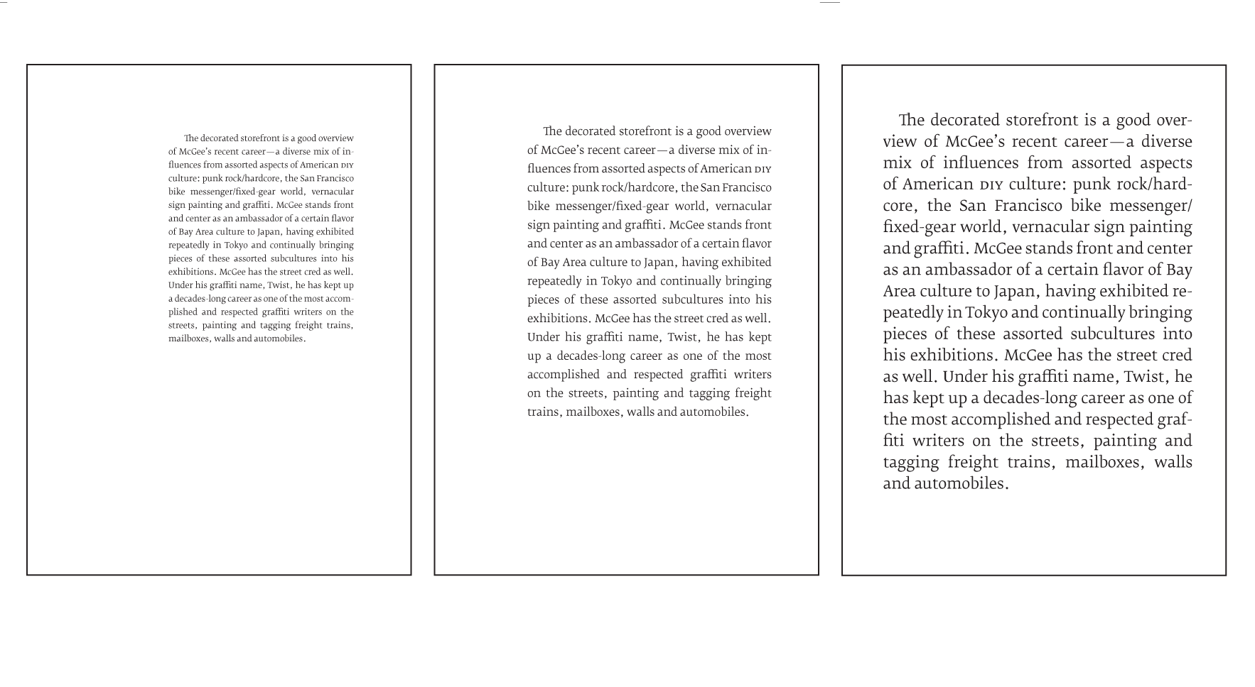
line length & font size —
necessary increase in line-length with font-size
Copy and Paste
That we can’t copy and paste is an insult. The rationale behind this restriction is obvious: publishers don’t want readers to easily extract entire books. It’s a form of DRM through obnoxiousness.
Dubious folks will always find a way extract the text and redistribute it. For the rest of us, artificially limiting copy and paste is insidiously inconvenient, and very much cuts into one of the greatest assets of digital text — easy manipulation and transportation. This Bush-league DRM is akin to using javascript to turn off right-clicks so users can’t save images on web pages: lame and ultimately ineffective.
Currently, printed book typesetting is far more nuanced and elegant than any Kindle or iBooks edition.
Add to the equation that many digital books are OCR scans with broken tables and sloppy page breaks, and you have to wonder just how anyone thinks they can charge a near equivalent price for an inferior reading experience. A reading experience made inferior not because of the device, but because of a lack of consideration in the presentation. A reading experience that can be made better with a stronger focus on fundamentals.
As Bringhurst states, Typography must often draw attention to itself before it will be read. Yet in order to be read, it must relinquish the attention is has drawn. Typography with anything to say therefore aspires to a kind of statuesque transparency.[9]
Our e-readers already draw enough attention to themselves. Achieving statuesque transparency should now be their goal.
The Network (or, e-reader ‘social’ features)
Do you know those stories of someone digging through the libraries of Mark Twain[10], David Foster Wallace[11] or Paul Rand[12] and finding their marked books? I love those stories. What intrigued these icons? Of which passages did they make note? It’s voyeuristic, inspiring and gives us insight into both the text and the person who read the text.
As I read a physical book, I underline passages and take notes. I mark these spreads with a dog ear.[13] Then, when I'm finished, I’ll summarize those notes on a blank page in the back.
I suspect many of you have similar habits.
The Greater Whole
So consider this: 10,000 of us reading the same Kindle book, each of us highlighting and taking notes. Would the aggregate of this not be illuminating? If I want to publicly share my notes with fellow Kindle or iBooks readers, shouldn’t there be a system in place to do this?
Show me the overlap of 10,000 readers' highlighted passages in a digital book. This is our ‘Cliff Notes.’ We don’t need Derek Sivers' brilliant summaries[14] anymore (sorry Derek!) — we’re collectively summarizing for each other as we read and mark our digital copies.
Show me a heat map of passages — ‘hottest’ to ‘coldest’. Which chapters in this Obama biography should I absolutely not miss?(Fig 7)
Let Stefan Sagmeister publicly share the passages he’s highlighted in the new Murakami Haruki novel. This is something I want to see. And I bet you do, too.
When I’m considering buying a book, show me how far the average reader gets. Do most readers get through the whole novel or give up halfway? How many notes do they take? How many passages do they highlight?
These can be intimate signifiers of the worth of a particular text. And signifiers that, until books became digital, were invisible — or at best, estimates. Systems should be in place to capture, aggregate and allow access to this data. And this access should be seamlessly integrated with our e-readers.[15]
Fig. 7
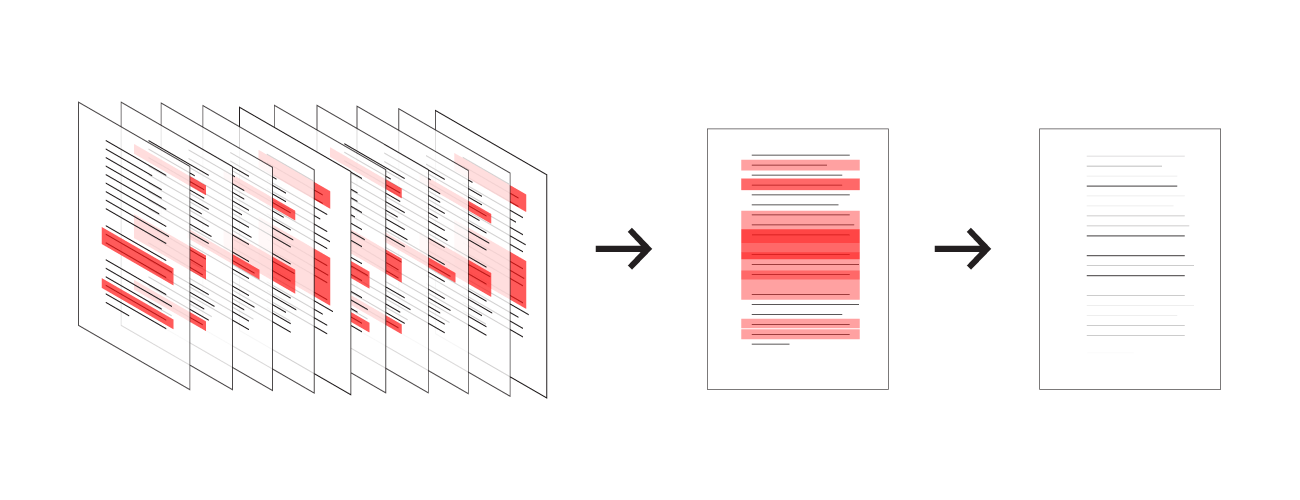
The Aggregate, or A Reading Heatmap —
Key passages illuminated by layering all readers' highlights for the same text
My Cut
When I’m done reading and marking a book, I should be able to create my own abridged copy. Show me just my highlights with notes. Let me export this edition. Let me email it to myself. Or, if you dare, automatically typeset it and let me order a POD copy for my personal library.
Life Outside The E-reader
Digital books shouldn’t be chained to their e-readers. This is text. It's nimble. There needs to be a publicly accessible way to reference these books. In other words: our digital books need to have an online presence. Amazon has, in effect, done this with their ‘look inside’ feature. They have a system for allowing limited access to the text without compromising the copyright.
For example: If I’m reading a particularly great passage in, say, On Writing Well, and wish to quote it to my Twitter followers, I should be able to do that seamlessly within Kindle.app. I select a highlight and choose “broadcast.” Kindle.app will then cut the text and include a link in the tweet. The link will send my followers to the corresponding page in On Writing Well on amazon.com. They can browse the preceding and following pages for context, and then choose to buy. If they already own the book, they can read it, right there, in that web interface.
The New Reading Fundamentals
Previously, reading was an act of solitude by design, with most residue of the process locked in a book's physicality. This is no longer true.
I'm excited about digital books for a number of reasons. Their proclivity towards multimedia is not one of them. I’m excited about digital books for their meta potential. The illumination of, in the words of Richard Nash, that commonality between two people who have read the same book.[16]
We need to step back for a moment and stop acting purely on style. There is no style store.[17] Retire those half-realized metaphors while they're still young.
Instead, let’s focus on the fundamentals. Improve e-reader typography and page balance. Integrate well considered networked (social) features. Respect the rights of the reader and then — only then — will we be in a position to further explore our new canvas.
References
- Designing for iPad: Reality Check — Oliver Reichenstein, iA Inc., April 12th, 2010 ↩
- What the iPad is Missing — Stephen Coles, FontFeed, April 8th, 2010 ↩
- Books, Typography and the iPad, Sam Wieck, March 2010 ↩
- PMN Caecilia ↩
- The iPad in the Eyes of the Digerati — Tim O’Reilly, David Gelernter, Liza Daly, Craig Mod, Sam Kaplan, Emily Chang and Max Kiesler, New York Times, April 6th, 2010 ↩
- File Sharing with an iPad: Ugh!, Ted Landau, The Mac Observer, April 6th, 2010 ↩
- These details matter now because now is when these marketplaces gain reader mindshare. I've been using Kindle.app — for all its shortcomings — on my iPhone the last six months. In a sense, Amazon's already won me over. There’s little to no incentive for me to read in iBooks. Especially considering iBookstore’s selection and pricing doesn’t beat Amazon. ↩
- Instapaper.com ↩
- As Transparent as Typography, Liz Danzico, Bobulate, September 6th, 2007 ↩
- Mark Twain, Self-Appointed Literary Critic, New York Times — "A trove of books owned by Mark Twain, which you can browse here, shows that he could not resist leaving comments and corrections throughout the margins of the many books he read." ↩
- What David Foster Wallace Circled in His Dictionary, Slate, April 2010 ↩
- Paul Rand: Bibliography as Biography, William Drenttel, Design Observer, September 3rd, 2003 ↩
- Pages with notes are dog eared on the lower-right corner. Upper-right corner is used for bookmarking (I have no qualms with folding pages!). Bottom-left for particularly great spreads. ↩
- Book I've finished recently, Derek Sivers ↩
- Enhanced Editions already does this with their book analytics. On the reading habits of their users, they track: which pages are read, what time of day the reading happens and for how long the session lasts. Peter Collingridge, CEO of Enhanced Editions, gave an excellent talk at TOC about this and more in February, 2010. ↩
- Nash on the future of publishing [video], April 2010 ↩
- On Writing Well, William Zinsser ↩
Highly Recommended


About the author
Craig Mod is a writer, designer, publisher and developer concerned with the future of publishing & storytelling. He is co-author of Art Space Tokyo, an intimate guide to the Tokyo art world. He is also co-founding editor and engineer behind TPUTH.com, co-founder and developer of the storytelling project Hitotoki, and frequent collaborator with Information Architects, Japan. He's lived in Tokyo for almost a decade and speaks frequently on the future of books and media.
An extensive collection of images of books he's designed is available here.
Thanks
For their invaluable insights, comments and editorial aid:
Hiroko Tabuchi, Liz Danzico & Oliver Reichenstein.
Sponsored by: