The Digital Physical
— Craig ModThe Weight
We had been on a long journey but it was lost in the bits.
There's a stage in a product cycle where you know it’s going to ship. Where you can see the end. It's right there. With this vision of completion comes some perspective: You begin to reflect on all of the work that it took the team to get there, to bring that end so close.
It was November 2011 when we arrived at that point. Soon there would be an app in the Apple iOS App Store — something representing the top slice of tremendous work. But that version 1.0 … how long would it last? How long before version 1.1 and 1.2? 2.0? Before we couldn’t even remember how 1.0 worked or what the path there looked like?
I became curious. What had we created?
Poking around, I found:
997 design comps in a shared folder,
9,695 git commits,
a bundle of notebooks full of sketches,
and dozens of photographs from launch night.
And so I asked myself a simple question: What does that weigh?
The Bits
Eight pounds.
What?
Eight pounds. That's what it weighs.
But we'll get to that in a minute.
On / Off
In James Gleick's The Information, there's a moment where the very idea of information is abstracted to on and off states. Bits:
The bit is a fundamental particle of a different sort: not just tiny but abstract — a binary digit, a flip-flop, a yes-or-no.
And then, applied:
[Licklider] was working on an idea for quantizing speech — taking speech waves and reducing them to the smallest quantities that could be reproduced by a "flip-flop."
We've entered a similar binary on/off era for physicality. Big physicality. Star Trek style. To go digital-physical and back again is increasingly frictionless.
And so:
What do we gain from these jumps?
How can they reframe experiences to help us better understand them?
These are questions I’ve found myself returning to repeatedly these past few years.
Abstractly, you can think about going from digital to physical as going from boundless to bounded. A space without implicit edges to one composed entirely of edges.
For a while now it had been clear to all of us that edges are a critical framing aid in helping us consume [1] but it wasn’t until last year — helping build Flipboard for iPhone — that I began to understand how critical they are to gain perspective on creation. To gain perspective on a journey captured in bits.
This is an essay about recognizing and reorganizing our journeys that live largely in digital space. How do we ground and bind those experiences? What is the value in giving them edges so we may hold them in our hands and hope to understand, perhaps, the weight of the work we produce?
The App
December 2011
Download For Free

The team had spent a great deal of the year crafting, refining, building and rebuilding Flipboard for iPhone. It was a demanding journey during which a prodigious number of ideas were challenged. Time and time again, the team reconsidered a button here, a transition (or two) there.
By December, every piece of the application had been disassembled, scrubbed, and oiled from a user experience, surface design, and information architecture perspective. Furthermore, every piece of the underlying engineering had been hammered and abused in testing for solidity: just try to crash the thing.
I mention all of this to emphasize the great experiential texture we felt during the process of building this application. Clearly, we were making stuff. Lots of it. Making and throwing away and making more stuff. Building upon and learning from the ever growing pile of experiments. Throughout, the team iterated in parallel on several design and engineering loops across everything. The final application is a piece of genuine craftsmanship produced by a full-stack team of genuine craftsmen.
This layered process happened almost entirely in digital space. Design comps were produced in Photoshop or Fireworks, screens mirrored to iPhones. Folders were shared throughout the team. And the IA was specced in Illustrator or InDesign.
Even the iOS software changes were captured with an atomic granularity. In most contemporary development environments, when an engineer modifies a program, that modification is checked back into the main source code repository along with what’s called a "commit message.” In this message is a brief description of the changes made by that programmer. In big projects, there can easily be thousands of commits. Some may be tiny: "Changed transition speed to 0.6 from 0.4 seconds." Others, much longer or more affecting: "Switching to live servers!" The codebase for Flipboard for iPhone is composed of nearly 10,000 such commits.[2]
And so we built. Commits were committed, design folders filled up, and screenshots cluttered up the photo folders on our devices. In other words, the more we iterated the more digital detritus built up.
Digitally Thin
There’s a feeling of thinness that I believe many of us grapple with working digitally. It's a product of the ethereality inherent to computer work. The more the entirety of the creation process lives in bits, the less solid the things we’re creating feel in our minds.[3] Put in more concrete terms: a folder with one item looks just like a folder with a billion items. Feels just like a folder with a billion items. And even then, when open, with most of our current interfaces, we see at best only a screenful of information, a handful of items at a time.
Perceptually, beyond some low threshold, data becomes boundless to us. Cloud storage compounds this: we don't even worry about HDs filling up anymore! Even when digital streams have clear beginnings and ends, I think we — humans — do a bad job at keeping those edges in view. In trying to reflect upon vast experiences or datasets captured entirely in bits with most standard interfaces, we run into the same wall as in trying to imagine infinity: we can’t.[4]
Finishing iPhone
As Flipboard for iPhone was nearing completion, I began to think about this detritus — our narrative; the proof of our journey. What struck me is that despite knowing we had been on a long journey, it didn’t feel like that journey was manifest anywhere.
Sure, you could open the design folder and cover flow through our thousand design comps. You could peek in the git repository and scroll through the near infinite number of commit messages. But, still: that thinness! The experiential texture of the journey was butting against the singularity — that fog of immateriality — that information enters when made digital.
I was leaving the company at the end of the year and I needed something to represent that journey. To give it edges, for me. For the company. So I did what I do — I flip-flopped the data. I made a book.
The Umbrellas

But let’s digress for a second.
Books have always excelled at capturing process. But perhaps not the process we’re talking about here. And this is an important distinction.
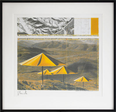
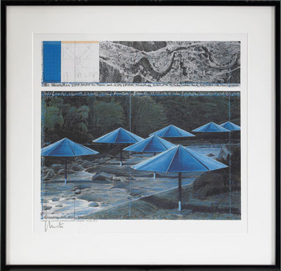
As the sun rose on October 9, 1991, Christo and Jeanne-Claude unveiled one of their temporary "gentle disturbances” [5] — The Umbrellas. Across portions of the eastern coast of Japan and the western coast of the US, they opened 3,100 massive umbrellas. In their words:
"This Japan-USA temporary work of art reflected the similarities and differences in the ways of life and the use of the land in two inland valleys, one 12 miles (19 kilometers) long in Japan, and the other 18 miles (29 kilometers) long in the USA.” [6]
This was the result:

Wonderful stuff.
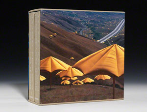
Years ago, standing in a small bookshop in London, I happened upon a large table far off in the back corner. Atop it were two hulking volumes. Together they comprised the Taschen collectors edition for The Umbrellas; I was mesmerized.
For hours I stood there plying through those two objects which so well captured Christo and Jeanne-Claude’s creative process. Documented within was the residue of engineering a dreamscape and overcoming endless bureaucratic snafus. That book — the physicality of it — codified the great effort behind their beautiful mountainside and rice paddy installations. It memorialized their efforts and journey. But for whom was this book created? I suppose it was for me — someone on the outside.
I would argue, however, that for Christo and Jeanne-Claude, the book simply formalized much of what they already knew. Their work benches were covered in schematics, file cabinets filled with correspondence between farmers and governments and architects and textile manufacturers and engineers. In other words — to them the magnitude and grandiose nature of their work was present all around their home, their work space. It manifest physically in those files and papers and cabinets. For them, a monster book like this didn’t illuminate the enormity of their undertaking — they were aware of The Umbrellas’ bombasity every time they opened their studio door.
It’s also important to note that Christo and Jeanne-Claude didn’t directly take money from outsiders. In fact, they funded much of their projects by selling the detritus of their process:
[The] 26 million dollar temporary work of art was entirely financed … through the sale of the studies, preparatory drawings, collages, scale models, early works, and original lithographs. [7]
Twenty-six million dollars of sketches! You can imagine just how viscerally aware they were of process by raising that kind of cash through selling off the very goop of their creativity.
Their monograph gave form to their creative process for those of us not privy to studio access; to those of us who had never seen their chaotic lair of physical detritus.
So this book about The Umbrellas is for us. It captures their process and — if not entirely making sense of it — at least gives us a frame by which to view it. Edges. But for Christo and Jeanne-Claude, the book was simply a formality. If anything, it shrank their sense of the project from something full of physicality to just a couple of books.
Which brings us back to the previous point: Something curious happens to our ability to understand scope when we move all that goop of process and narrative into a computer. Even for those of us doing the making: the insiders. The Christos, if you will.
When all the correspondence, designing, thinking, sketching — the entirety of the creative process — happens in bits, we lose a connection. It's as if all that process is conceptually reduced to a single point — something weightless and unbounded. Compounded over time, the understanding of where one is as a creative in a digital landscape collapses to the just-a-little-while-ago, the now, and maybe the tomorrow. [8]
At the end of the Flipboard for iPhone project I wondered if we could find value by exploding that singular point into a form we could grasp. That form could have taken many shapes but it's easier than ever to make a book. Although, this would be a book to serve the precise opposite role of The Umbrellas monograph. It wouldn't shrink our creation. Instead, it would hopefully give shape and weight to the amorphous nature of our digital production processes.
The Book
And so:
997 design comps in a shared folder,
9,695 git commits,
a bundle of notebooks full of sketches,
and dozens of photographs from launch night.
What does that weigh?
At 276 pages long and 1 foot by 1 foot square, it weighs nearly 8lbs.
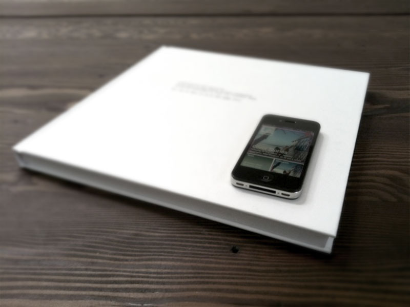
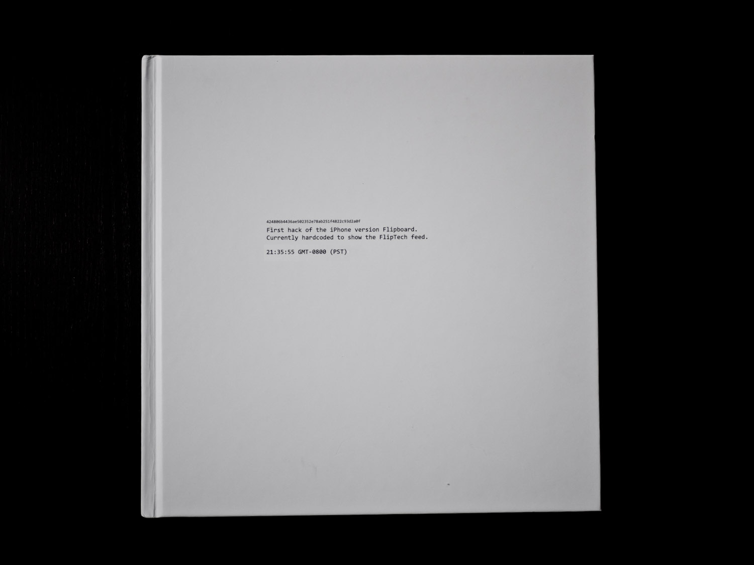
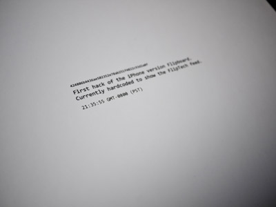
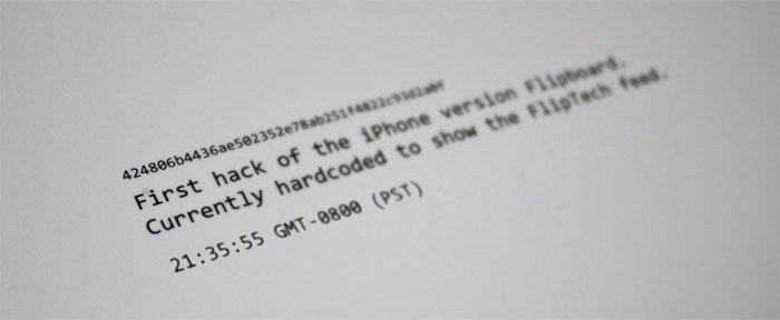
It begins on the cover with a commit message — the first push to the main code-base. A hack. A test, a possibility. The exact moment development begins on a software project is always fuzzy. Lots of development happened before this moment. Other intense cycles happened after. But this moment marks the first time in the code stack that the product had an identity — the seed for what was to come.
I love the hyper granularity of time — 9:35pm and 55 seconds on a Saturday night on the west coast (GMT -0800) of the United States. So specific!
Romantics like to correlate the loss of physicality in our digital shifts with a certain loss of humanity. Often cited are the correspondences between Raymond Carver and his editor Gordon Lish in which we see clearly — thanks to the pencil strokes and marginalia of their found letters[9] — just how instrumental Lish was in shaping Carver’s voice. [10]

Those early edits[11] were so grandiose — pulling the text into such a minimalist place — that when Carver dropped Lish and used other editors later in his career, readers misattributed the shift in writing style:
… those who viewed Carver’s later stories as more expansive than his early work, simply never knew that he had always been expansive.[12]
If we're excited by the voyeuristic insight of that, we should be doubly excited about where things are going.
This — this hyper-hyper granularity of time on the Flipboard for iPhone book cover — 9:35pm and 55 seconds; digital atomic precision of that moment — is just the tip of the commit-stack for what kinds of meta-data are now — or soon will be — generated within the digital texts we produce.
Perhaps the next Carver’s manuscript will contain the entire typing history of the document including GPS data of where he was when he wrote it. We will be able to replay the entire composition process. Shadow, if you so desire, a particular Hemingway through a certain Spain as he writes a new The Sun Also Rises.
Here's that voyeurism made real: In 2011 the startup Stypi released a product[13] which already allows you to replay document creation. Every keystroke. By sharing the URL of a document, readers play back your thought process. YCombinator founder Paul Graham (and Stypi investor) used this application to compose his November 2011 essay, Startups in 13 Sentences.[14] It's fascinating and illuminating to watch Paul write. We gain an insight — a very human, very intimate one — into how he crafts his essays.

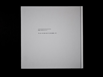
So the Flipboard for iPhone book begins with some of this meta-specificity on the front cover and ends with the final commit message on the back. It uses the natural digital boundaries of version one of the app — first and final commits — to define the boundaries of the digital-physical version.
The first commit happened as a late Saturday night hack. The final commit happened on a Thursday at 4:47am after a marathon week of coding. There's something about this specificity that's perversely romantic. As if you can imagine the very moment the engineers hit the return key to finalize these decisions. Flipboard for iPhone was born precisely, and it was finished precisely.
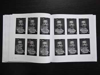
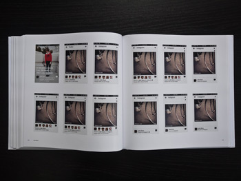
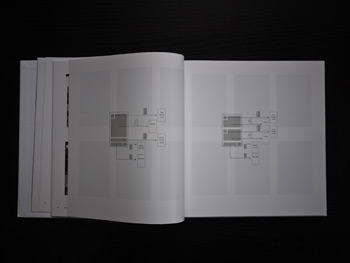
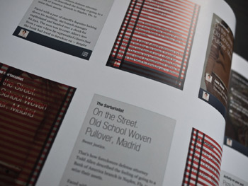
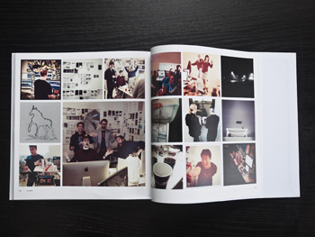
The book then steps through, month-by-month, the design and engineering of the product. It begins in February with HTML comps, and ends in December with version one of the application.
What we’re able to see in this form — printed — perhaps better than we can in cover flow, is the sheer tightness of our design iteration loops. Pages of information architecture comps, sketches from our notebooks, and views of the various grids through which we iterated take on new clarity in this digital to physical flip-flop.[15]
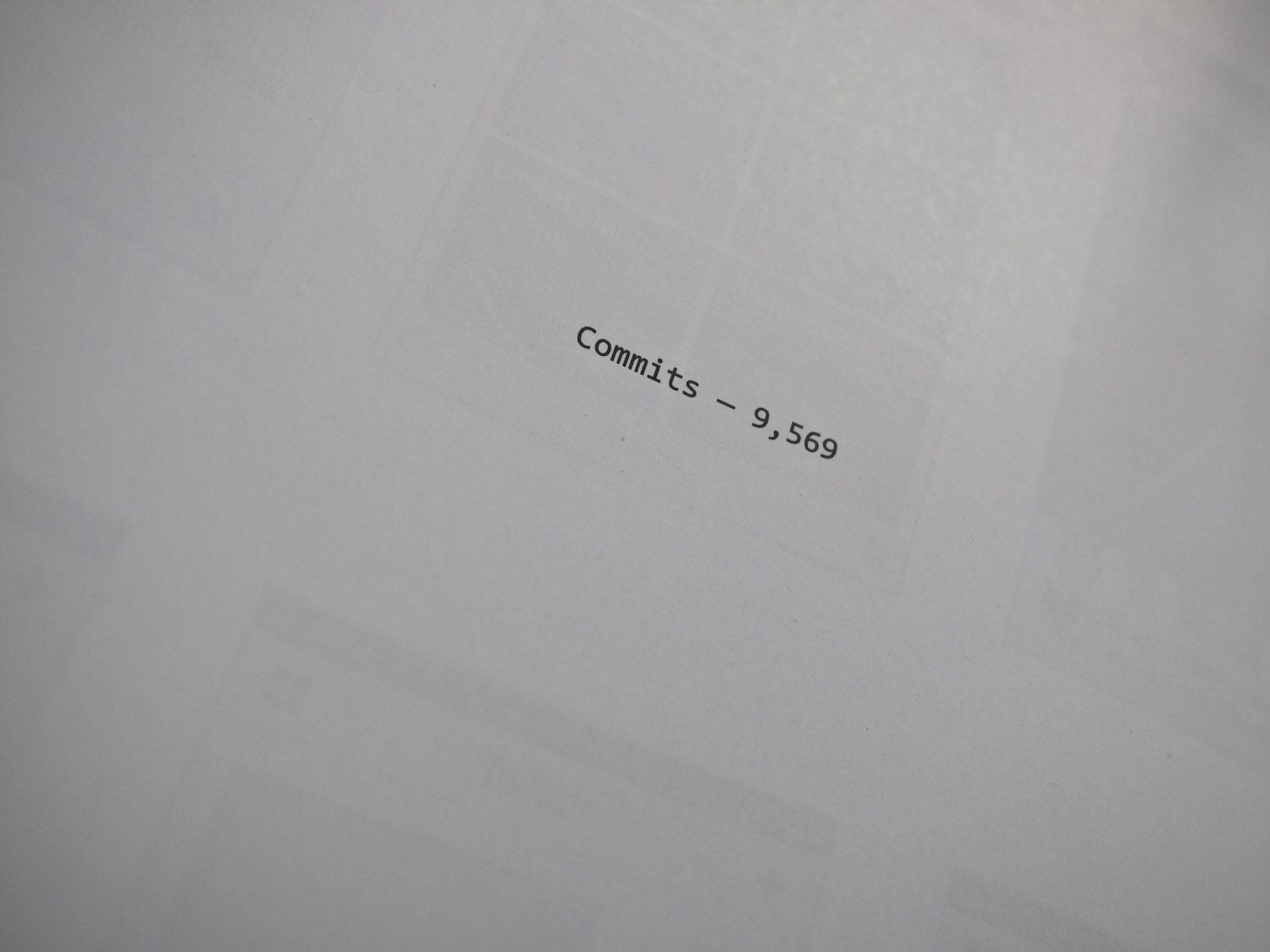
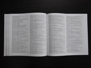
Then at the back: the commits. All 9,569 of them.[16] As you flip through this high-resolution macro view of the commit stack, the very texture of the page changes as new developers join the project; as the software jumps into different phases of development.
And finally, at the very end, pages and pages of the photos from our launch night. They were covertly assembled via geotagged searches across Instagram and Flickr.
All the digital intangibility of iPhone development is inscribed into this eight pound book, wrapped in an immutability. It's a digital-physical. An explosion of months of ethereality into something human parseable.
The Delivery
UPS
The book arrived from the print on demand company Blurb[17] without fanfare — a square box from UPS simply appeared on my desk one morning.
So this is what all of that design and development weighs. As I opened the box and pulled out the book, there was something deeply satisfying about its imposing physicality. An emotional response you couldn't intuit from the Indesign templates. This feeling, of course, speaks to the cognitive dissonance we experience when jumping between digital and physical representations of the same thing. Especially when they're composed of the same data.
The Fellowship
The post-launch project breakdown happened in a quiet, sunlit room in the early afternoon. The Flipboard for iPhone team gathered around a giant wooden table. Ten or fifteen of us. What went right? What went wrong? What could we do better next time?
We talked about what a wild journey we had been on. But, I piped up, I worried that the journey — and with it lessons we learned — seemed to be fading in the post-launch quickness that often characterizes Silicon Valley. What did we do right and wrong are great questions, but even more generally: What did we do?
I pulled from my bag the giant book and placed it on the table with a thud. And as the team began to flip through it and understand what it was, you could feel the room swell with a strange relief. Finally there were edges to this intensely immaterial process we had all been through. The book represented, I believe, closure on a process that often has no closure. And pragmatically, it would now serve as a repository of the rich interface experiments we had conducted.
The book wasn't made for anyone outside of the company. It is, weirdly, an object for the folks who made the very thing it’s about. It’s for the people who should be most intimate with the project and process but who — because of the nature of digital — may have a hard time seeing the edges and understanding the weight of what they had created.


The Umbrellas is for the consumers.
Flipboard for iPhone is for the producers.
YES/NO, ON/OFF
It's worth remembering that a hardcover book like this is as much a product of the digital publishing shift as any .epub or .mobi file. Flipboard for iPhone would have been nearly impossible to make five years ago. I produced two copies. Two copies! of this huge thing, printed in full color. And they arrived ten days after submitting the files. A miracle of sorts.
… a binary digit, a flip-flop, a yes-or-no.
Digital ↔ Physical.
In Part
Of course, Flipboard for iPhone is not an accurate representation of the full production process. Anyone who has been involved with a startup can attest — imbued in a company's output is an incalculable amount of team energy. Lost sleep, lost muscle mass, stress, highs as a beautiful solution to an engineering or design problem emerges, lows when you realize the next solution obviates the first, bonds born from late night hacking sessions, design reviews, inside jokes, sclaps, animated gifs, high-fives, scowls. All of this is manifest in the final product somewhere. It's in there. All of that and more. Of course you can never show it all. What could possibly represent that scale of emotion? A mountain? All you can hope to find is something — a scaffolding — to represent a clear subset of the process. A well defined space onto which the team can affix those experiences.
And so what projects like this speak to is the unique and increasingly important value we can give data by abstracting physicality. Jumping back and forth. Creating that space. Capturing a journey effortlessly in bits, and then giving it edges. This dance makes our digital experiences more understandable, parseable, consumable.
Edges are about feeling as much as seeing. With edges comes a sense of weight. And with that comes the ability to feel — physically and psychically. And with that, a better understanding of what we've built and where we've been.
Referenced or Noted
- It’s one reason, for example, it feels so good to scroll down to most e-mailed on nytimes.com — it’s bounded, doesn’t update much, and you feel like you can read it all.↩
- If you want to geek out on this stuff, you can learn all about version control and software like git here: http://en.wikipedia.org/wiki/Revision_control ↩
- I believe part of the recent surge in the desire to do "real" stuff with our "hands" is driven by the digital thinness we're wrapped in. Conferences like Do Lectures, new shops selling pickles in Brooklyn, woodsy digital refuges. It feels like there's a renewed momentum around craft and physicality. All circumstantial, of course, and perhaps just a product of my generation getting sick of screens. ↩
- Of course, this is mainly an interface problem. That is to say — printing stuff out isn't the only way to draw edges, combat the feeling of thinness, or help us keep digital data in perspective. Collating and printing is just one kind of interface with which to attack this problem. Higher resolution screens with smarter design solutions can and should also help us solve this problem. ↩
- http://www.artagogo.com/commentary/christo/christo.htm ↩
- http://www.christojeanneclaude.net/major_umbrellas.shtml ↩
- http://www.christojeanneclaude.net/major_umbrellas.shtml ↩
- This is why great project managers are so critical — their job is to keep the entirety of the production process in view, both the long-before and the long-after our now. They are masters at framing all the intangibility of a software project into something with clear edges, and making sure all the pieces — front and back-end engineering, design, marketing, etc — are all moving at the right speed, at the right place within the context of this greater whole. Kind of like a rally car co-driver. ↩
- Excerpts from their letters: Letters to an Editor, The New Yorker, 2007 ↩
- The full edit of the Beginners text is available on newyorker.com: "Beginners," Edited: The transformation of a Raymond Carver classic., The New Yorker, 2007 ↩
- Being Raymond Carver, The New Yorker ↩
- The Real Carver: Expansive or Minimal?, Motoko Rich, The New York Times, October 17, 2007 ↩
- Based off of Etherpad which was acquired by Google in 2009, open sourced and the original site shutdown. http://en.wikipedia.org/wiki/Etherpad ↩
- Paul originally linked to the article on his blog. You can see the original 'performance' on Stypi (nice URLs!). And read the reactions to the piece here on Graham's own Hacker News. ↩
- Again — one of the qualities we're benefitting from in printing these out is resolution and size. If we have paper-resolution screens (like the 2012 iPad) at a larger size, then I think we can achieve aspects of the experience we get from printing it out on paper. ↩
- git log --pretty=format:'%h %an %ai %s' \{\{\{first_commit_hash\}\}\}..HEAD --reverse > everything.txt :: More on hacking git logs. ↩
- I've been using Blurb to do print on demand books for years now. They provide InDesign templates on their site as well as PDF specifications. They offer branding free (for a fee) books with a variety of great paper and binding options. Also, as a bonus, Blurb is a great company and Eileen Gittins, their CEO, is wholly devoted to making beautiful books accessible. ↩
